Creating a funny, simple and eye-catching logo redesign for "UnSheeping" mobile app.
Unsheeping logo needed a complete redesign. The new logo, with its main feature the "sheep", had to be modern, simple and funny. Trying to keep those ideas in mind here you can see, besides the final logo and its symbol "the sheep", some attempts and sketches made during the whole process of creation.
Ideate
Initial Sketches
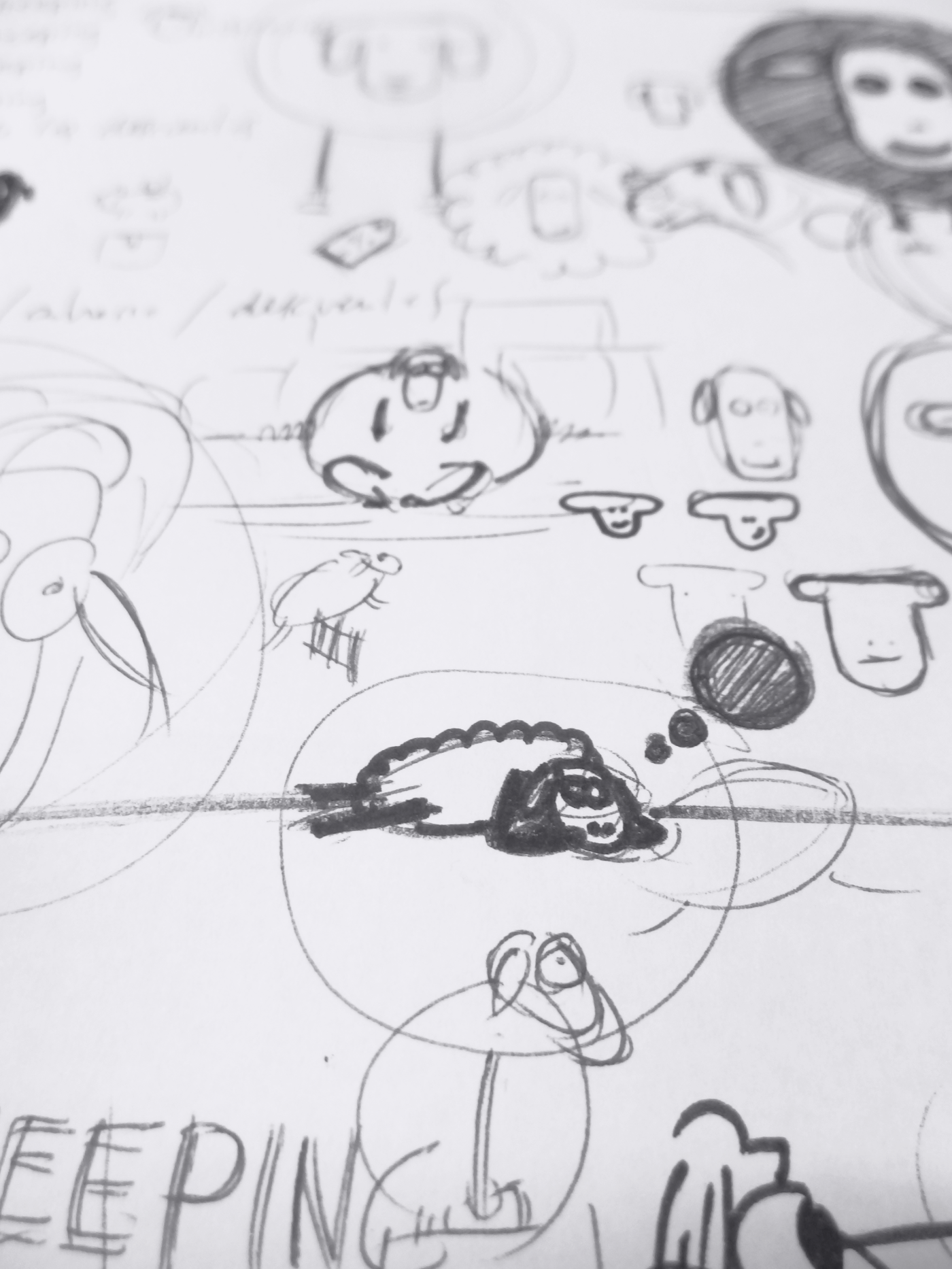

With main requirements in mind I began the ideation process by creating quick and rough sketches of the symbol: "a sheep". It had to be funny, simple yet attractive. Since the very beginning it was clear that the symbol style couldn't be realistic nor abstract, its appearance had to be between those two concepts. As you can see above several visual styles were explored in order to reach style objectives.
Design
Picking out the Pose
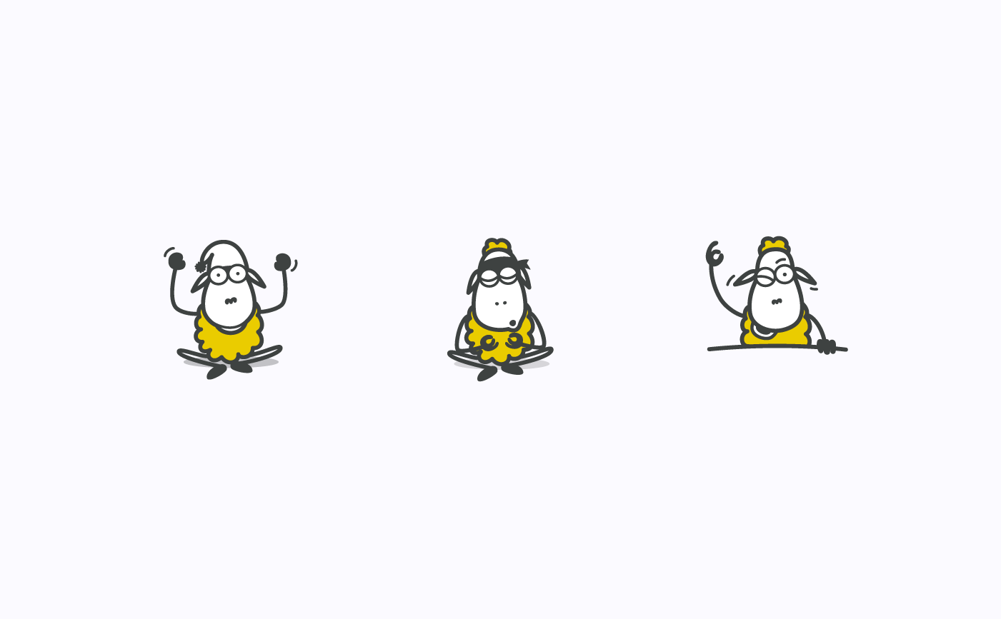
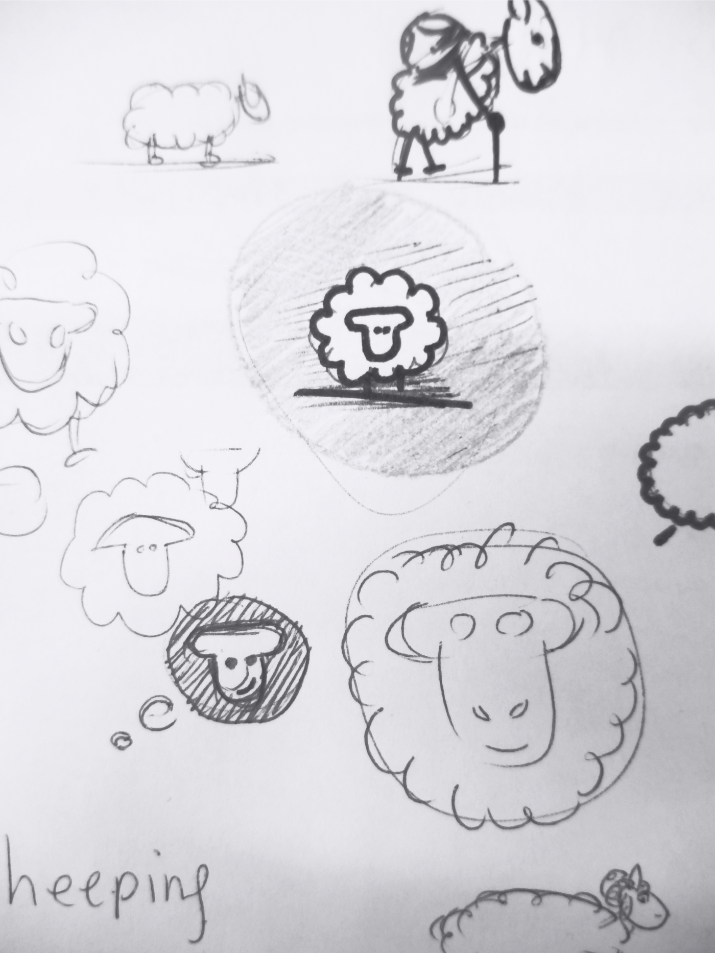
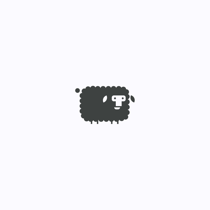
View of studies for different poses of the "sheep"
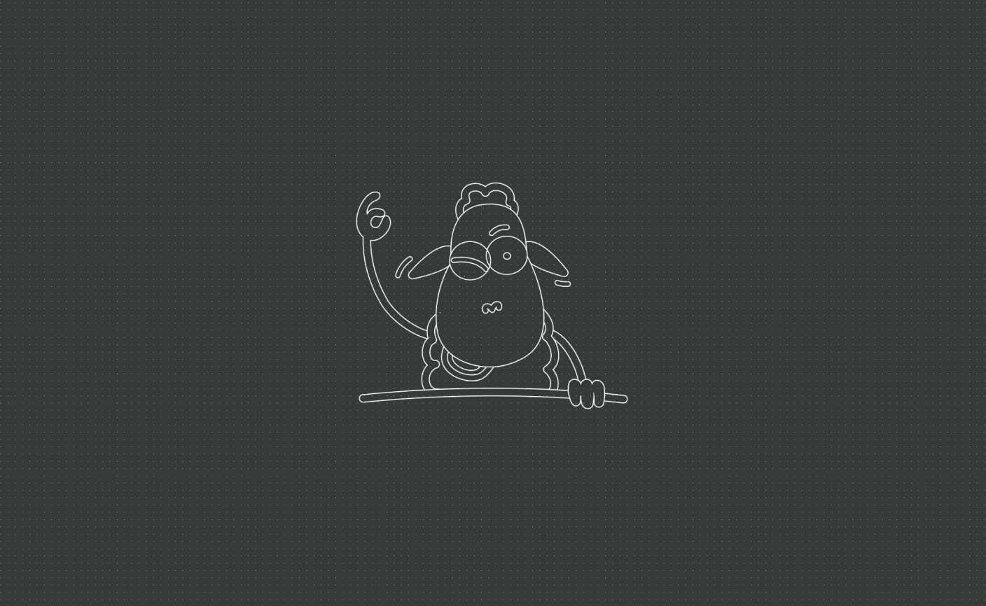
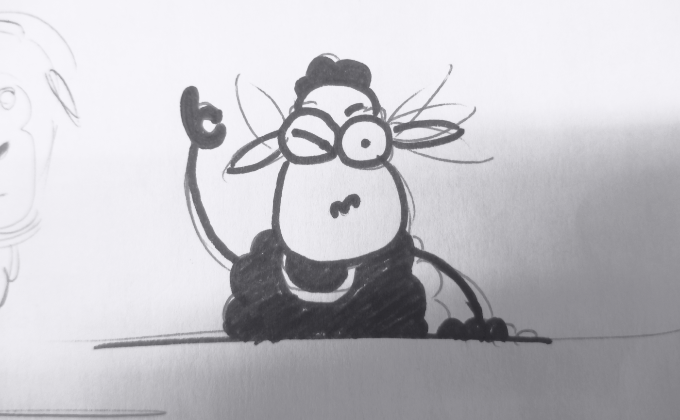
View of the outlines of the Unsheeping symbol
Once a sketch of the new symbol was created and chosen several different poses for it were created. In the end the above one was picked out and its vector shape was developed to be used within the logo.
Design
Final Version
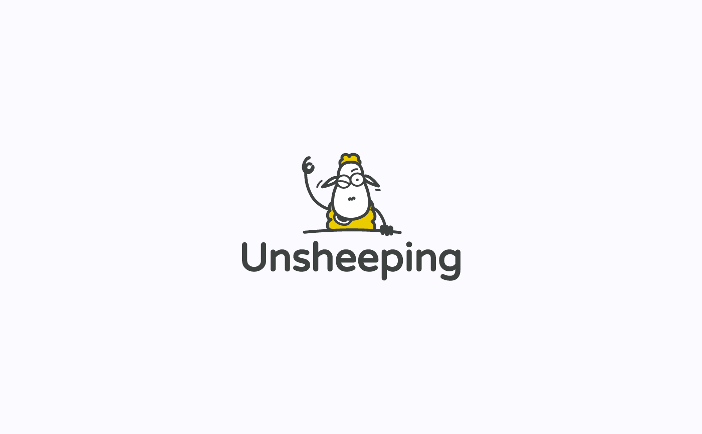
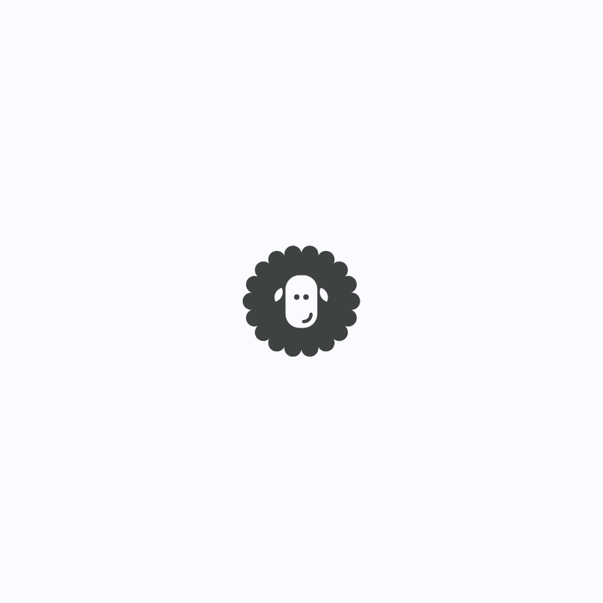
View of the final version of "Unsheeping" logo on light bakground
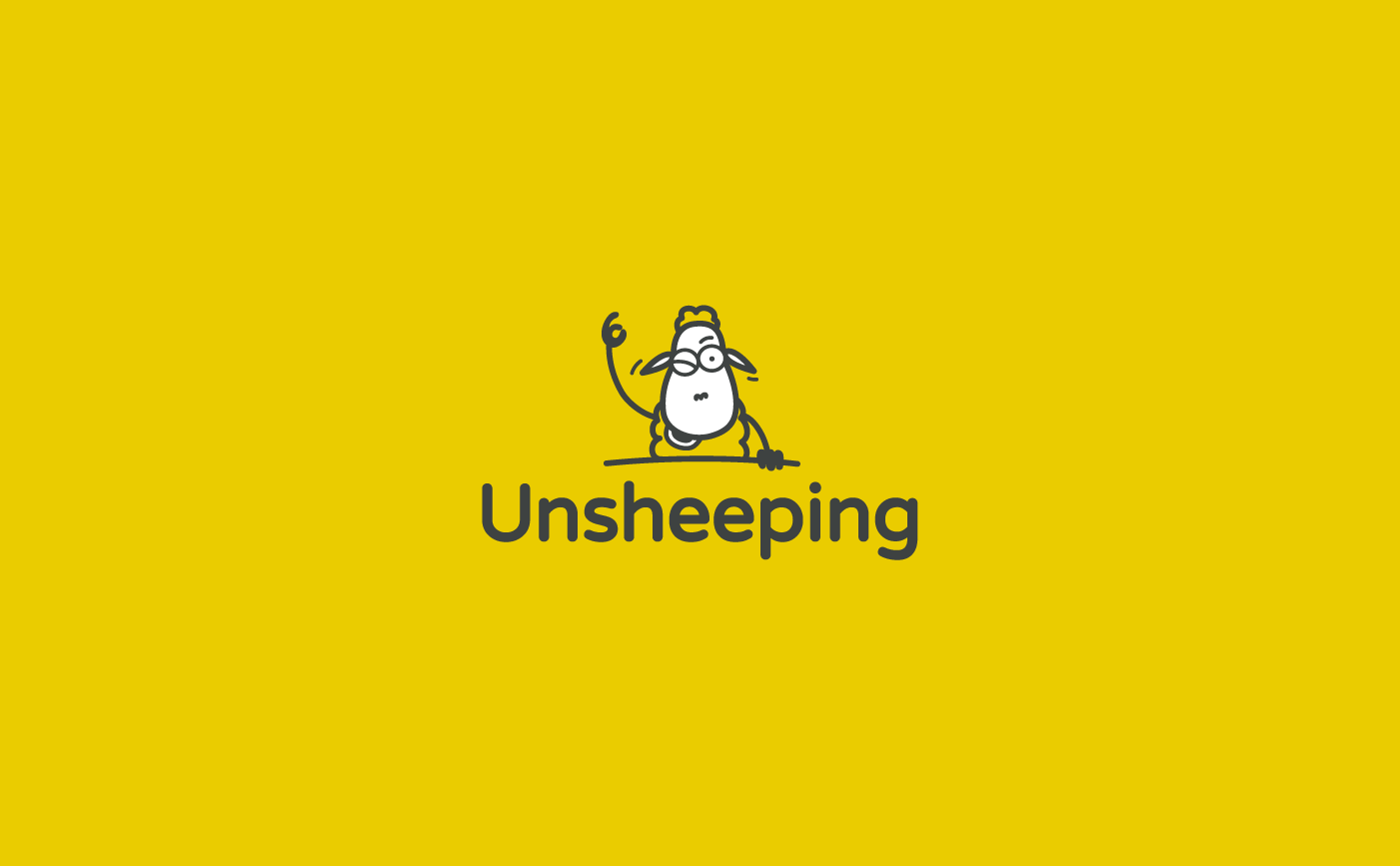
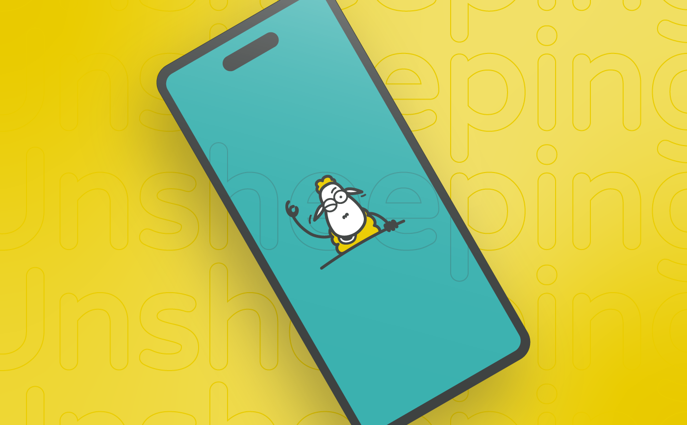
View of the final version of "Unsheeping" logo on yellow bakground
Besides the symbol (our "sheep") a mild, soft and round typography was chosen to accompany it. Varela Round, from Google Fonts archive, was the one used to form the whole logo along with the "sheep".
Iterations
Discarded Proposals
View of discarded proposal
View of discarded proposal
During the creation process for the symbol many different proposals were drawn. The above two are part of those drawings and, as you can see, they both have a completely different visual style from the one chosen in the end.