Updating visual appearance, improving Information Architecture and optimizing HTML & CSS.
Understand
Pain Points
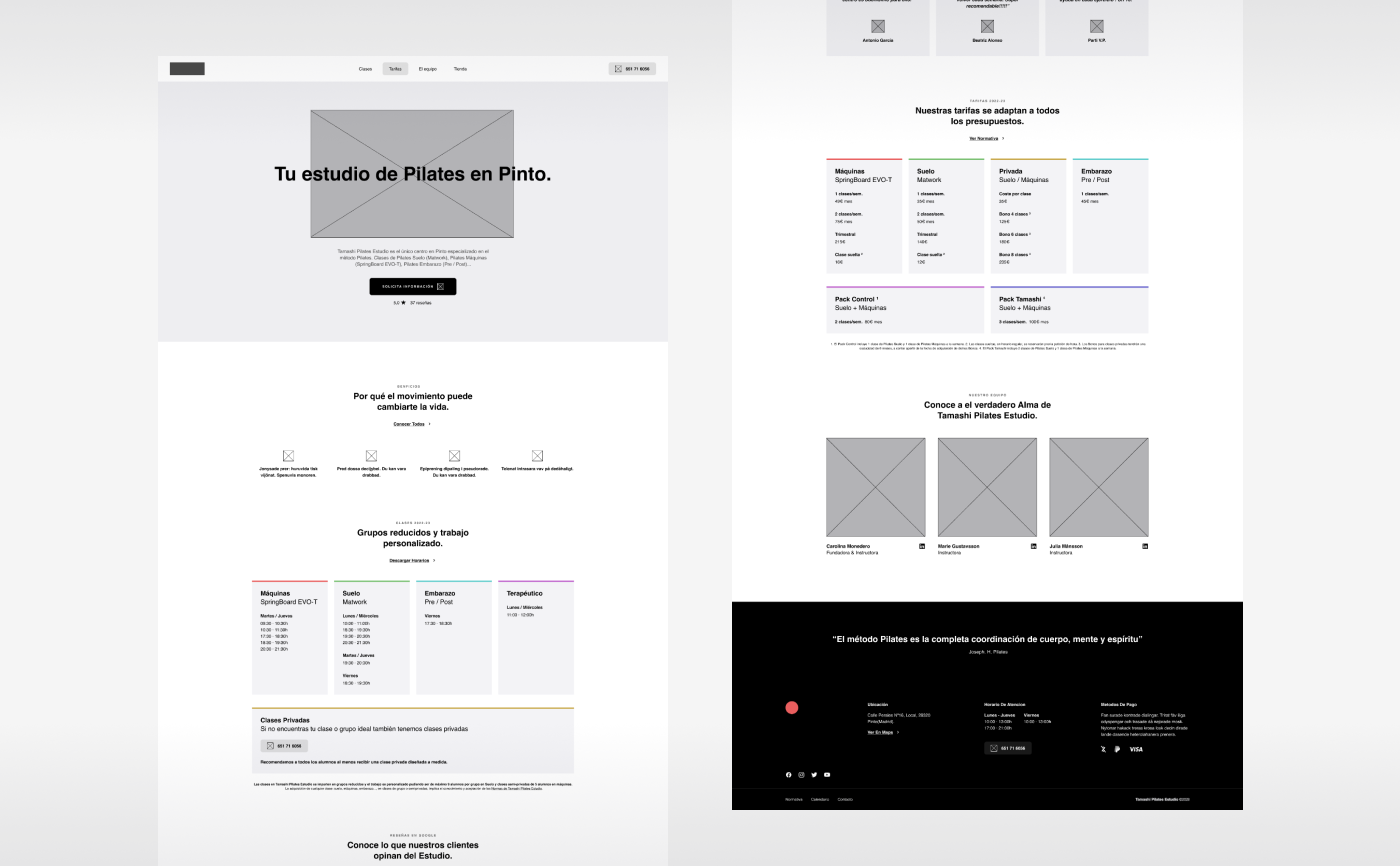
After an initial assessment of the published website at that time, 2 key aspects were clearly in need of some improvements: website's visual appearance and its Information Architecture and content structure.
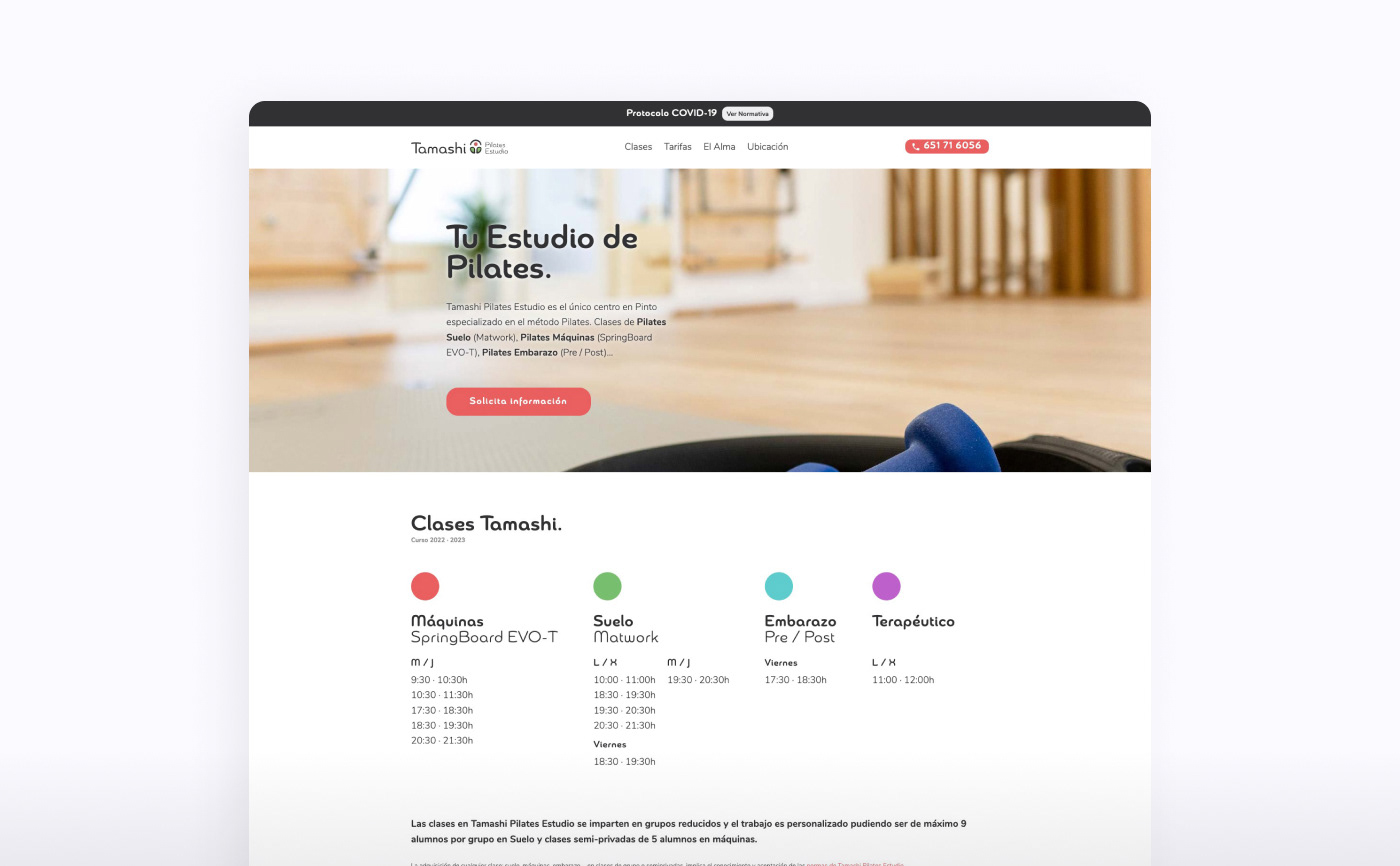
Website screenshot before the update
Design: Typography
It was decided to address a change on website's typographies. A more manageable font was selected to be the new main one, still with a lot of the previous main font's character: modern, round, mild and bold.
Design: Colour Palette
A wider Colour Palette was developed in order to help cope with any type of visual issues or needs in the near future.
Information Architecture
A new Information Architecture was carefully designed and set to improve the hierarchy of all contents, their legibility, accessibility and the overall user experience of the updated website.
HTML & CSS
As part of the project update these areas were also updated, which, in the end, turned out to be a deep change regarding the CSS's layer, in order to be able to show the new updates properly on different devices and screen resolutions.
Ideate
Wireframes
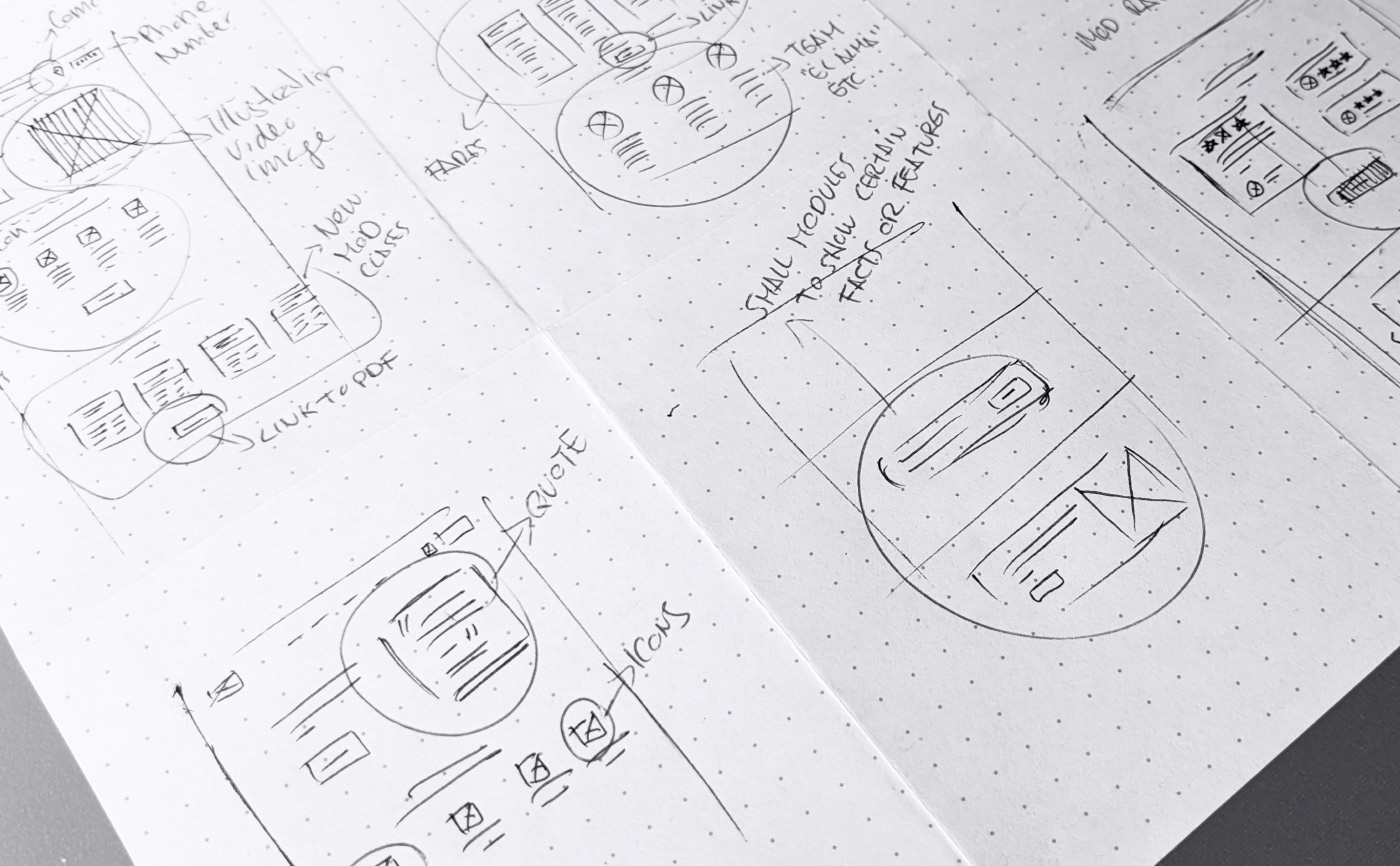
Rapid iterations made on paper
Rapid iterations made on paper
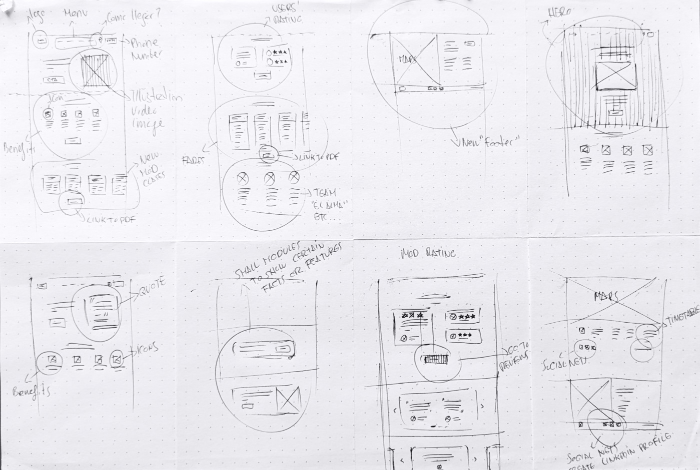
First digital Wireframes made on Figma
To iterate quickly and easily on new visual solutions and "Information Architecture" structure and hierarchy, numerous paper wireframes were made as fast as possible in order to improve website's structure at that time. After picking out the most suitable paper wireframes' solutions, digital wireframes were also created, so as to quickly identify the likely downsides within the new approach.
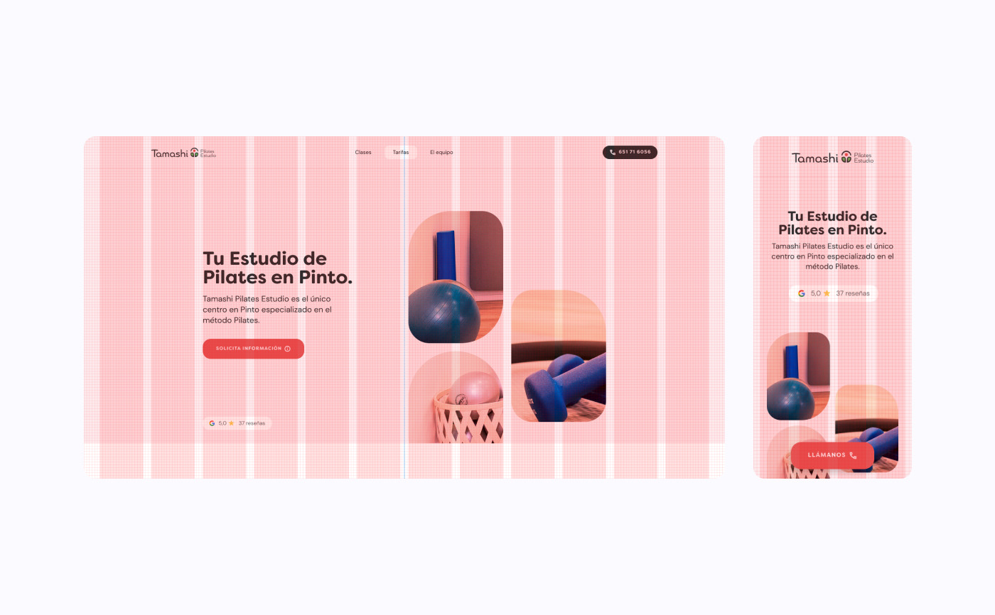
Design
Mockups
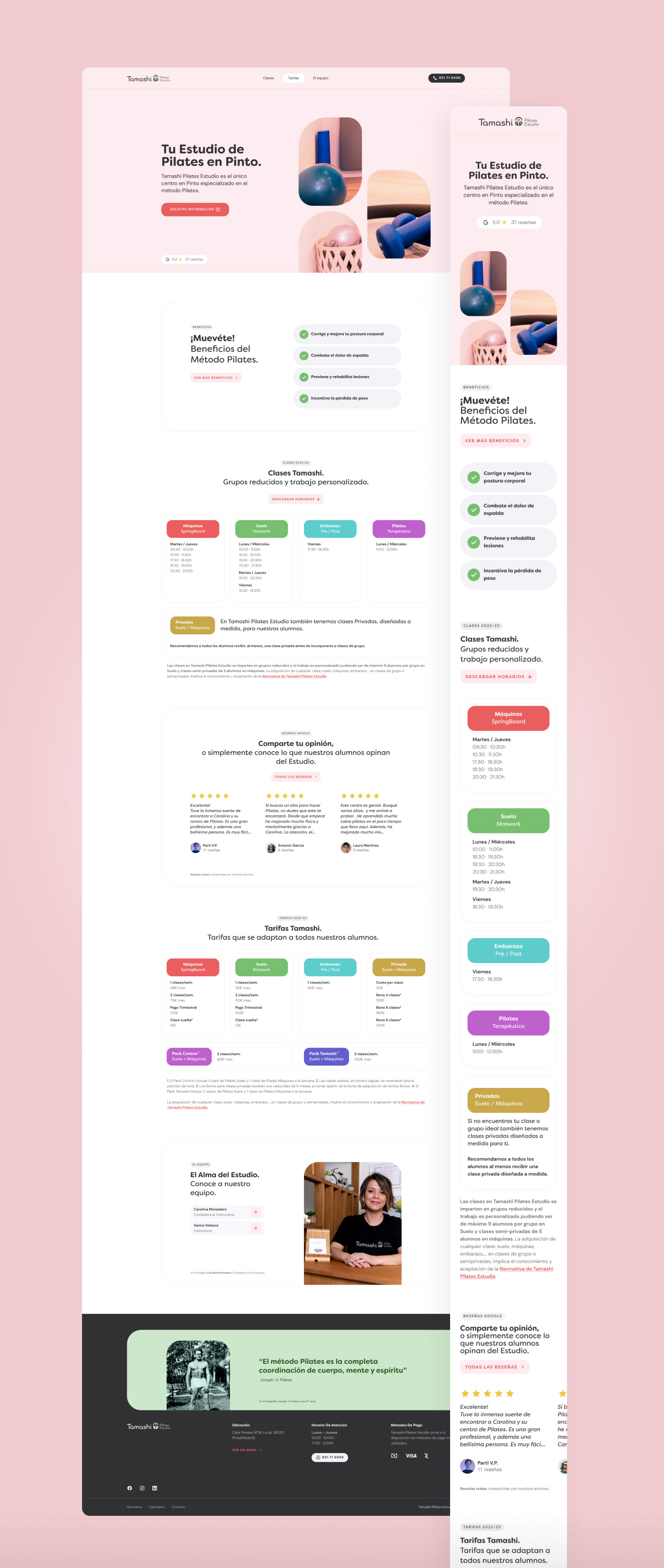
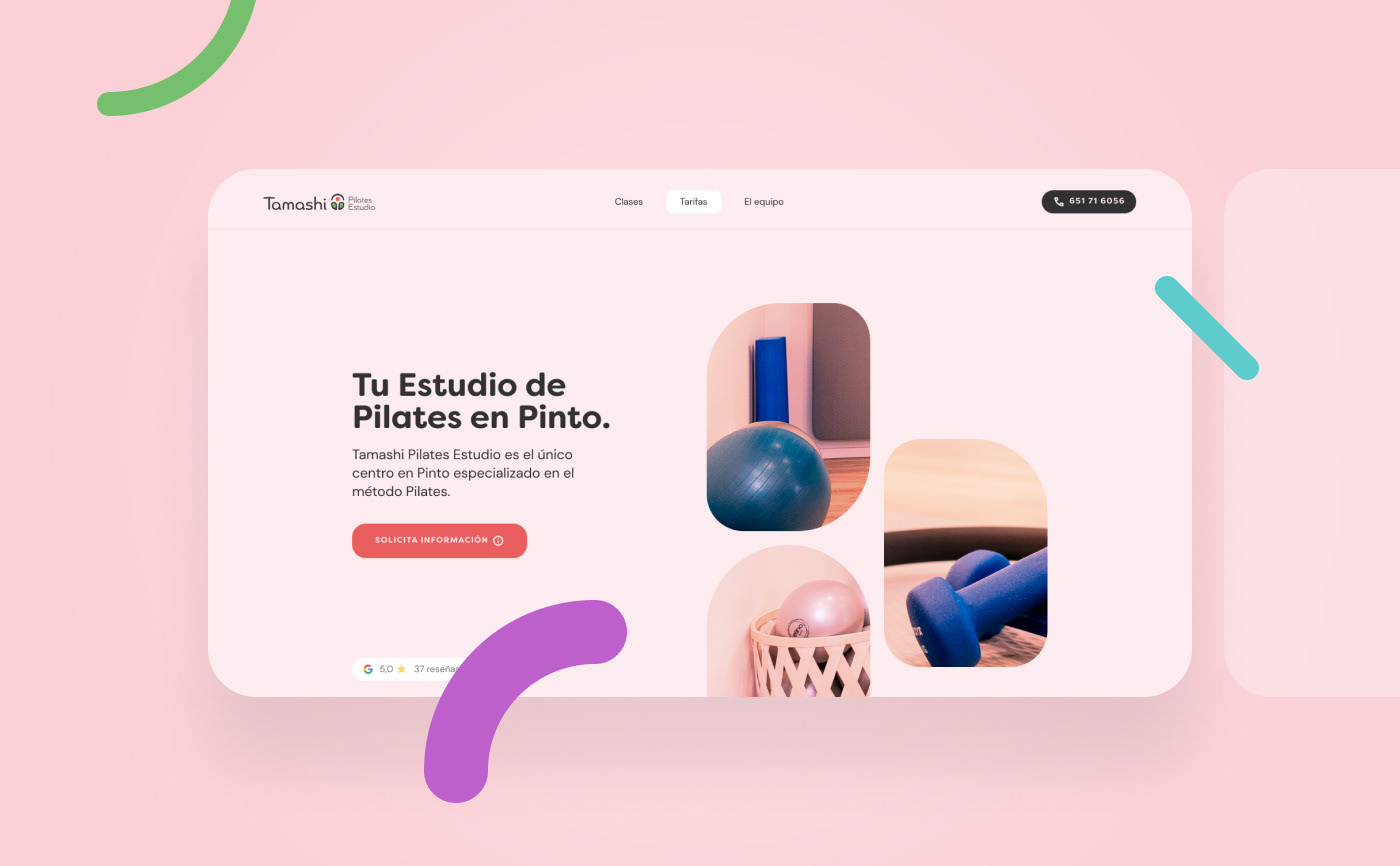
Following rapid iterations on paper and the creation of several digital wireframes, and after picking out the most suitable solutions from them, final Mockups were created following a more modern and sophisticated visual style approach. Visual Consistency, Accessibility and Usability guided this stage of the development cycle.
Design
Colour Palette
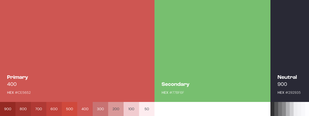
Tamashi colour palette is now made up of 3 main hues (Primary: #CE5652; Secondary: #77BF6F and Neutral: #292935). In order to make the palette broad enough Primary and Neutral variations were also added to it, from 50 to 900.
Design
Typography
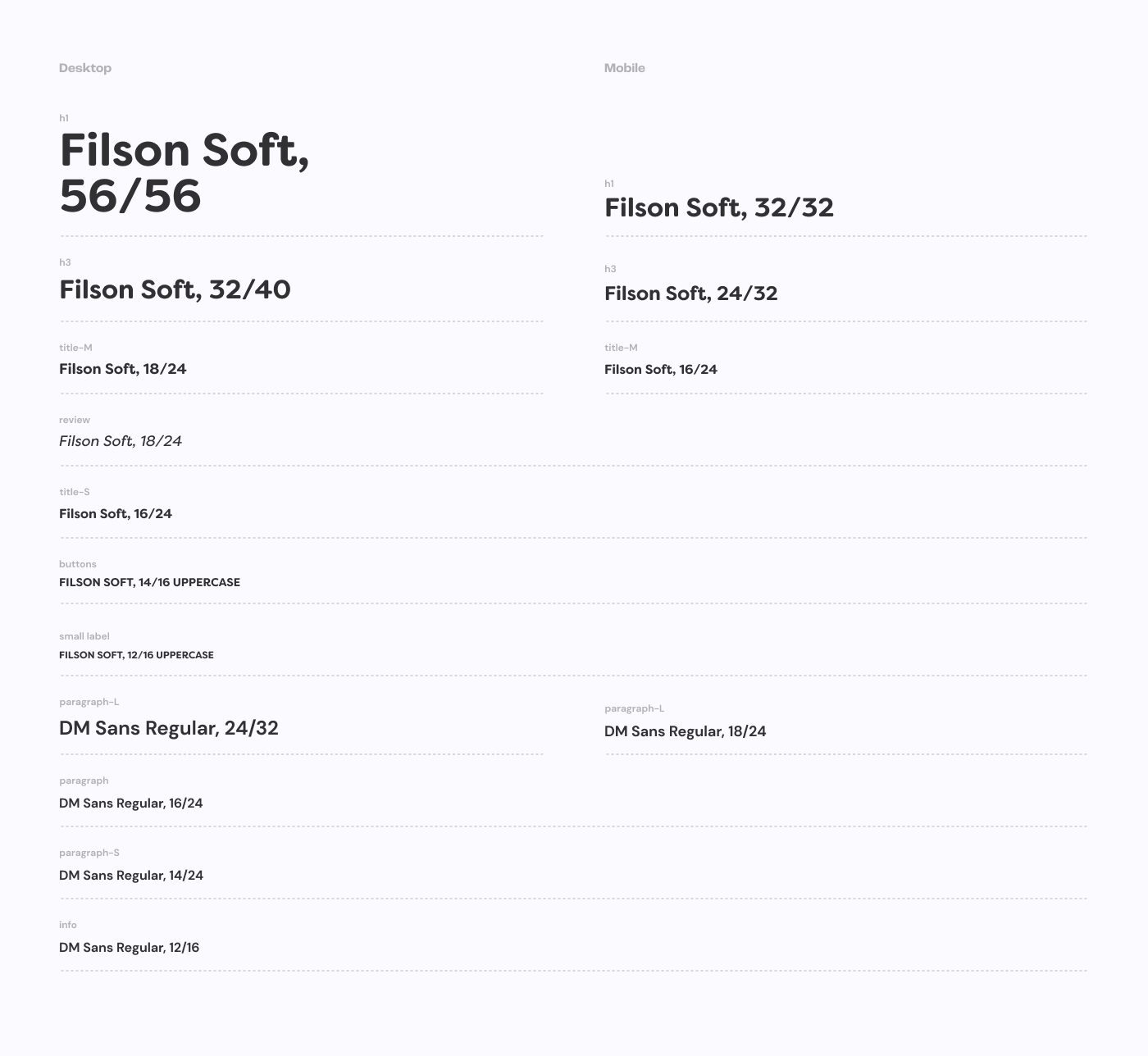
Prior to the stage of Hi-Fi mockups it was decided to address a change on website's typographies. For website's main typography, a more manageable one was selected, but still with a lot of the previous character: modern, round, mild and bold. Typography used on paragraphs and smaller text passages was also changed. In this case a nearly "grotesk-featured" type was selected, so as to be clearly legible, even in very small texts, and also to create visual contrast in comparison with the main font.
Design
The Grid
In order to make design tasks easier, faster and more consistent across screen resolutions, a 12 column grid was established to lay the design within desktop screens. The 12-column grid was transform into a 4-column grid for mobile devices and screens with small resolutions.
Take aways
Test, Measure & Iterate
After various iterations on paper, digital wireframes and, eventually, final mockups, a modern, elegant, and with a better Information Architecture structure, Landing Page was defined and published. Thanks to its new "IA" and content structure, some simple yet modern new design features, users can now navigate the site, and process information available, in a faster and less painful way than in the past. For future updates our next steps will be: measure how well users interact with the new design features and information structure applied and also analyse business performance.