Create and set the visual foundations for a
non-profit organisation called "Solar".
"Solar", a non-profit organization, was in need of a brand identity capable of transmiting organization's main principles: power-energy, minimalism and flexibility-modularity. To do so they ran a contest on 99Designs website to let designers help them in this particular task. Here I'll share with you some of the materials, ideas and final solutions created for this particular project.
Ideate
Initial Ideas
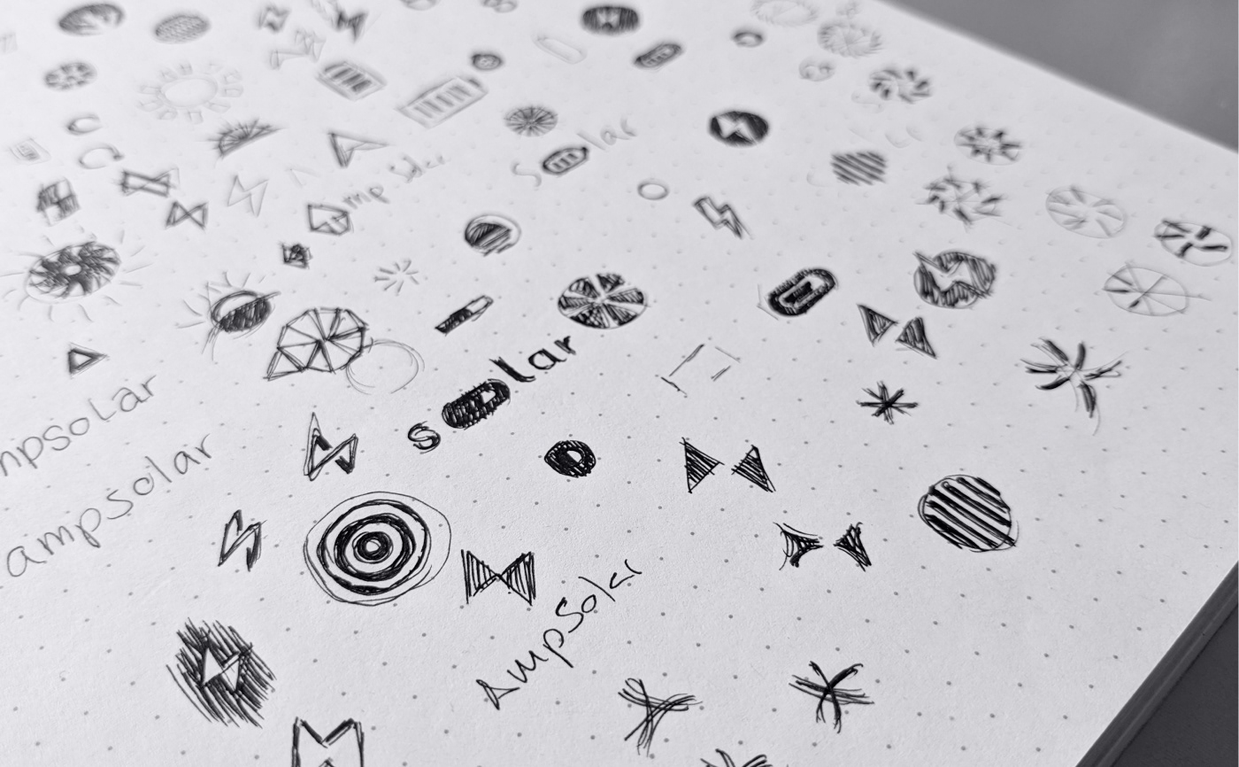
Initial ideas drawn swiftly and roughly on paper
Design
Foundations
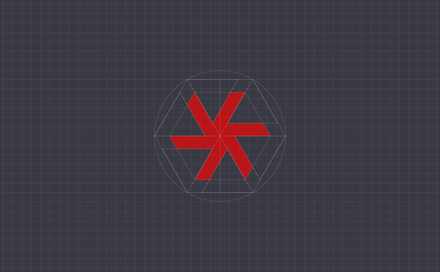
Basic geometry of the symbol
Behind the basic geometry used to create the shape of the final symbol submitted for "Solar" team, lies the idea of a moving star, which could be our sun. To create this moving star the shape of a hexagon has been used shrinking slightly its interior triangles' size.
Main measurements, proportions and lines of reference within the composition
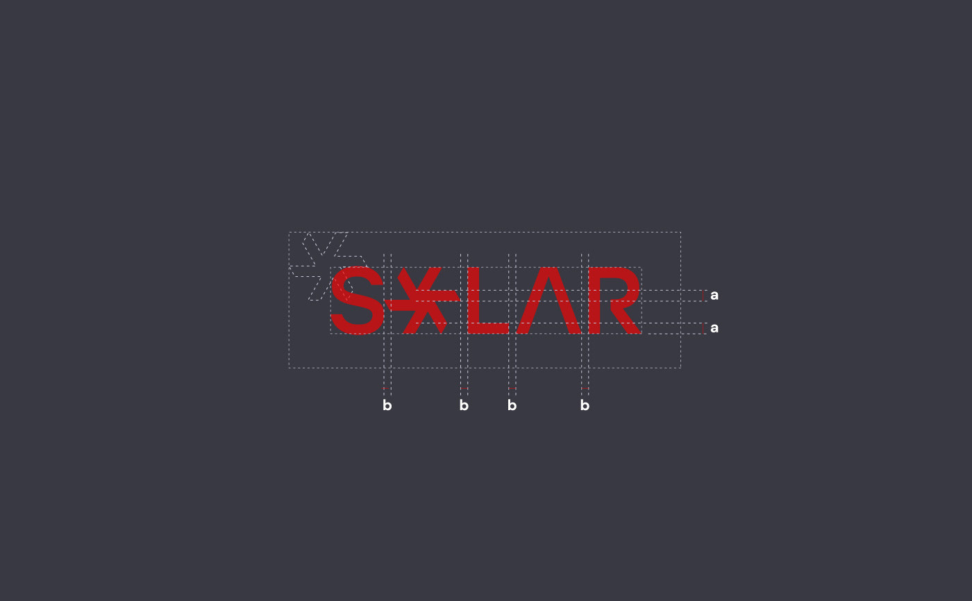
Design
Final Versions
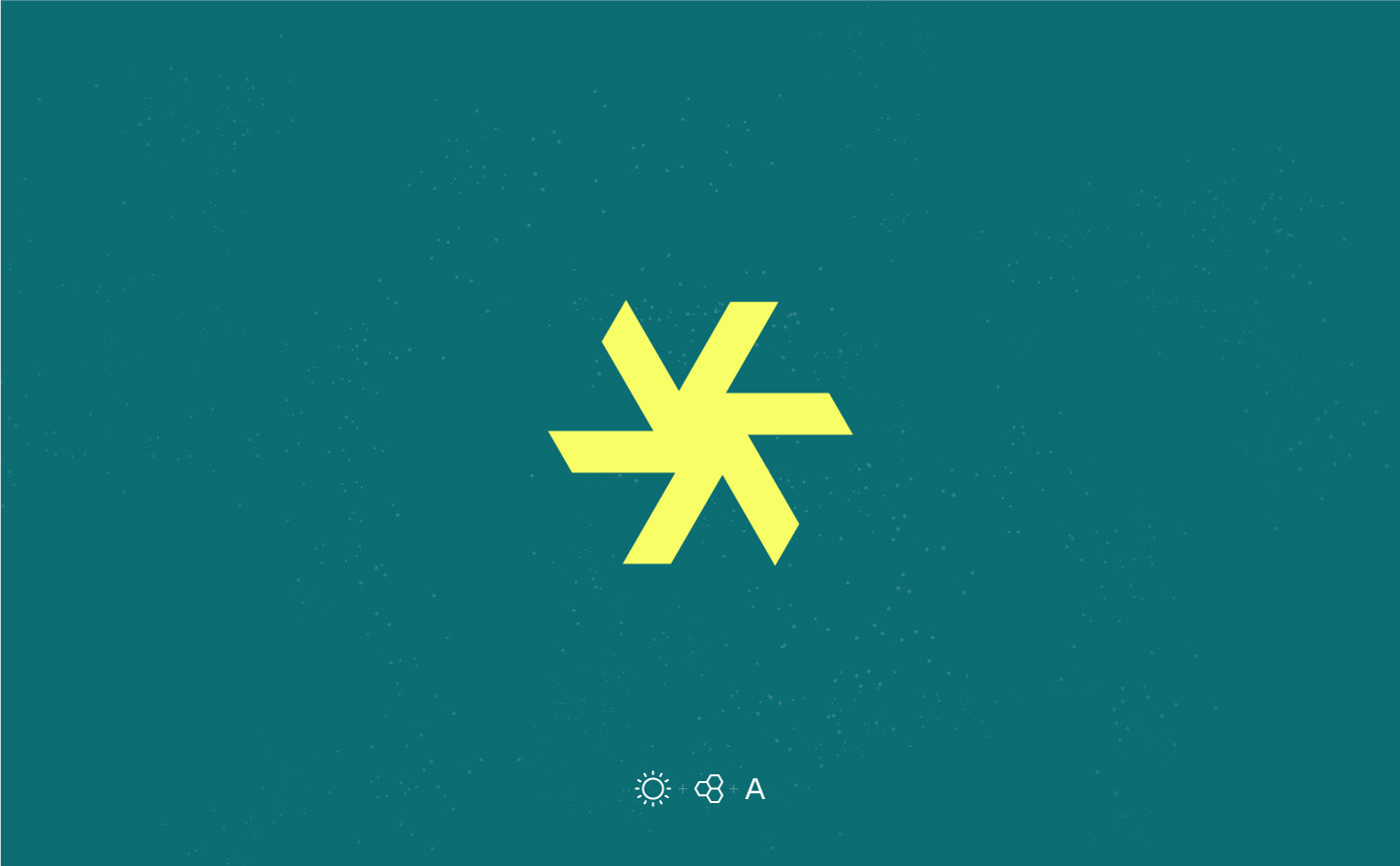
Final symbol and the concepts behind its shape: sun, modularity and the letter "A"
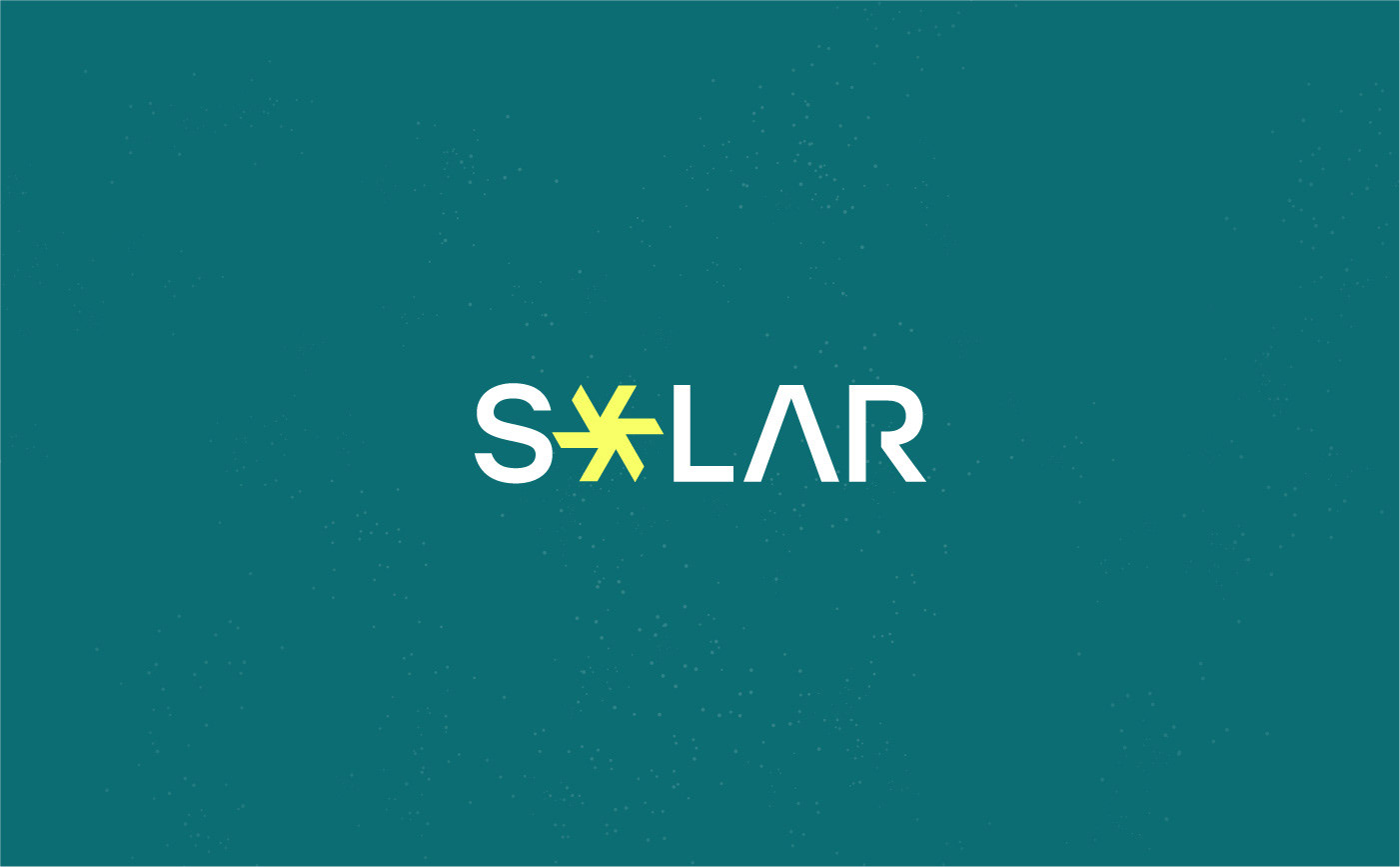
Solar final logo version on Primary
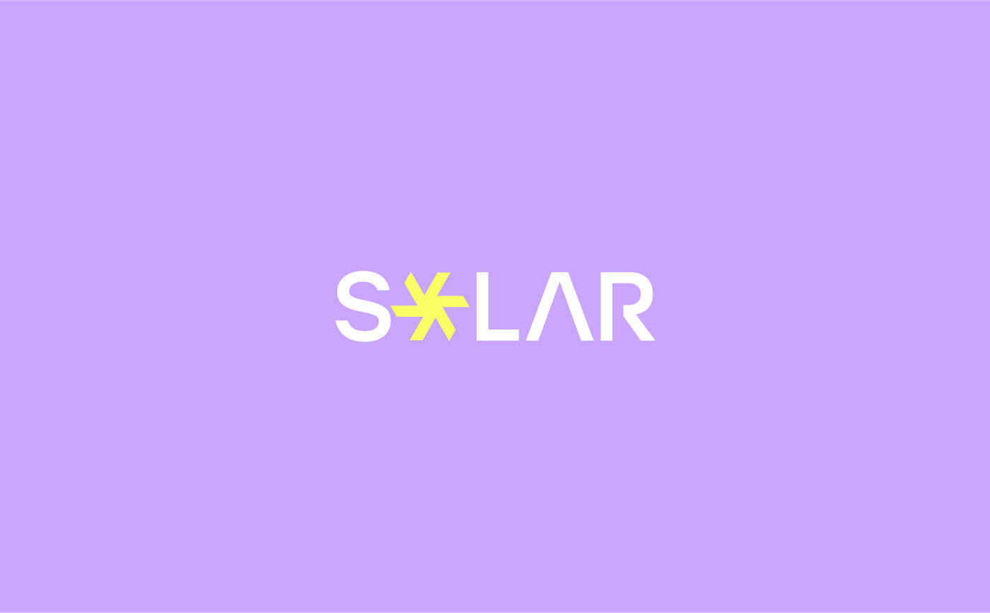
Solar final logo version on Secondary
Design
Colour Palette
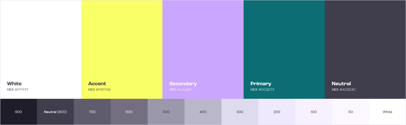
Final colour palette created for "Solar"
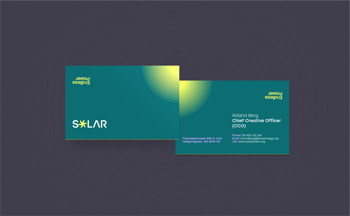
The final colour palette created for this project is visually bold and vibrant this way aligning with the key visual principles of the brand. It is also broad enough to deal successfully, later on in the future, with a wide range of different visual pieces such as: business cards, posters, flyers, websites, and so on...