Design a website to help people order Japanese food online in an easy and enjoyable manner.
Empathise
User Pain Points
Time
Middle-aged adults with children at home can’t always afford the time to cook a decent meal.
Lack of confidence
Users may feel afraid of sharing their card data on the internet or phone.
Knowledge
Usually young independent adults are unable to cook as they lack the necessary knowledge.
Usability
Many middle-aged adults don’t feel comfortable while using online websites or mobile apps.
Ideate
Wireframes

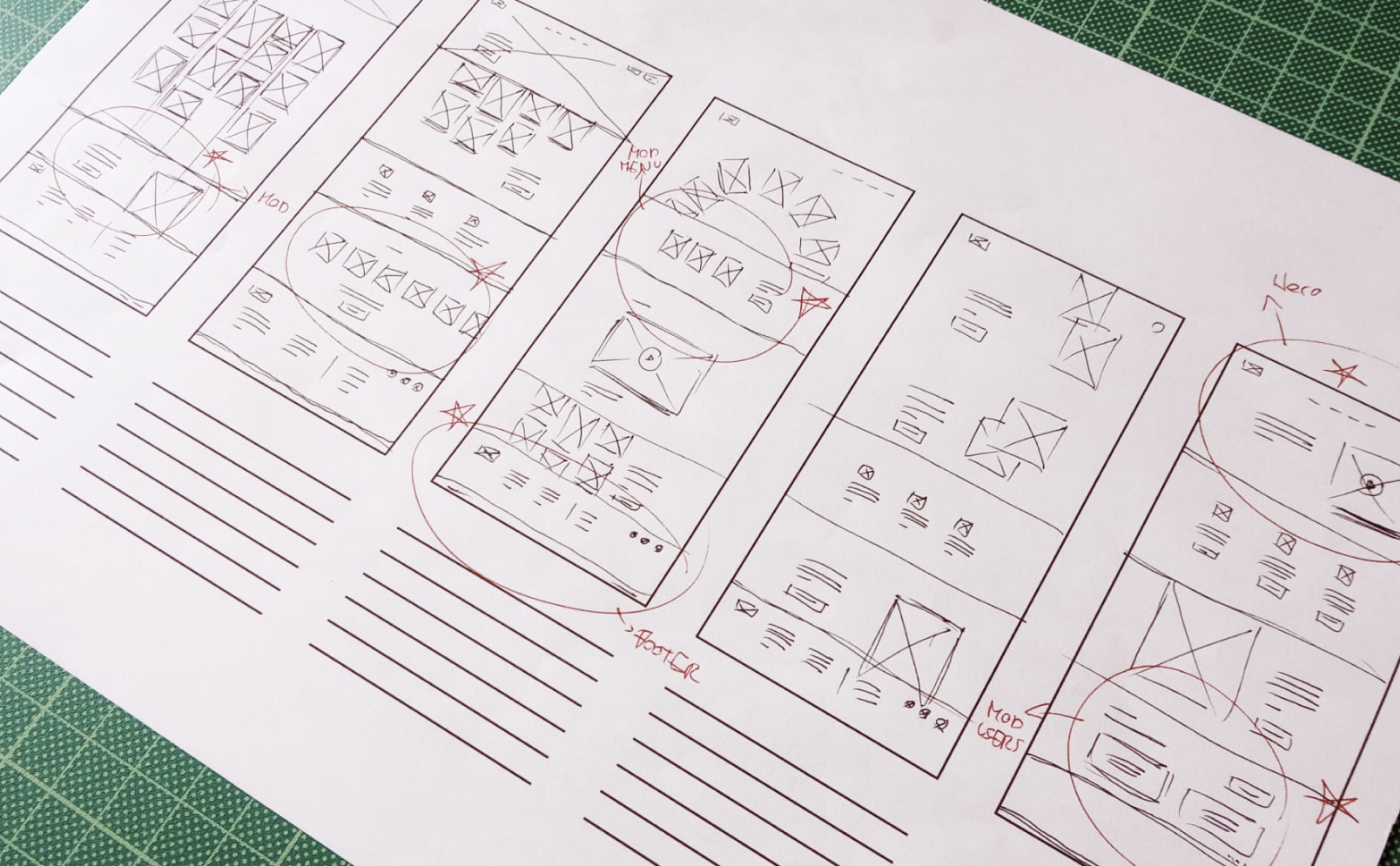
Stars were used to mark the elements of each sketch that would be used in the initial digital wireframes.

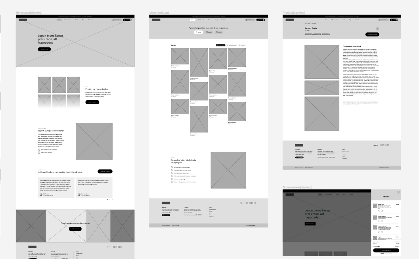
Wireframes depicting users' main flow
Taking the time to draft iterations of each screen of the website on paper ensured that the elements that made it to digital wireframes would be well-suited to address user pain points. For the home screen, I prioritized a quick and easy ordering process to help users reach their goal.
Prototype
Lo-Fi Prototype
Cocoro's Website Lo-Fi Prototype for: "Add to order" flow
Using the completed set of digital wireframes, I created a low-fidelity prototype. The primary user flow I connected was adding a product and completing the order process, so the prototype could be used in a usability study.
Test
Usability Studies
Affinity diagram made after running Usability Studies
I conducted two rounds of usability studies. Findings from the first study helped guide the designs from wireframes to mockups. The second study used a high-fidelity prototype and revealed what aspects of the mockups needed refining.
Design
Key Mockups
View of the "Home" screen for desktop
View of "Menu" section
View of "Product details" page
View of modal: "Feedback message"
Iterate
Accessibility Considerations
Buttons
The use of iconography and text within all main buttons, to make it clearer and easier for users to figure out what to do next and how to reach their goals.
Contrast Ratio
Design elements within the screens all fulfil “Contrast ratio standards” from WCAG.
Design
The Grid
Desktop and Mobile grids
In order to make design task easier and more consistent across screens and devices a 12 column grid was established to lay the design within desktop and medium-sized screens. The 12-column grid was transform into a 4 column-grid for mobile and smaller screens.
Take aways
What I learned
While designing the Cocoro’s Restaurant website, I learned that the first ideas for the website are only the beginning of the process. Usability studies and peer feedback influenced each iteration of the website’s designs.
The website makes users feel like Cocoro really thinks about how to meet their needs.