Transforming a dull website, with little content, into an exciting well organized & modular Landing Page.
Understand
Main Pain Points
Information Architecture
IA needed a completely rearrangement as the current website at that time had several links with very little content, which made users do extra click-work to get to where they wanted to. In order to simplify user's flow as much as possible, it was decided to summarise and group all main contents within a completely modular and rearrangeable "Landing Page".
Design
Design was boring, old-fashioned and not user friendly, as neither main actions within the website were clear nor main user's flow, thus making a thorough re-design completely necessary.
Ideate
Paper Wireframes
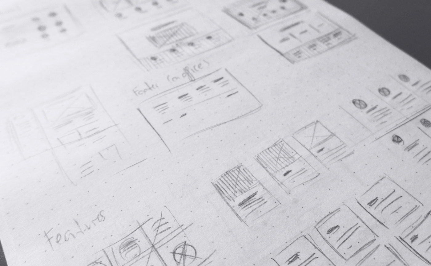
Rapid iterations of wireframes on paper
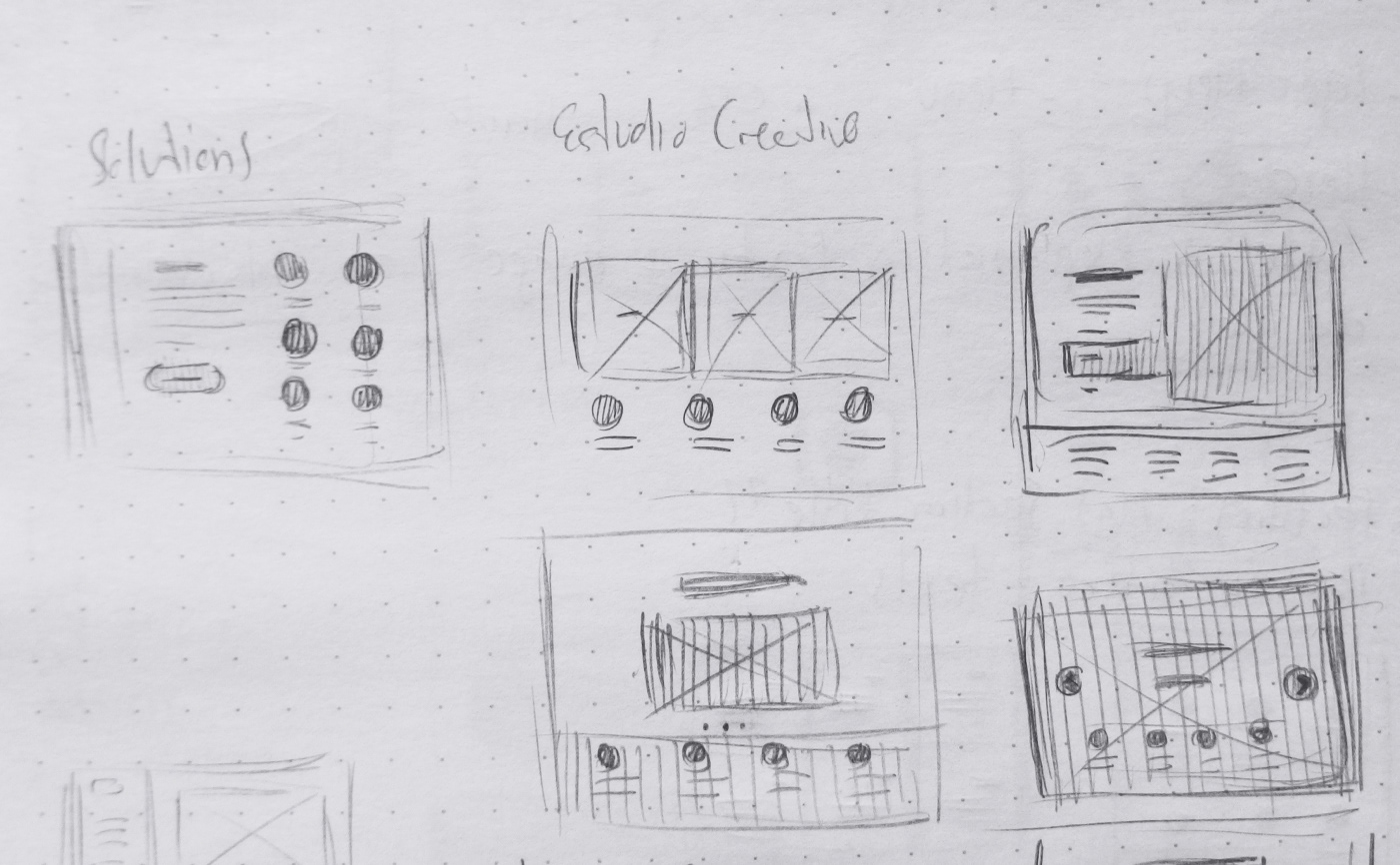
Rapid iterations of wireframes on paper
To iterate quickly and easily on new layouts and IA hierarchy and structure, numerous paper wireframes were made as fast as possible in order to transform a several-page website into a single Landing Page .
Design
Key Mockups
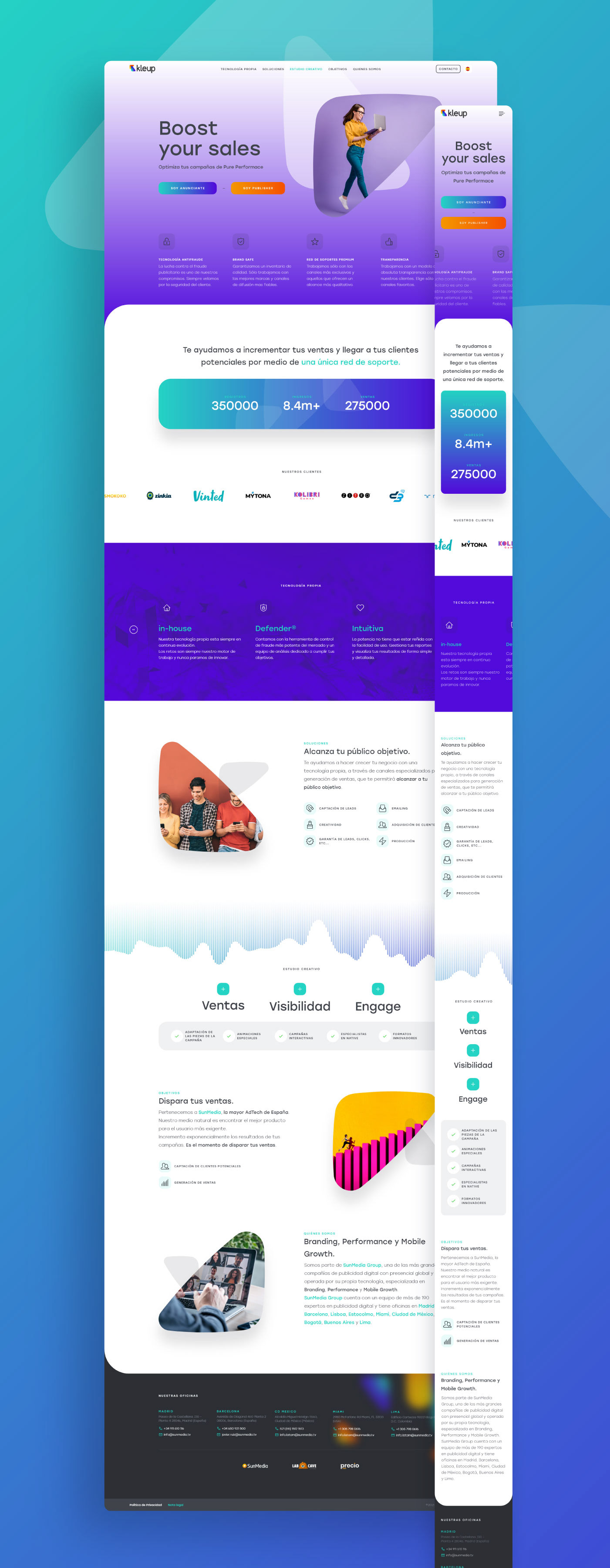
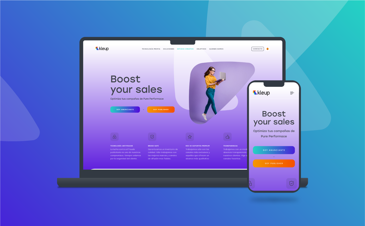
Final "Landing Page" mockup designs were more exciting, with their own visual character and with a simpler and much more intuitive content structure what eventually enabled users browse the website faster and painlessly.
Design
Colour Palette
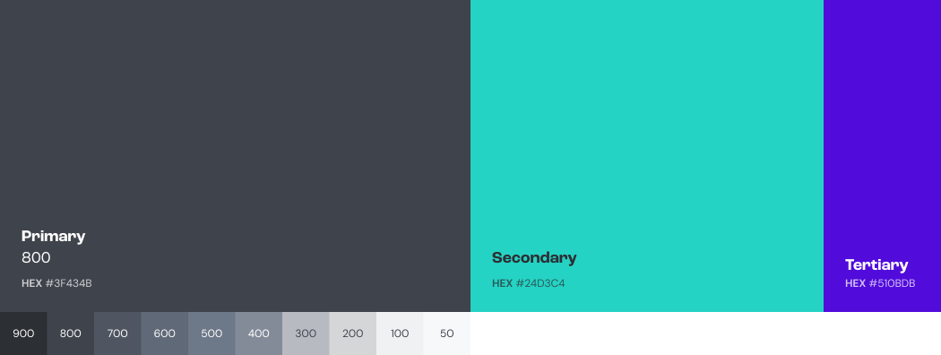
Kleup's colour palette was made up of 3 main colours (Primary: #3F434B; Secondary: #24D3C4 and Tertiary: #510BDB). In order to make the palette broad enough Primary hues were also added to it, from 900 to 50.
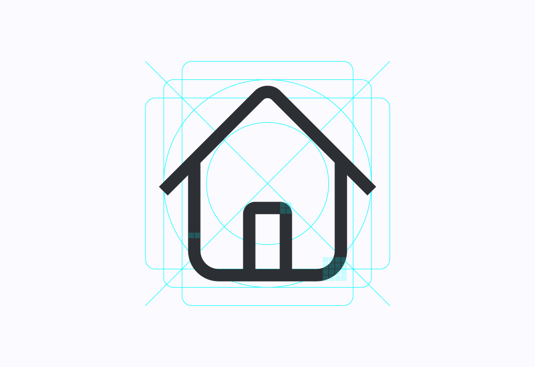
Design
Iconography
View of the icons grid
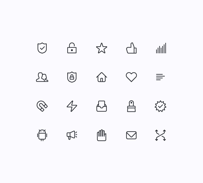
40x40px icons
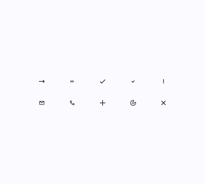
20x20px icons
In the end a set of around 30 custom icons was created. The set was divided in 2 different categories, as regards size: those within a 40x40px grid and those within a 20x20px grid. Some of the icons' main features are: rounded corners from 2px to 4px, stroke weight 2px and, stroke Cap: Butt Cap.
Design
Typography
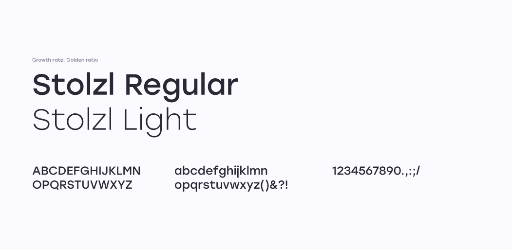
Two fonts (Regular & Light) from a sharp and modern Sans-Serif typography were chosen to be used within the project. Stolzl fonts are part of the archive of Adobe Fonts, designed by Mariya V. Pigoulevskaya from The Northern Block. They offer perfect legibility (chief objective), even at very small sizes, and properly used they bring about: rhythm, elegance and modernity.
Design
The Grid
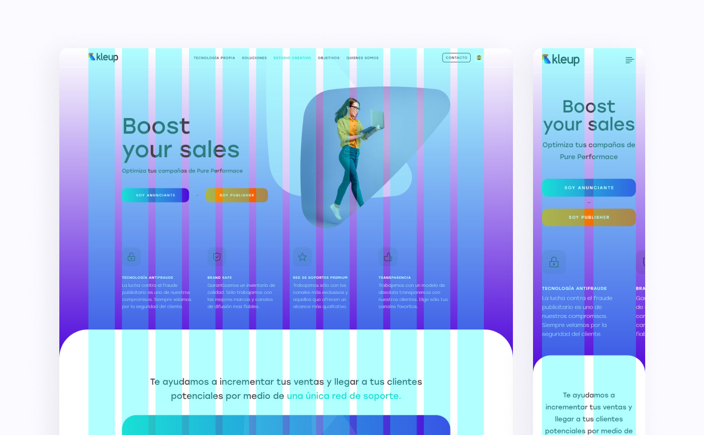
In order to make design task easier, faster and more consistent across screen resolutions, a 12 column grid was established to lay the design within desktop. The 12-column grid was transform into a 2 column-grid for mobile and smaller screens.
Take aways
Goal Accomplished
After various iterations on paper wireframes and, eventually, mockups, a modern, exciting and with a well structured Information Architecture Landing Page was launched. Thanks to its new IA structure, and a sober yet exciting new design, users can now navigate the site in a faster and more intuitive way than in the past, and best of all, reach their goals effortless.