Building a strong, soberb yet appealing and modern brand identity for a Japanese restaurant.
As part of one of Google's UX Design PRO Certificate micro courses, it was required, based on an online prompt tool, to create a project or digital product in order to put into practice all the things learnt through the course and eventually share the project with the online community on Coursera so as to get an assessment. In the end I had to start working on the creation of a website and mobile app for a Japanese restaurant. Here you can see the initial step of the project: Creating the brand identity of that restaurant.
Inspiration
Moodboard
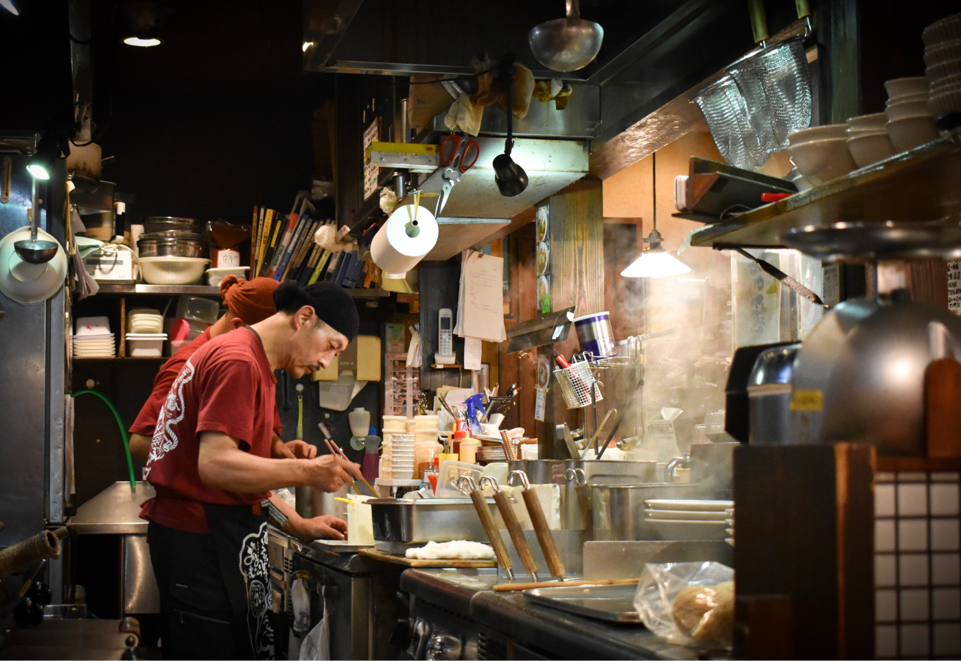
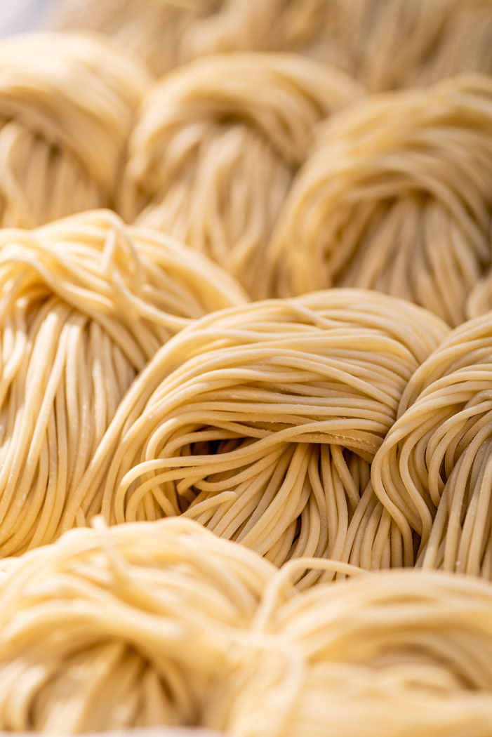
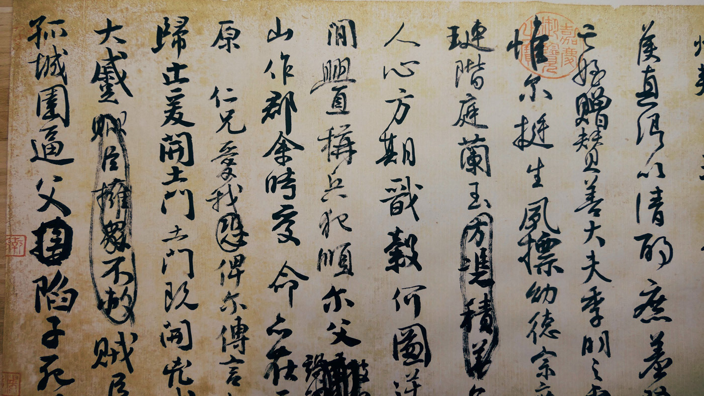

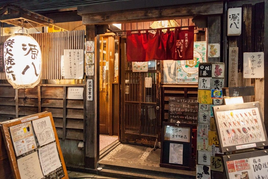
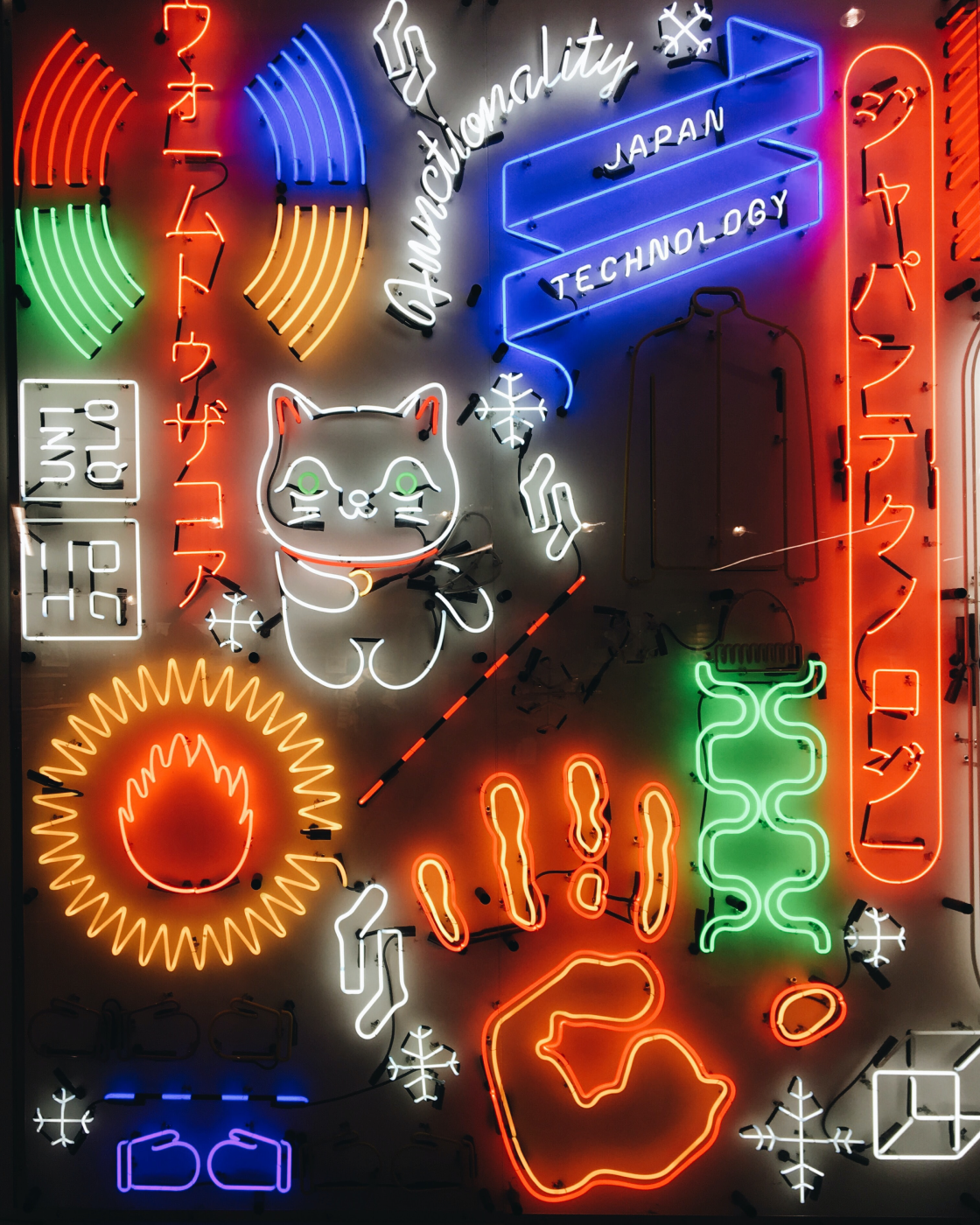
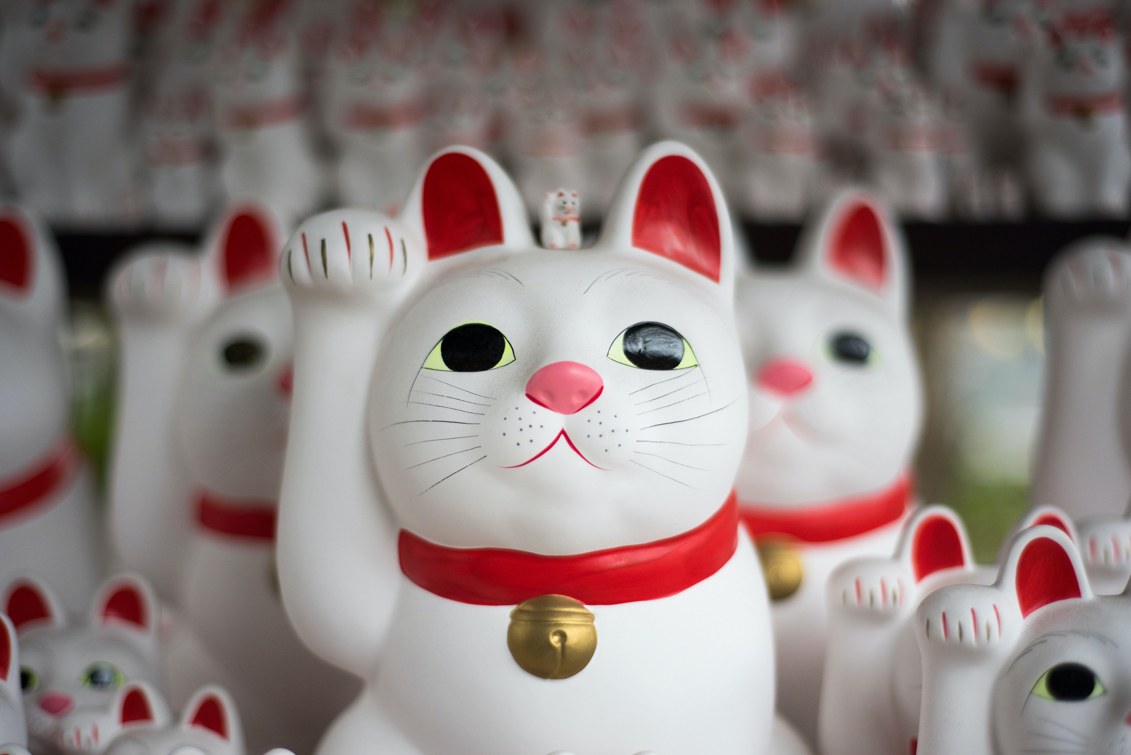
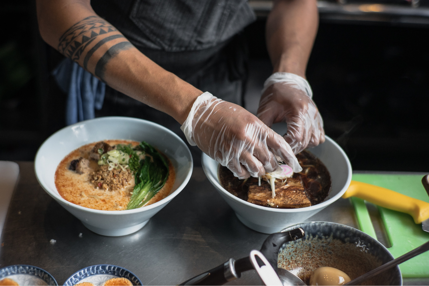
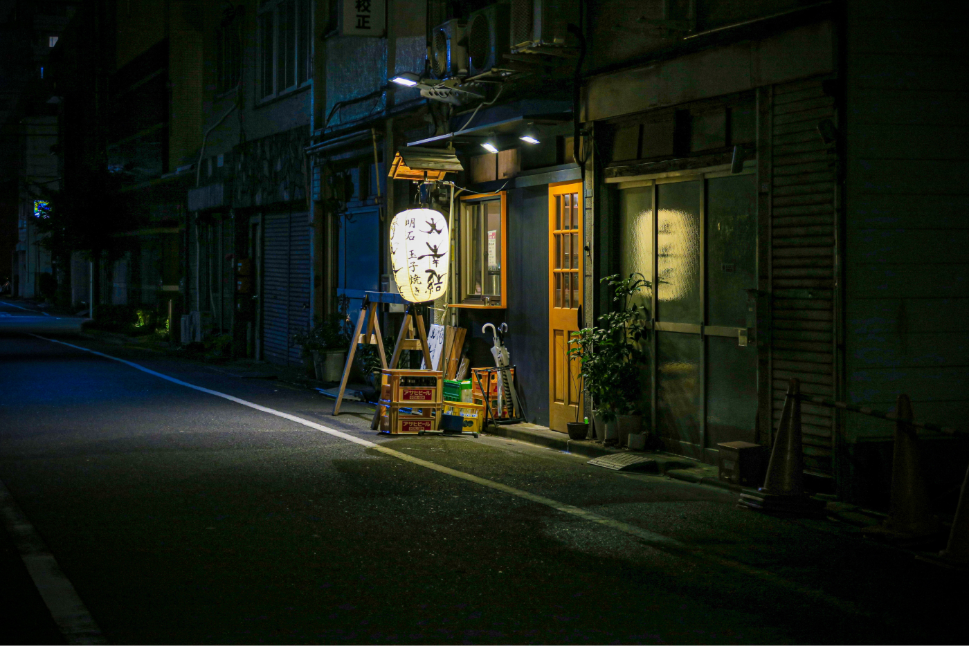
In order to help begin the creative process a used a "moodboard", which in essence is a bunch of images collected and put together so as to help find ideas, topics, scheme colours and visual tone.
Ideate
Initial Sketches
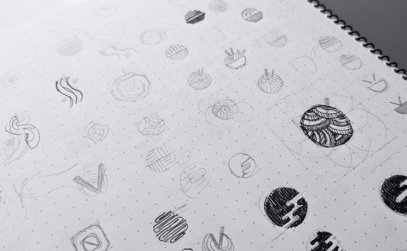
Based on basic ideas previously collected on the moodboard I first started the creative process by drawing rough sketches of different concepts on paper. This way I can quickly and easily iterate on different ideas and decide which one to use for further development, digitally speaking.
Design
Foundations
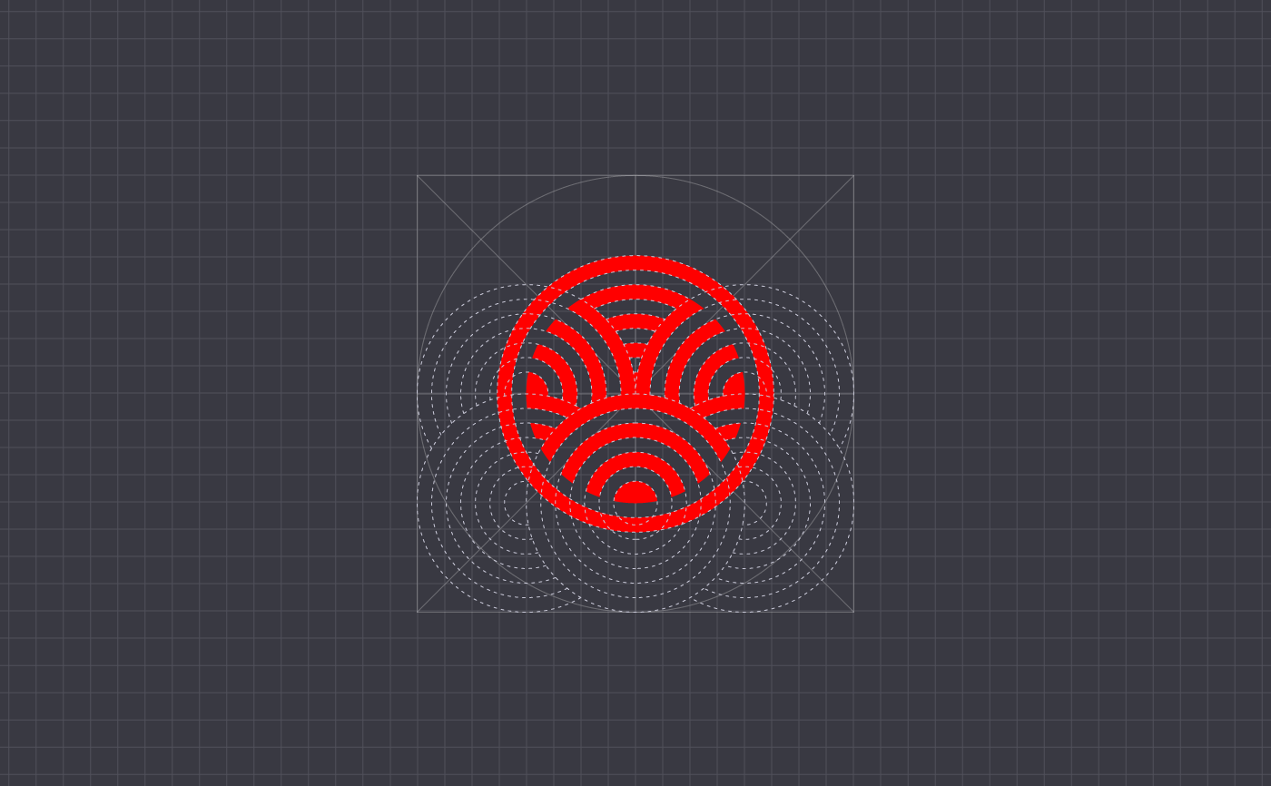
Basic geometry behind the symbol's structure
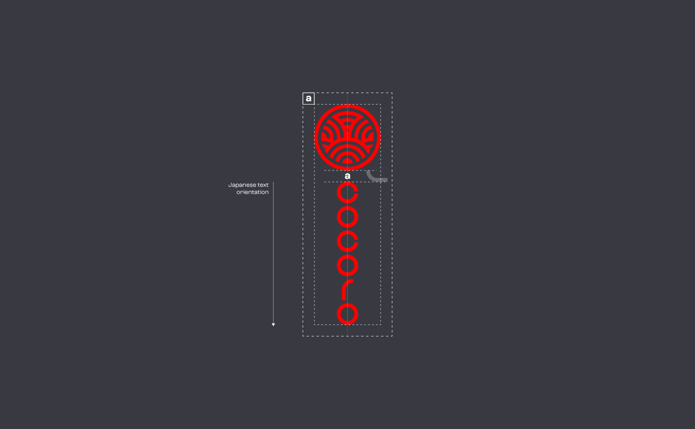
Orientation and proportions; symbol & text
Final symbol and main concepts used to create its shape
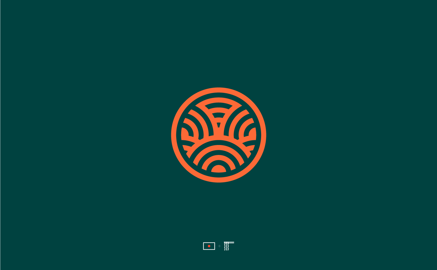
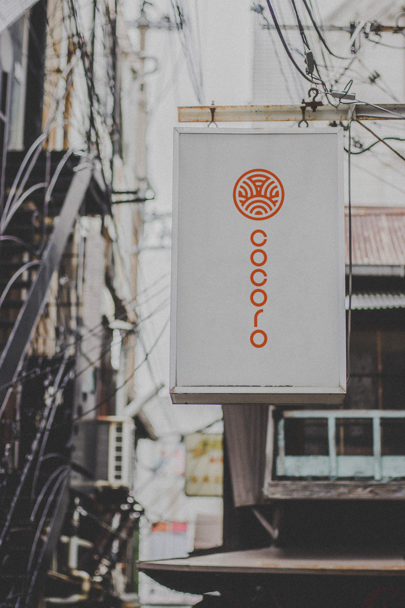
After the initial sketches on paper, in the end, I decided to work further on the idea of a circular shape, depicting the red circle of Japan's national flag, with concentric spheres within, depicting, on one hand, traditional Japanese visual design patterns and, on the other hand, a bunch of asian noodles.
Design
Final Version
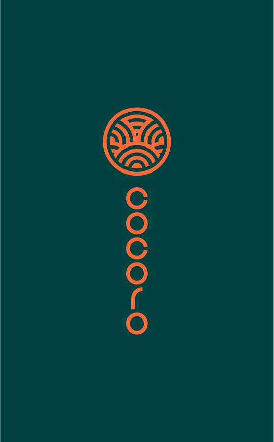
FInal version on dark background
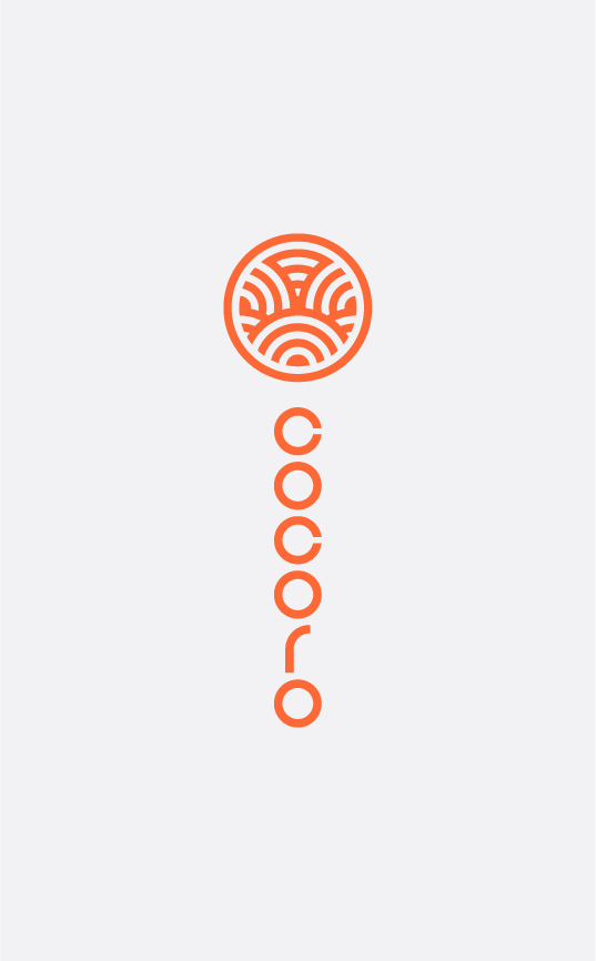
FInal version on light background
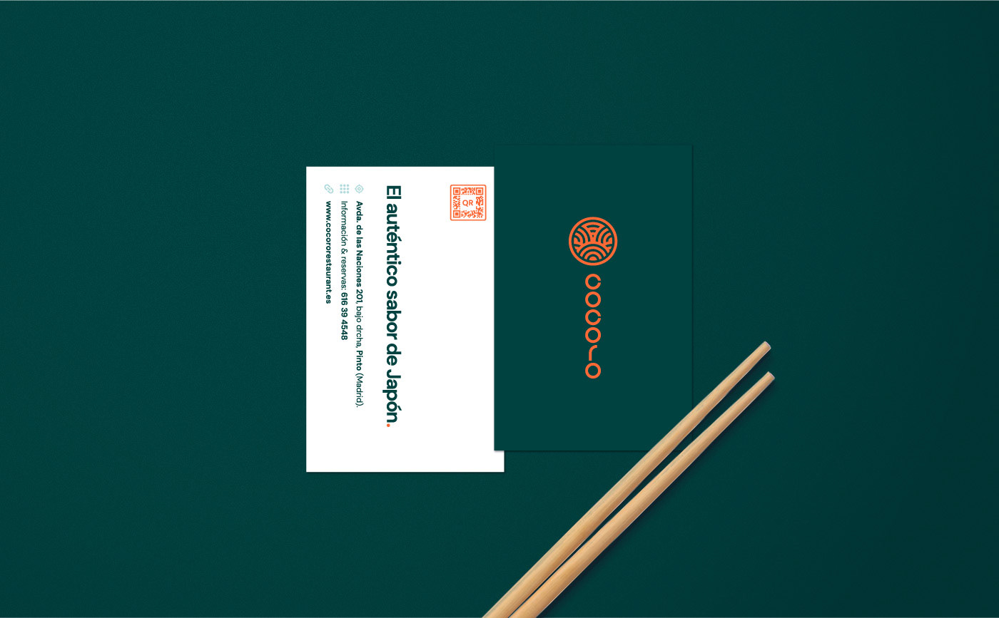
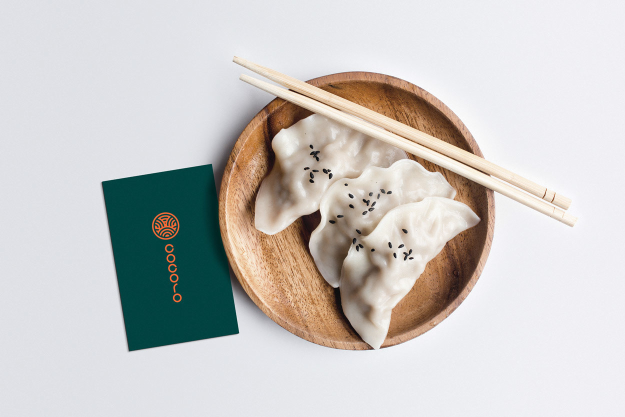
Images above show, on different backgrounds, how the final version of "Cocoro" logo works visually on different surfaces. Text within the composition was decided to be displayed vertically, as if it was a Japanese text, as Japanese texts are traditionally read from top to bottom and from right to left.
Design
Colour Palette
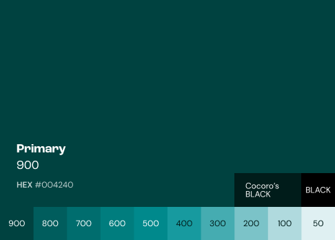
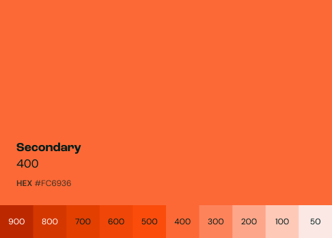
Cocoro's colour palette was made up of 2 main colours (Primary: #004240; and Secondary: #FC6936) and their respective hues from 50 to 900, in order to make the palette broad enough to cope with any visual needs.
Status
Starting point
The creation of this new brand for Cocoro Restaurant will enable stakeholders imagine how it can be used on different environments, each one with their own goals, purposes and users or clients.