Create an organic, minimal and modern brand to depict the character of the studio.
Understand
Seeking the tone
Tamashi Pilates Estudio's new brand had to be organic, minimal, modern and soft. With these chief concepts in mind I began the design process in the search of a visually appealing and consistent logo and its applications.
Ideate
Rough Sketches
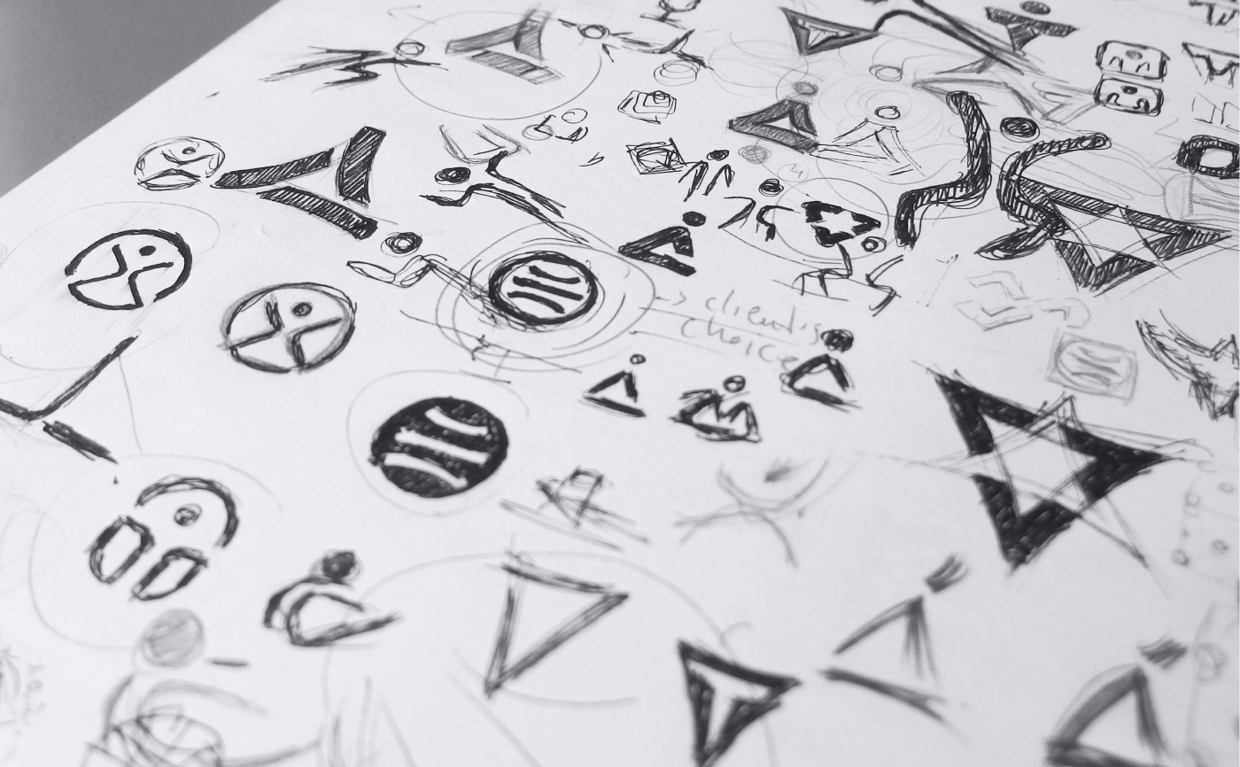
Some of the initial sketches made on paper
As usually, before beginning the design process on a computer, I make a lot of rough sketches of the main ideas I would like to work on. These simple drawings on paper let me quickly iterate on different variations and see how they work. For this particular project some of these variations were based on human figure.
Design
Beginning the Process
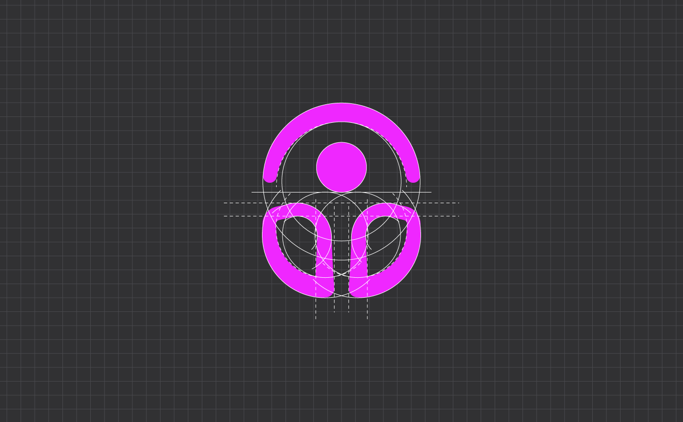
Basic geometry of the symbol
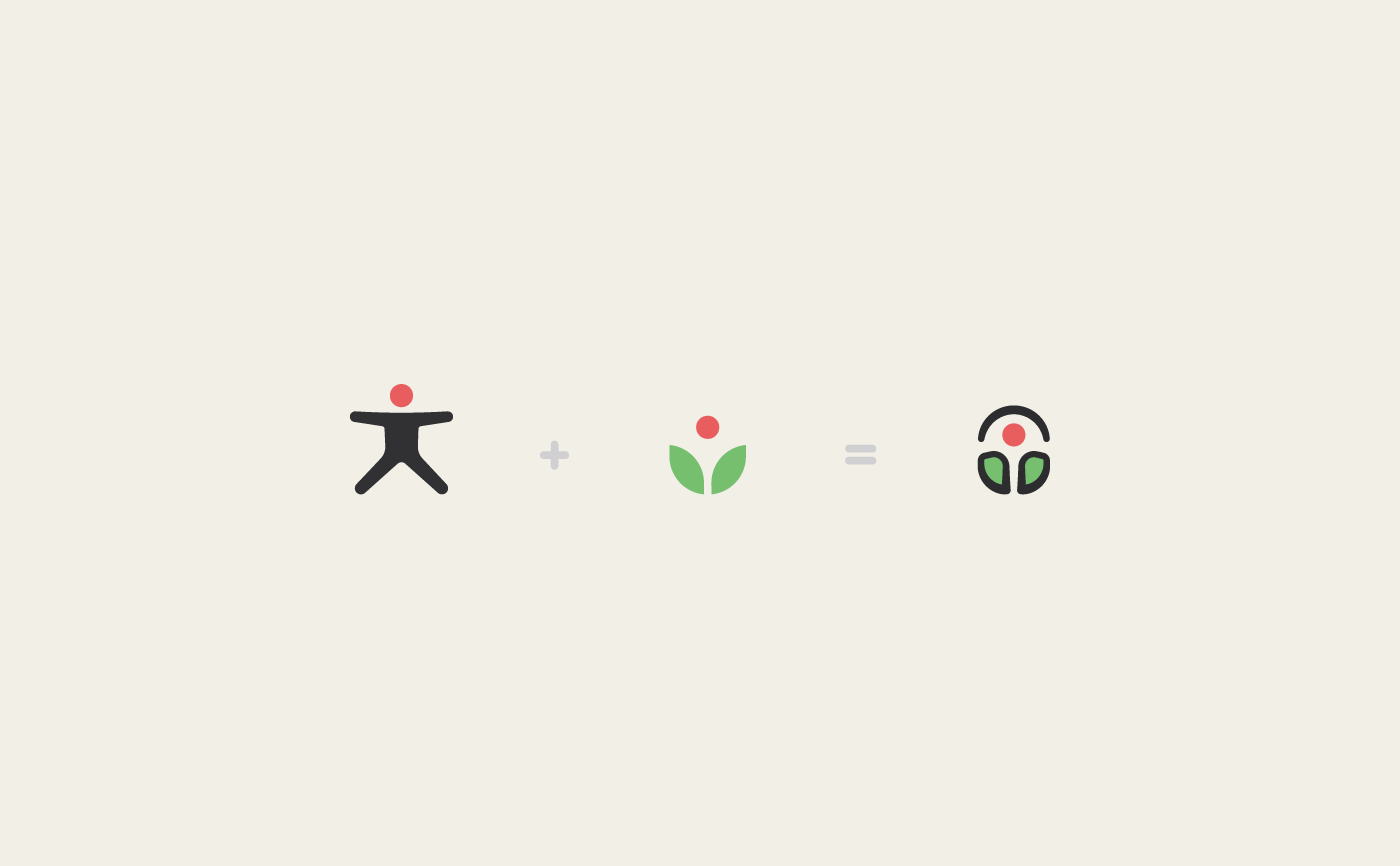
Concepts behind the symbol

View of the final symbol on light background

View of the final symbol on dark background
Main lines of the Symbol are based on Vitruvian man drawing, by Leonardo da Vinci, whereas hues, red and green, represent a plant or flower that blends underneath.
Design
Logo Proportions
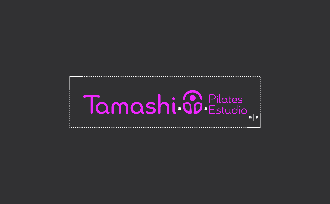
Different measurements showing the final shape of the logo
A horizontal variation of the logo was picked out as the main version. However due to their proportions, further variations of it were also necessary to be designed in order to fit the different applications where the logo might be used in (square & circular).
Design
Final Version
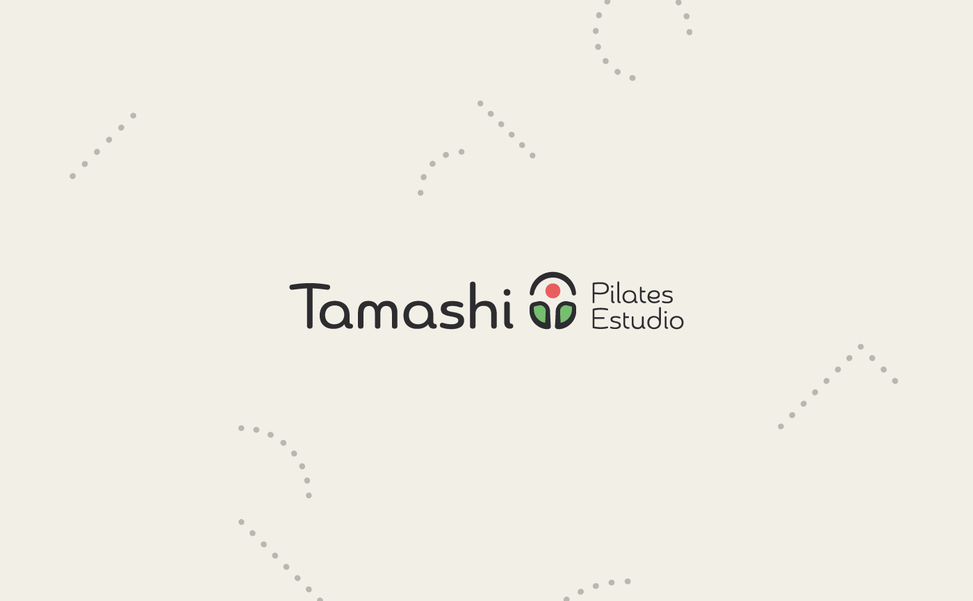
Simultaneously to the creation of the symbol, a friendly and soft typography, yet modern, was chosen to accompany it. The result can be seen above.
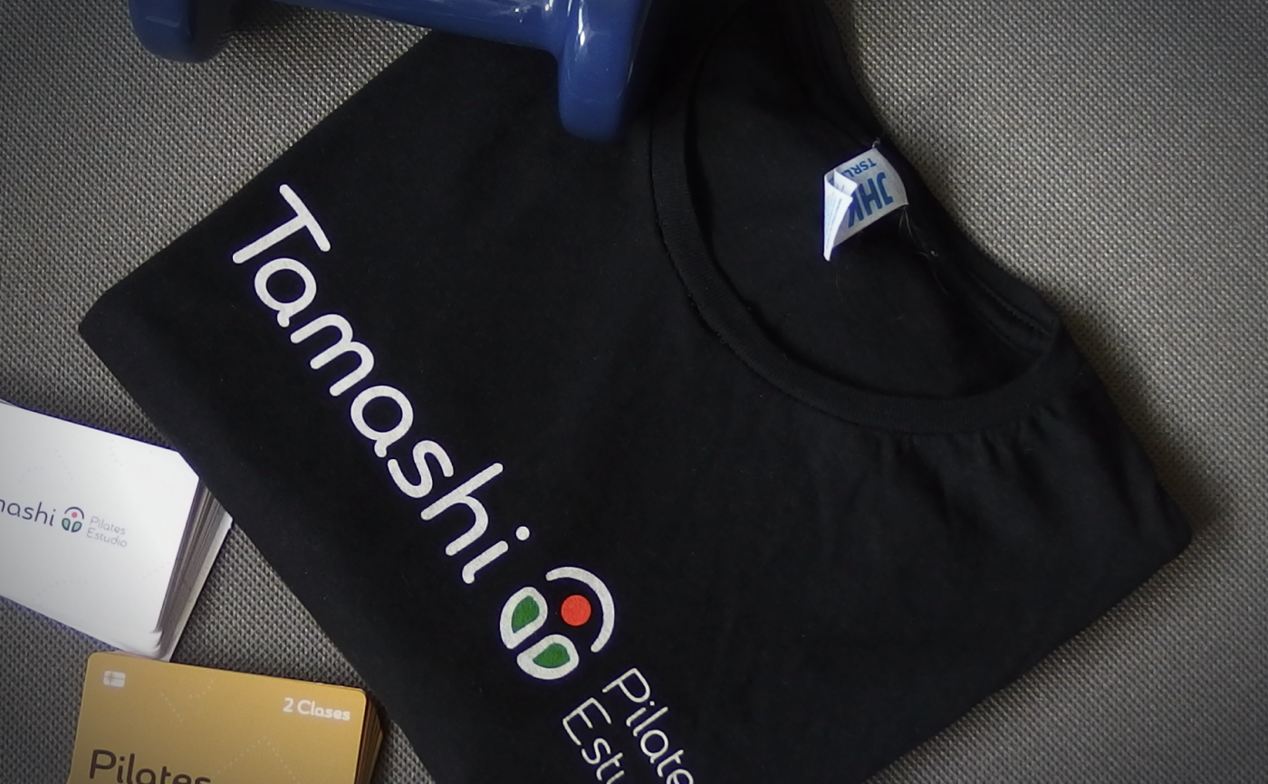
Test
Brand Applications
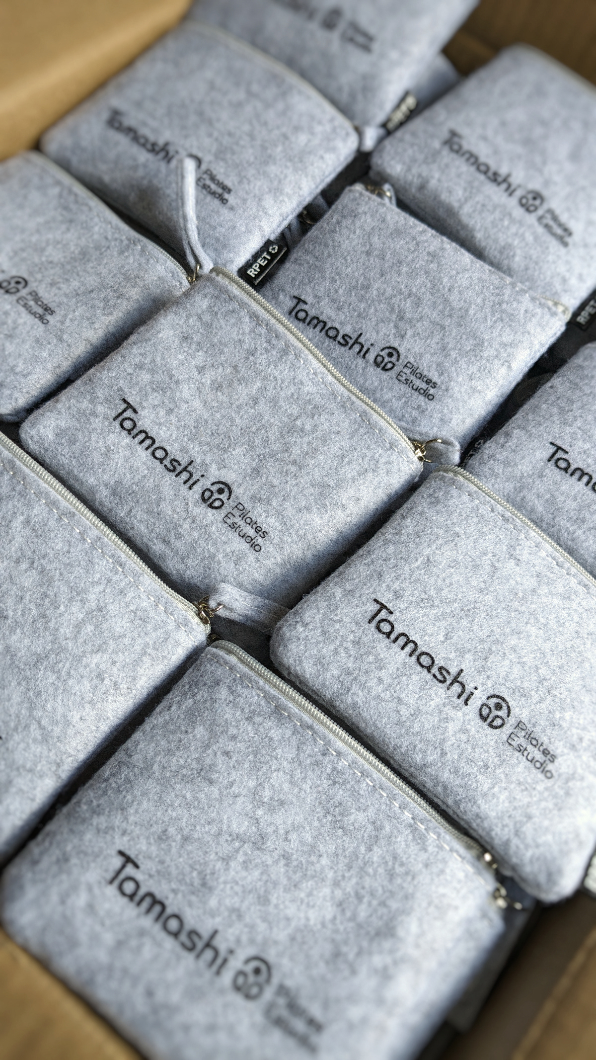
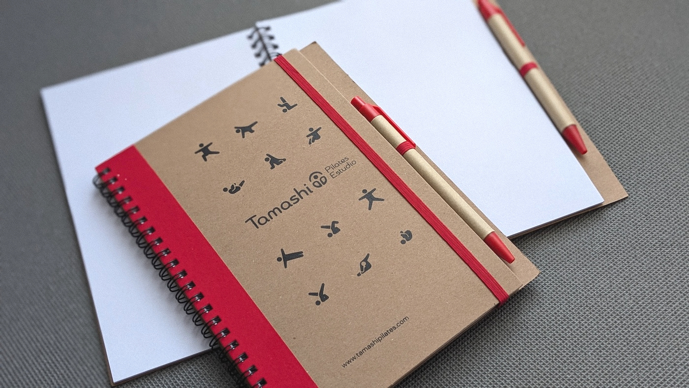
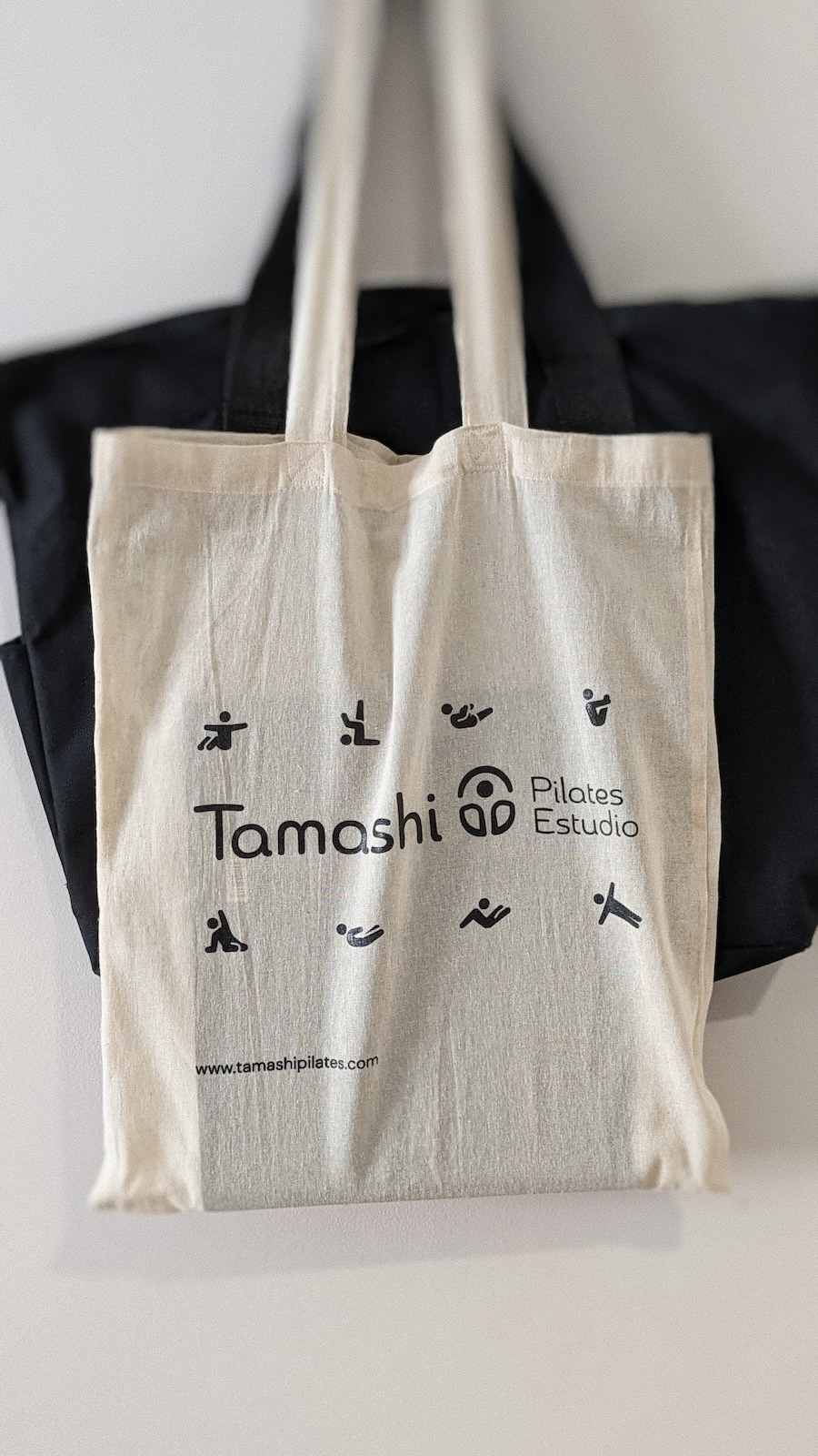
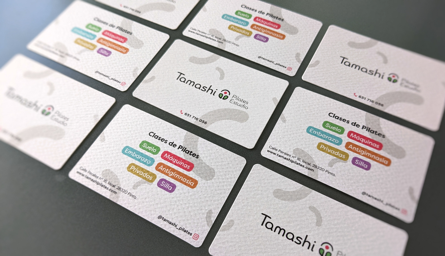
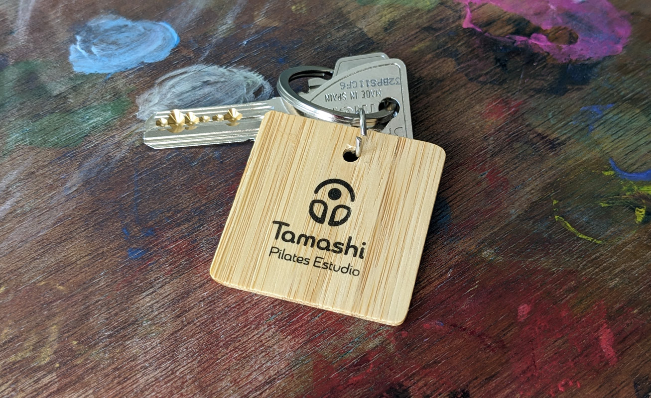
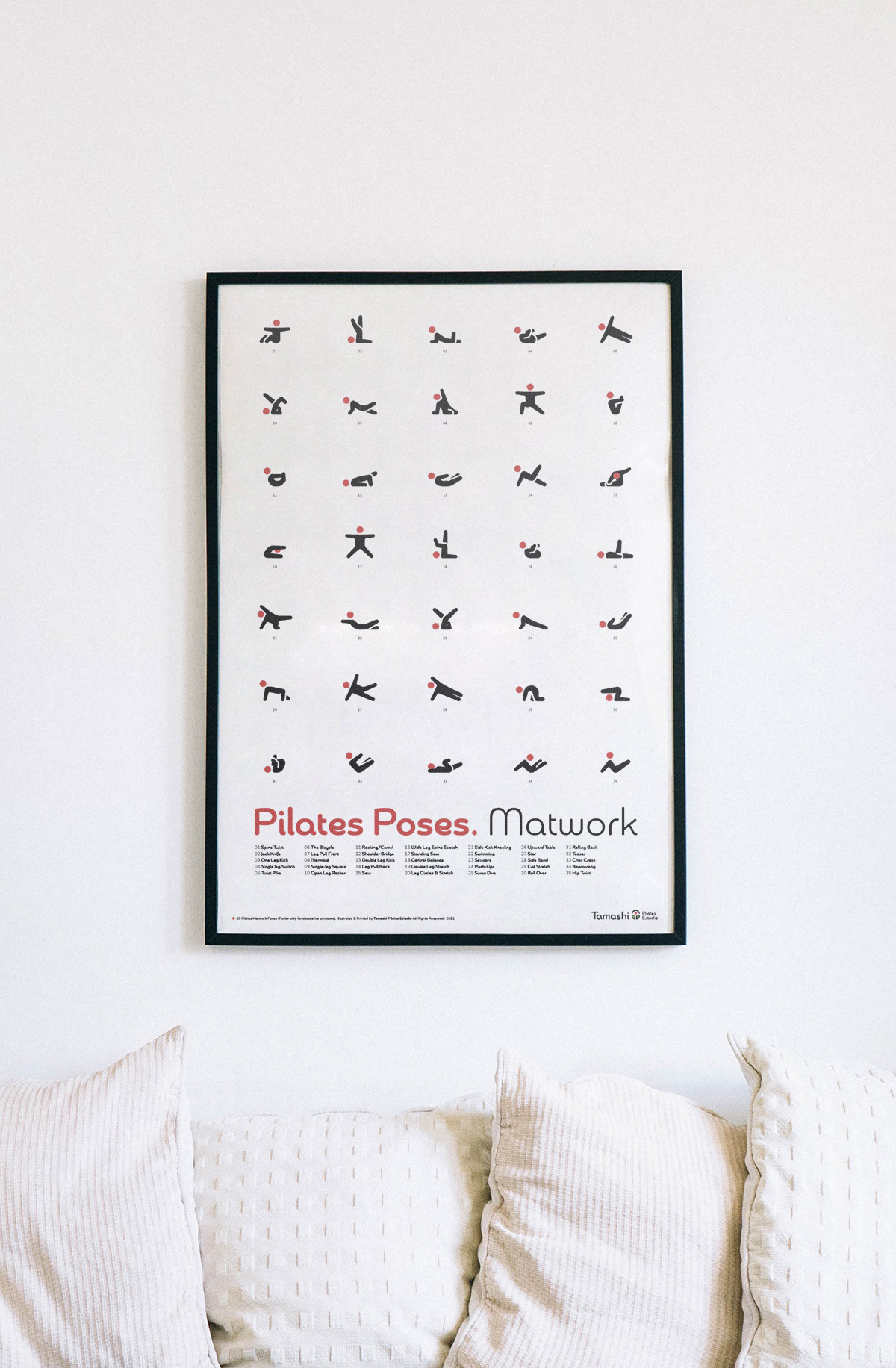
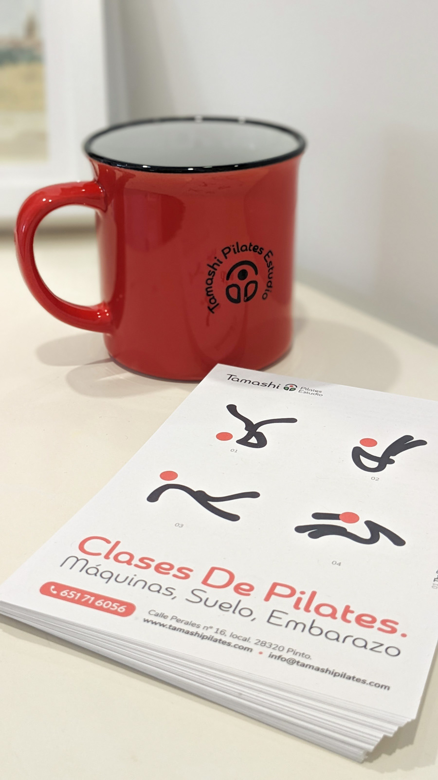
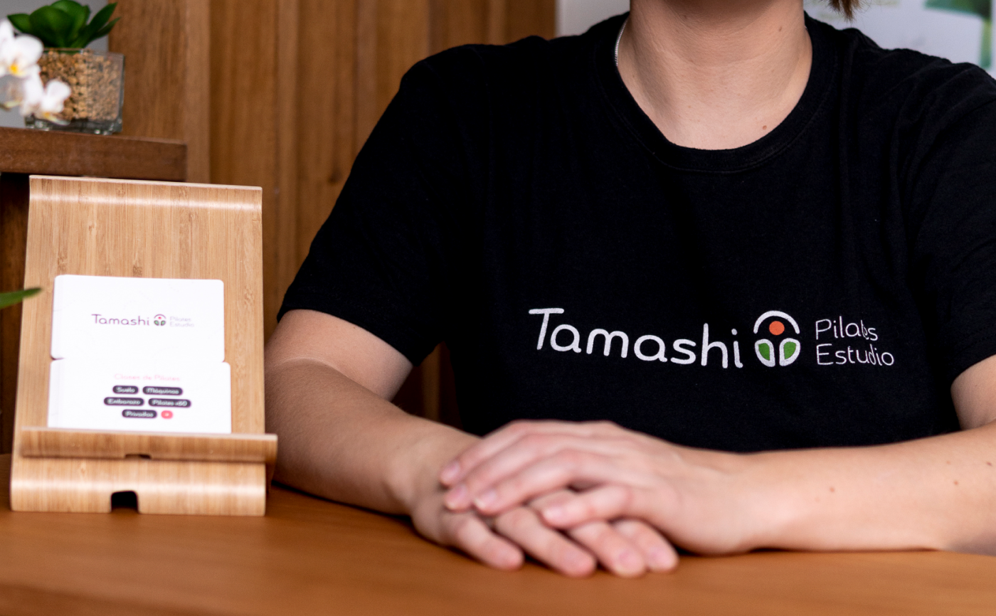
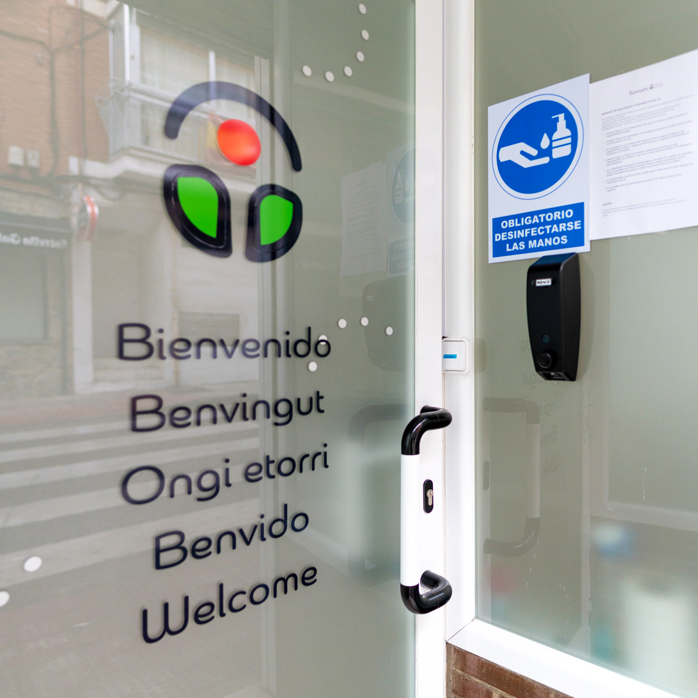
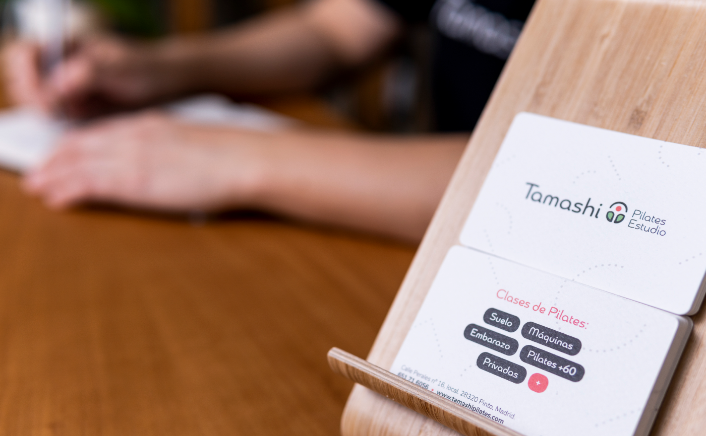
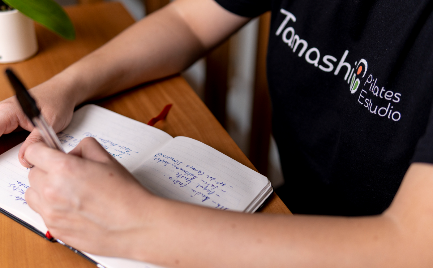
As a living creature Tamashi Pilates Estudio brand is evolving as it becomes more mature. Along this process of maturity an ample number of different pieces of the new brand, as regards stationery and digital design, have been created. They all use the same visual language and tone as they're: organic, minimal, modern and soft. Above you can see some of them and the means where they've been applied to.