Turning a poor design, as regards visuals, IA & usability, into a more appealing, usable and exciting web-based dashboard tool.
Understand
Initial request
Development & Marketing teams at CheckLynx reached out for a deep assessment so as to improve a web-based dashboard tool, available at the time for company clients. After the required assessment several important aspects were clearly in need of a profound improvement: dashboard's overall visual appearance, Information Architecture and content structure and finally the usability layer.
Dashboard screenshot before iteration on Visuals, IA & Usability layers
Design
Key Mockups
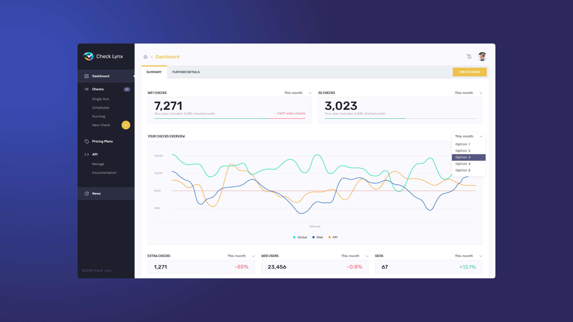
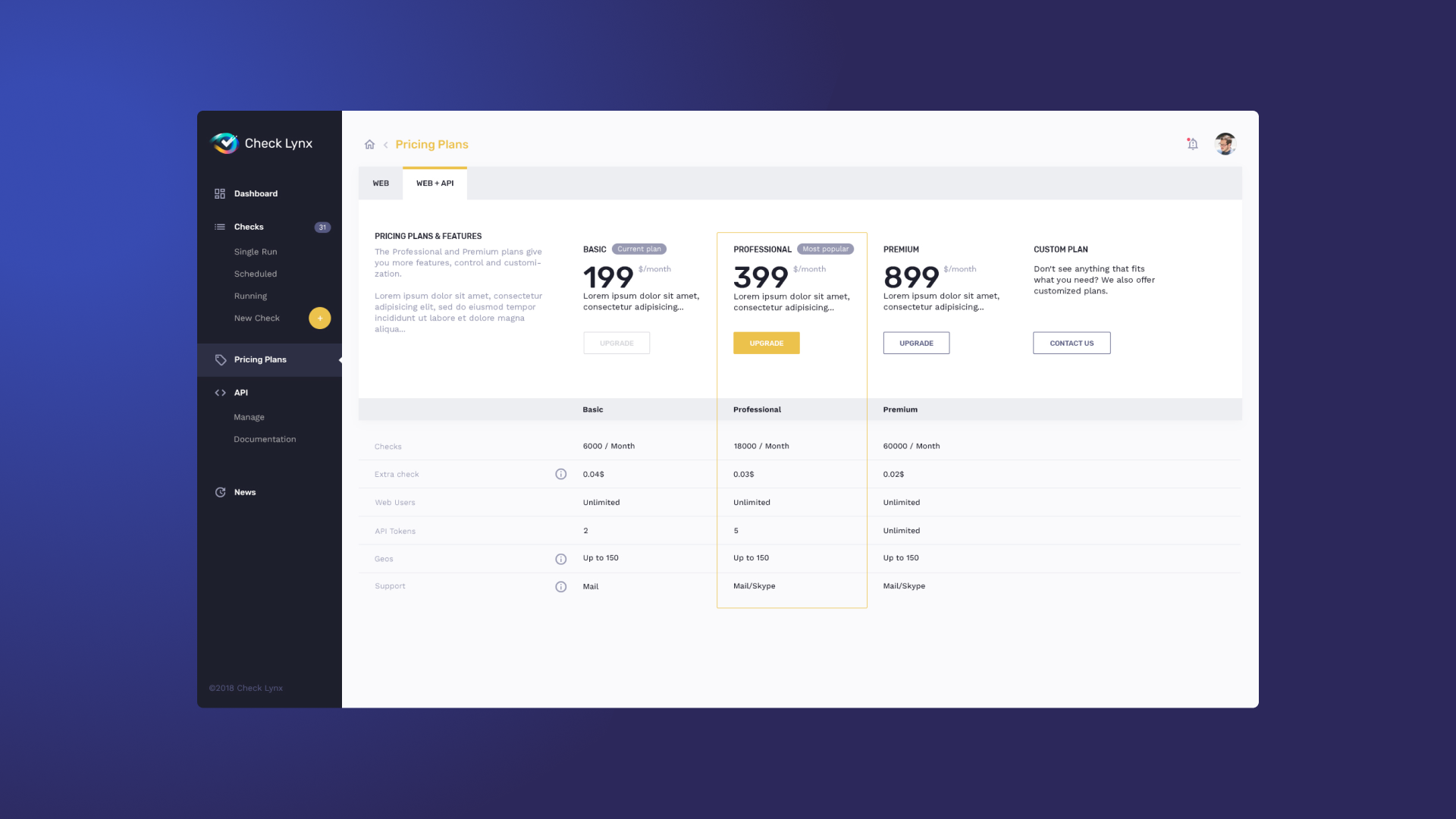
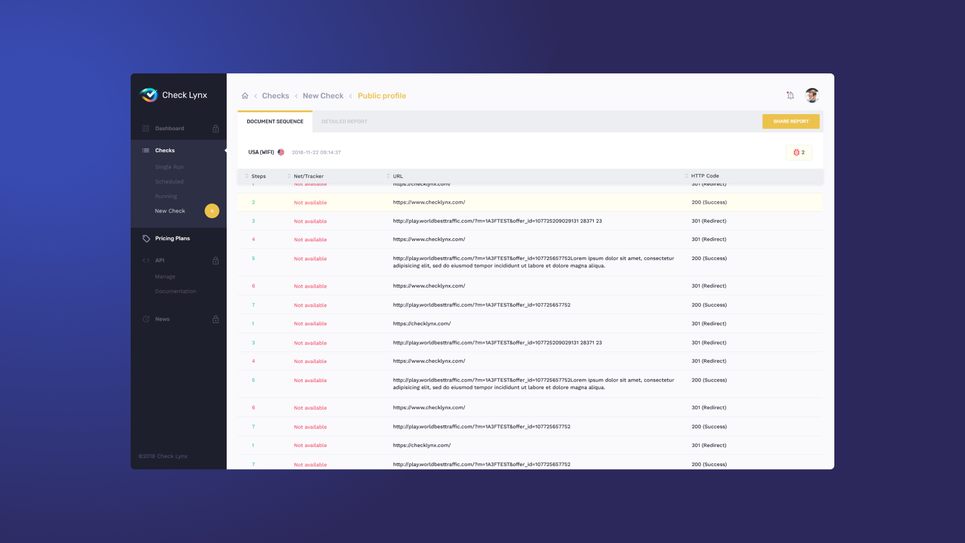
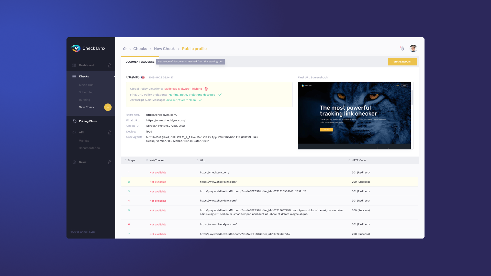
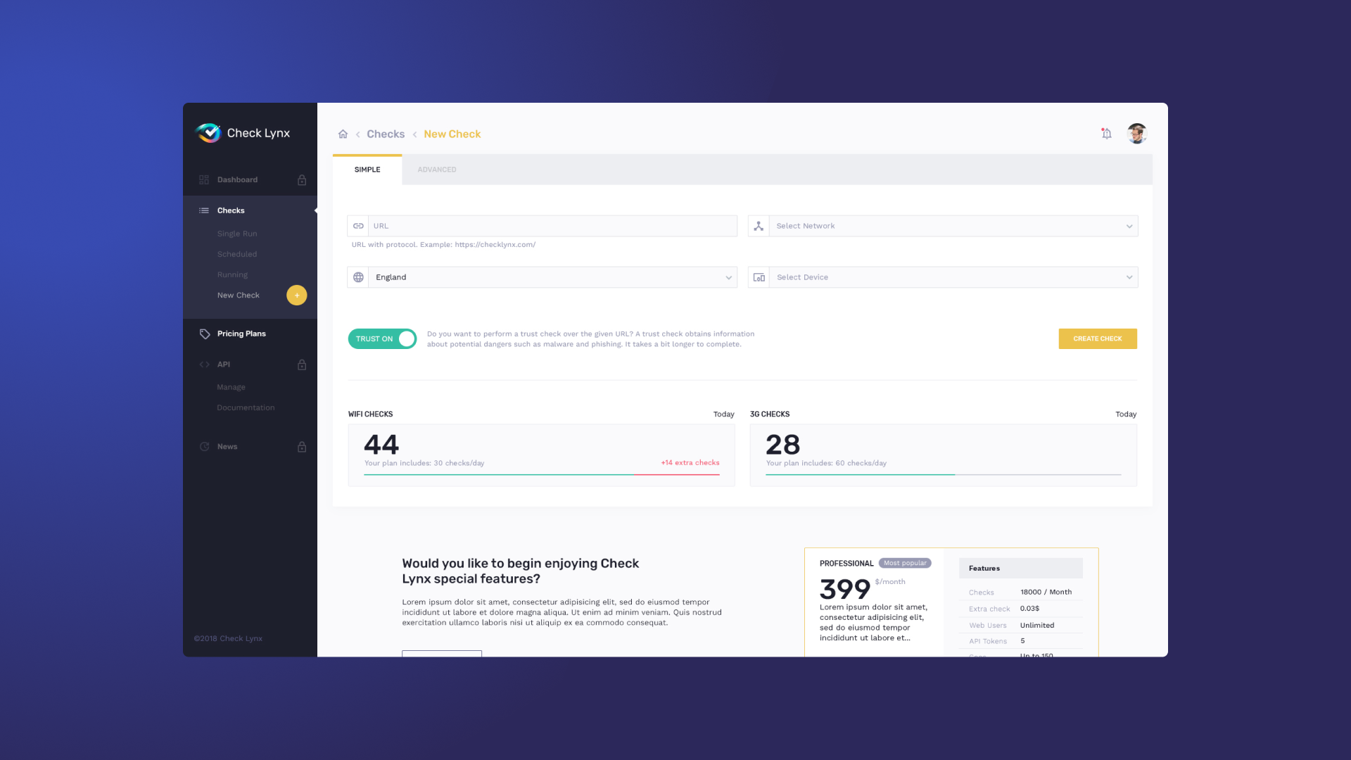
Final mockups above show how an overall visual voice & tone were set and consistently applied along the different screens of the tool. Information Architecture (IA) and content structure were reviewed and redesigned so as to allow users quickly assume dashboard's functionalities and create their own mental models on how to use them.
Test
Analysed results
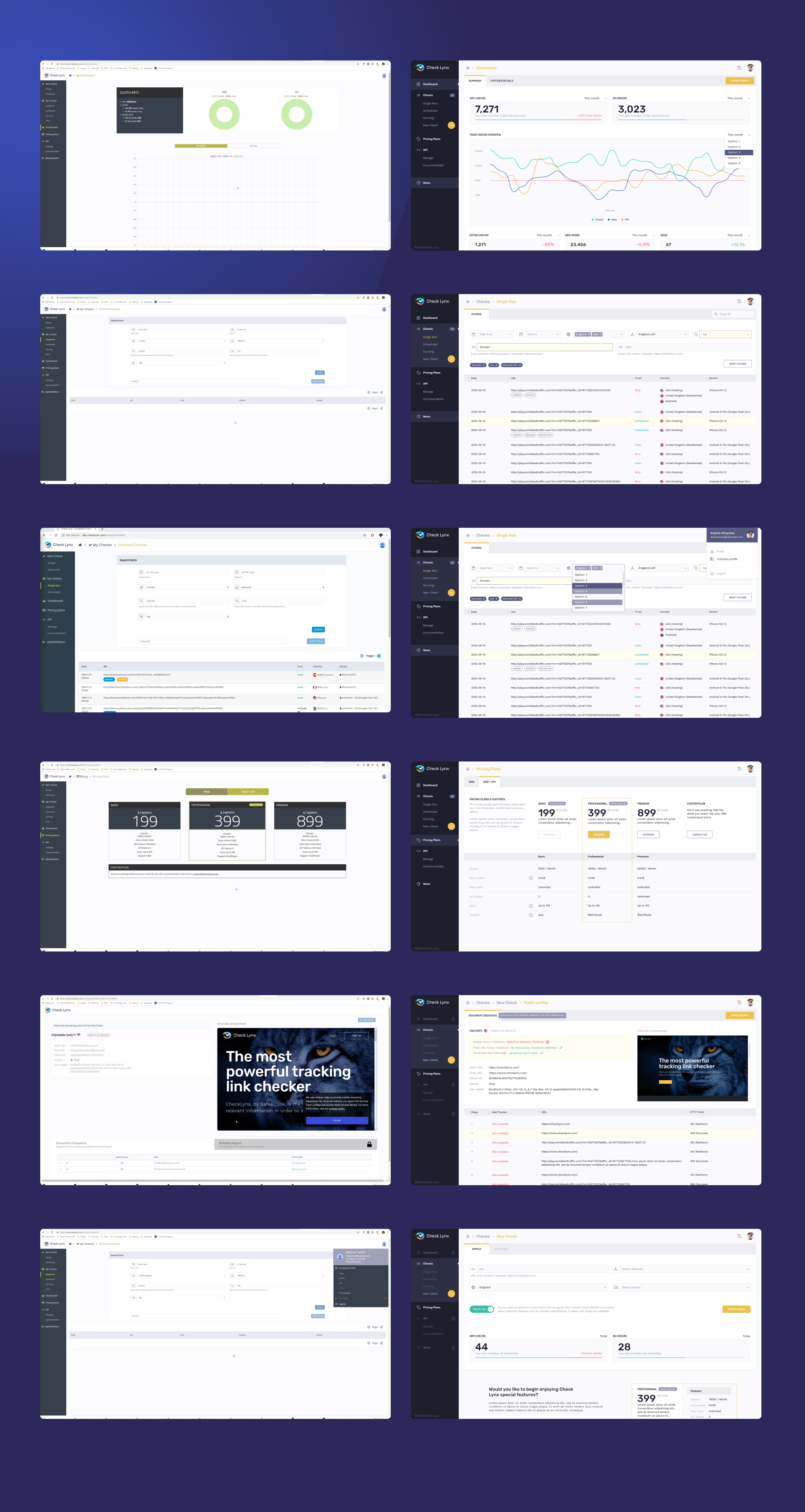
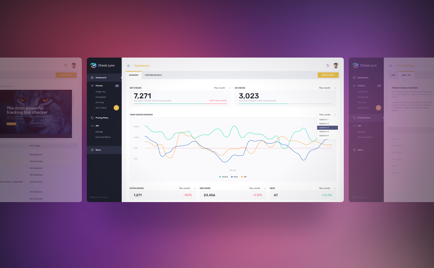
On the left in the picture above, you can see some screenshots gathered from the tool available before iteration on Design, IA and Usability layers. On the right you can see the same screens but after the requested iteration. One can clearly see the improvements achieved throughout designs.