Helping Labcave improve its presence online, and convey its new business strategy, by designing a consistent, intuitive and appealing website.
Understand
Back to basics
Labcave's website at that time was neither visually consistent nor user friendly thus making directors at Labcave want to re-build the website totally from scratch, so as to make it look less overwhelming, visually speaking, more accessible and with a brand new and more comprehensive content.
Initial and main UX requirement was: making the website Information Architecture, structure and layout, simpler and more accessible without forgetting consistency and beauty.
Initial and main UX requirement was: making the website Information Architecture, structure and layout, simpler and more accessible without forgetting consistency and beauty.
Ideate
Paper Wireframes
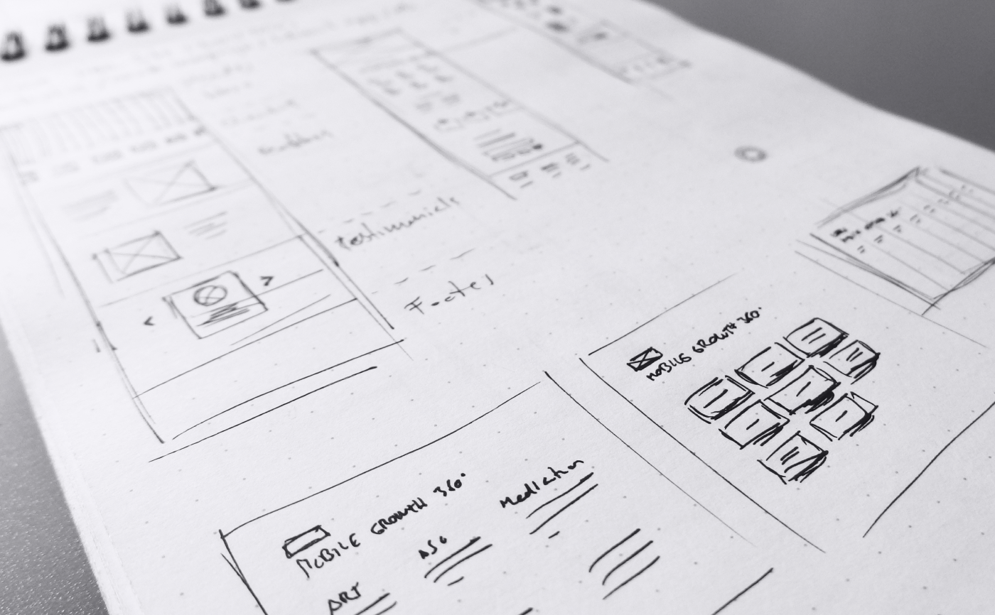
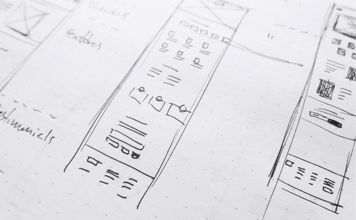
Before beginning the design process on my computer I began creating a number of different rough sketches of wireframes and solutions on paper. For me, as I was originally trained as an Illustrator, it is easier, faster and more enjoyable.
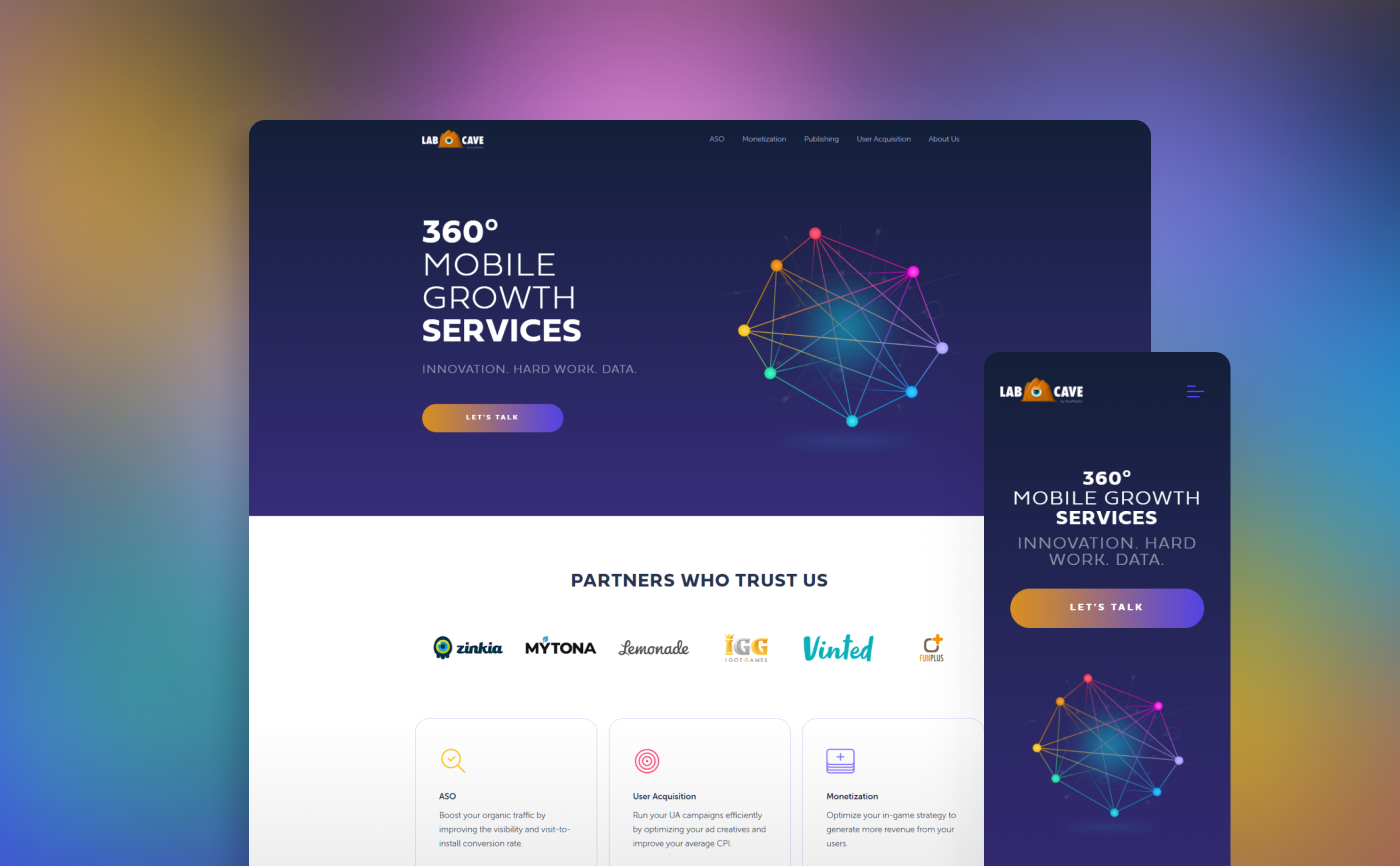
Design
Key Mockups
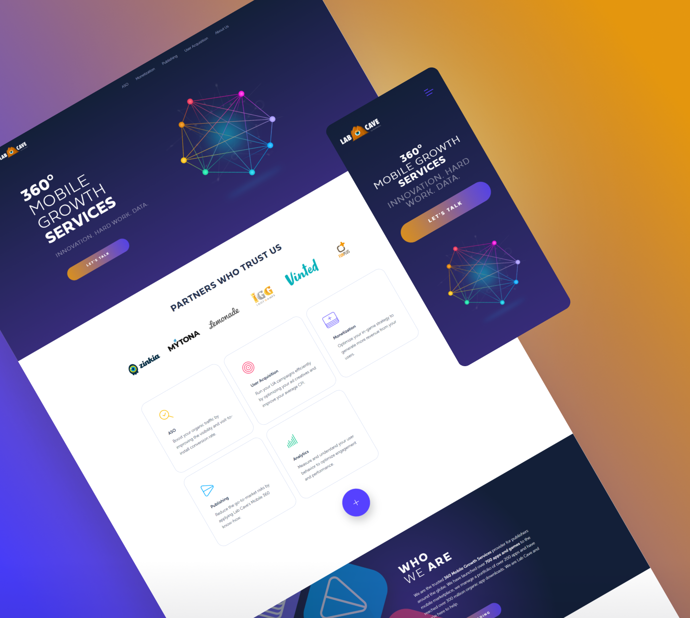
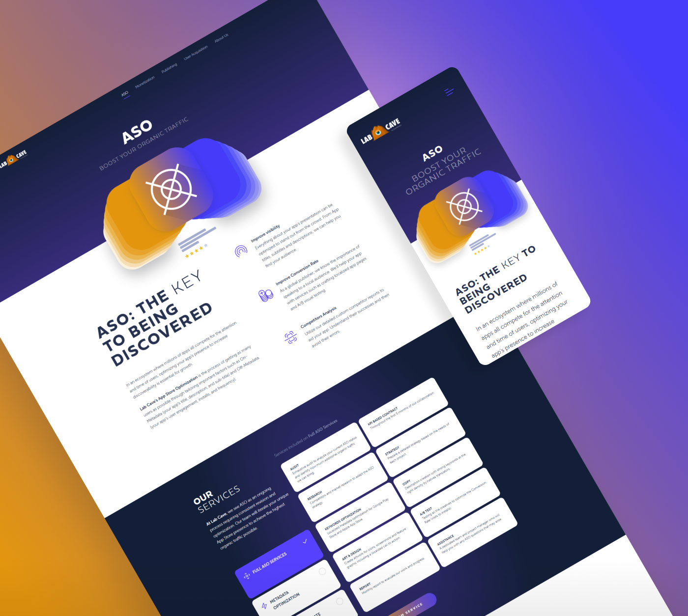
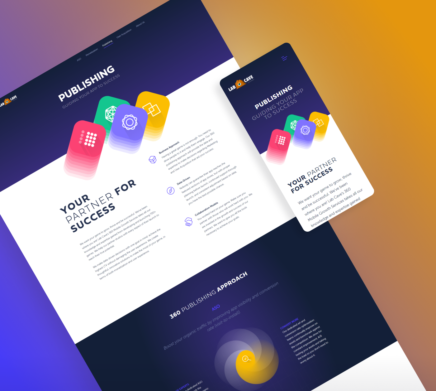
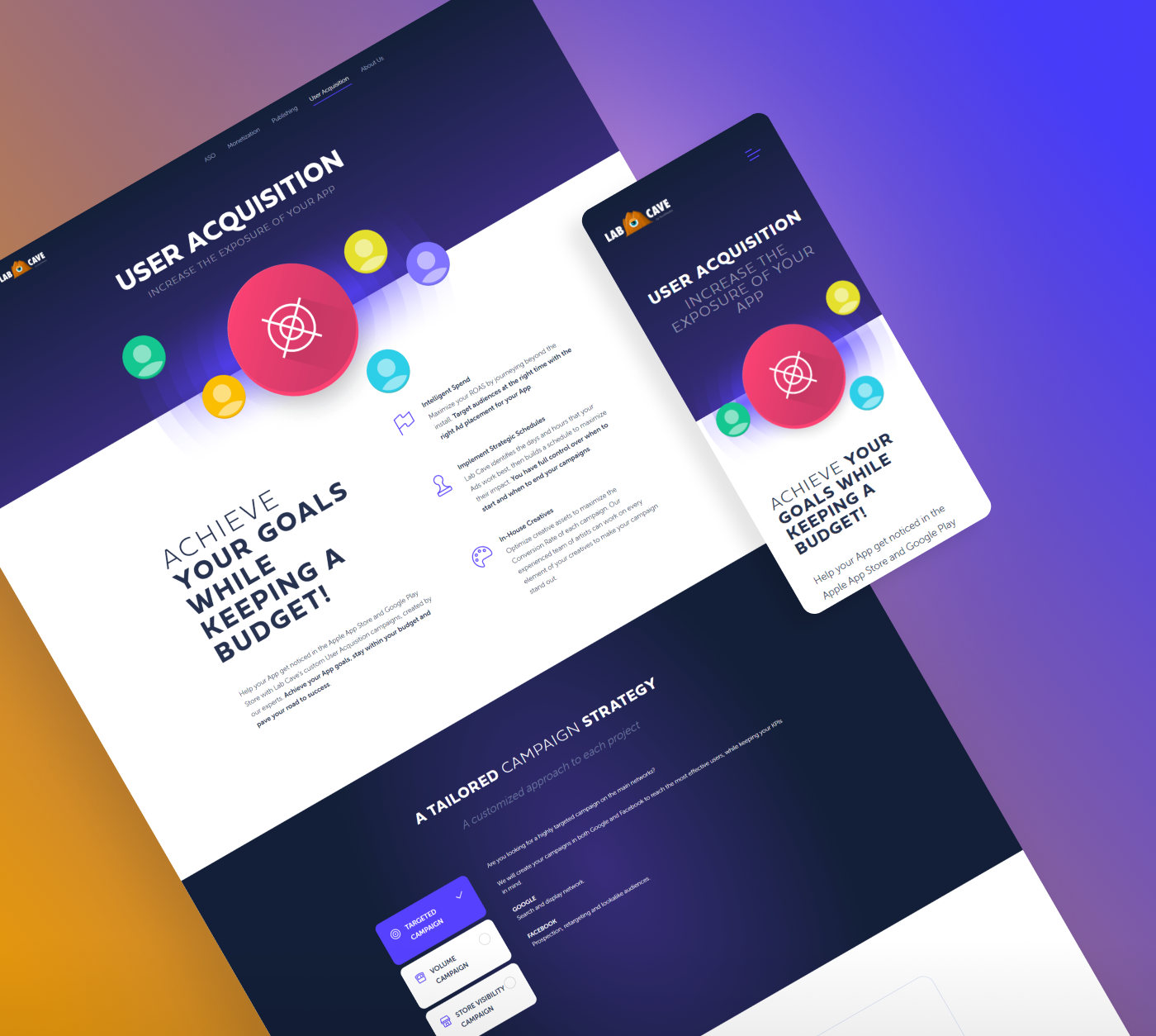
Above you can see several final mockups for desktop screens and their mobile versions. In order to make development process easier every design was adapted to 3 different screens: Desktop, Tablet and Mobile, using a "graceful degradation" approach during the design process, that is designs were initially created for desktop screens and then their tablet and mobile versions.
Design
Colour Palette
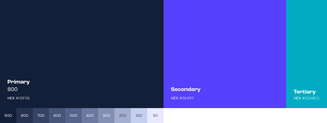
Labcave's colour palette was made up of 3 main colours (Primary: #131F38; Secondary: #5641ff and Tertiary: #02ABC3). In order to make the palette broad enough Primary hues were also added to it, from 900 to 50.
Design
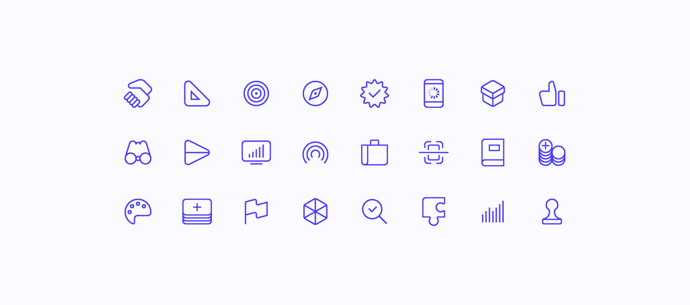
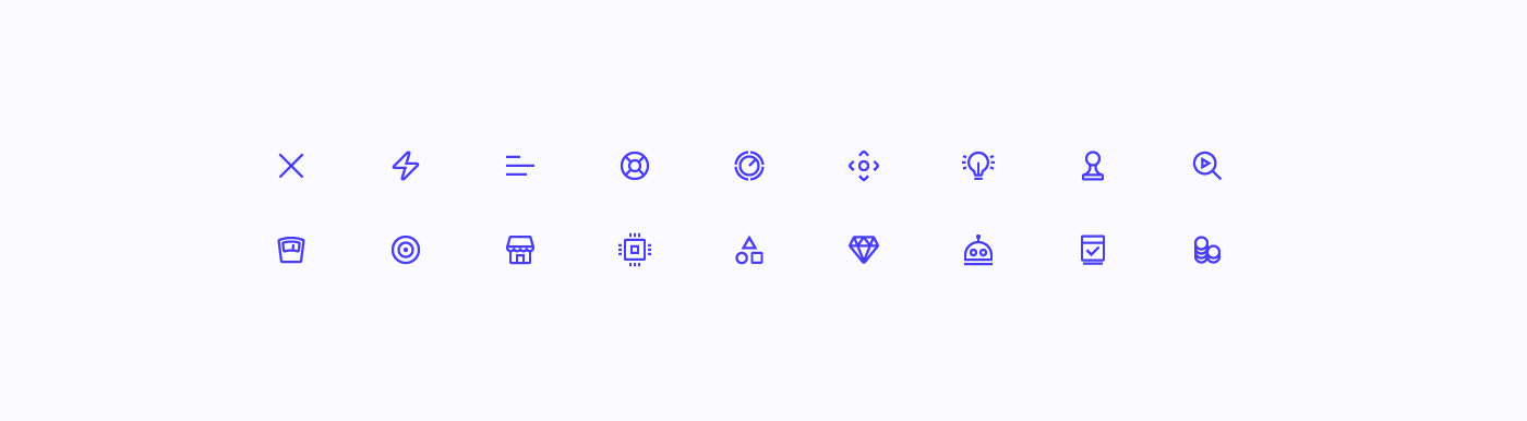
Iconography
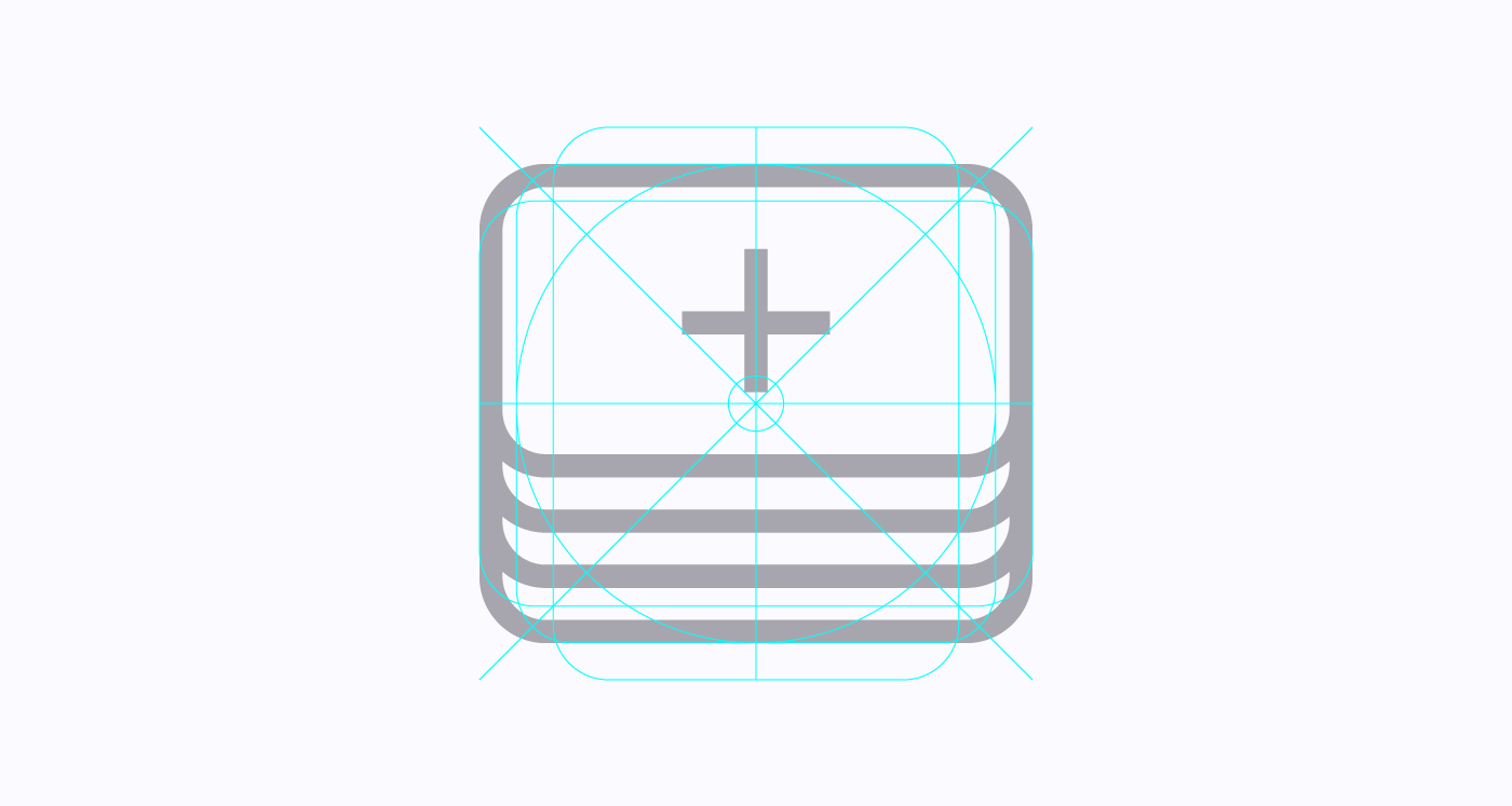
Labcave Icons' grid
60x60px icons
30x30px icons
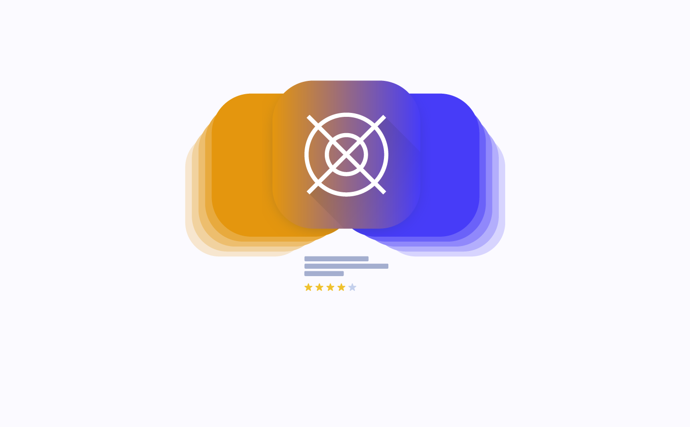
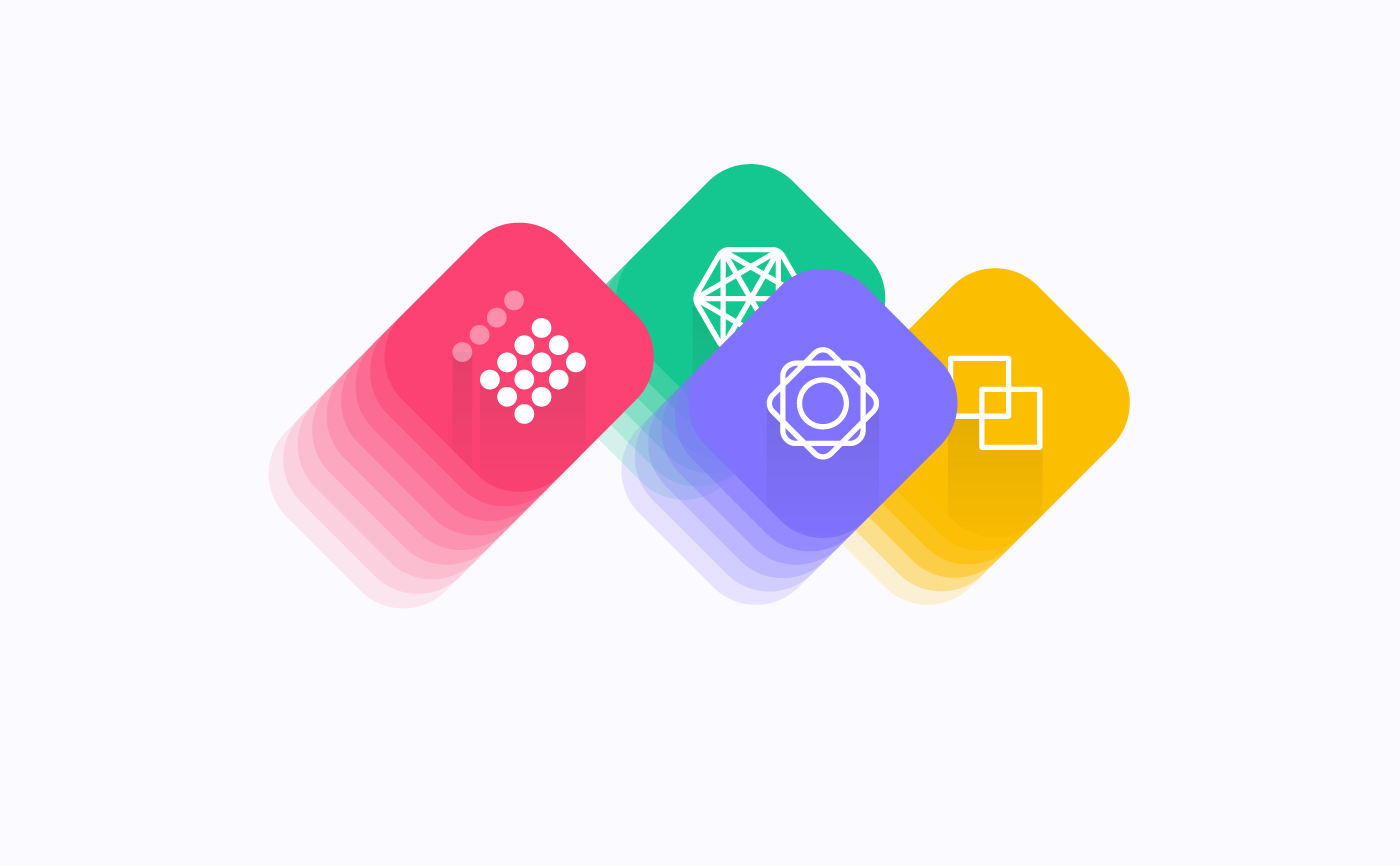
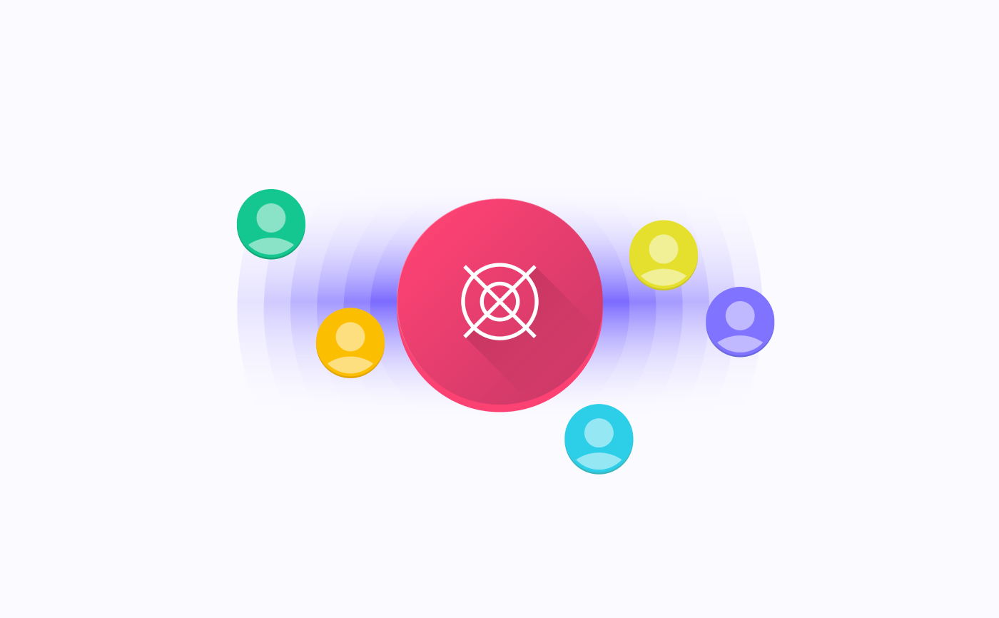
In the end, to fully suit website's new design needs, two completely original set of icons were created from scratch. A set of Icons, 24 icons, were created within a 60x60px grid so as to be displayed on the website in a more prominent way, whereas the other set of icons, 18 icons, used a 30x30px grid to be displayed in a smaller size.
Design
Typography
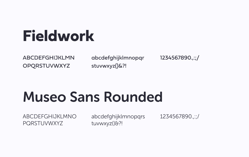
Two different typographies were chosen to be used within the project, both part of the archive of Adobe Fonts. One only used for main titles and headers called Fieldwork, designed by TipoType, and the other one, reserved for paragraphs and subtitles, called Museo Sans, designed by Jos Buivenga from Exljbris Font Foundry.
As part of a request from Labcave it was decided to use a bold and strong typography (Filedwork) for main titles and headers throughout the whole website, therefore a softer, lighter and more gently typography (Museo Sans) was used in paragraphs and subtitles so as to balance, visually speaking, the final result.
Design
Illustrations
For every page of the website, even the home page, an original illustration was created to help better convey page's new content. They all are geometric, colourful and, visually, as minimal as possible.
Take aways
The simpler the better
As I was able to learn from this project not always louder and bolder design approaches are the best way to convey a business's philosophy. Here design tone used was unable to convey Labcave's actual character, regarding business strategy.
It was pretty clear for directors, at that time, that a thoroughly re-design was needed and they decided to turn back to basics, bearing in mind simplicity, accessibility and beauty. And that is exactly what I tried to create: a simple, yet beautiful, accessible and functional website.