Updating Labcave's brand but always maintaining the mountain as its main feature.
Labcave team asked me to begin exploring new visual tones and languages for Labcave's Brand. Proposals shared on this page are all quite different from one another in order to be able to explore different boundaries in terms of style. A key request for all of them was that they must have a main element: a "three-peak mountain". In the end none of them was chosen to replace their logo however I'd dare to say that during the process of creation some good proposal were created.
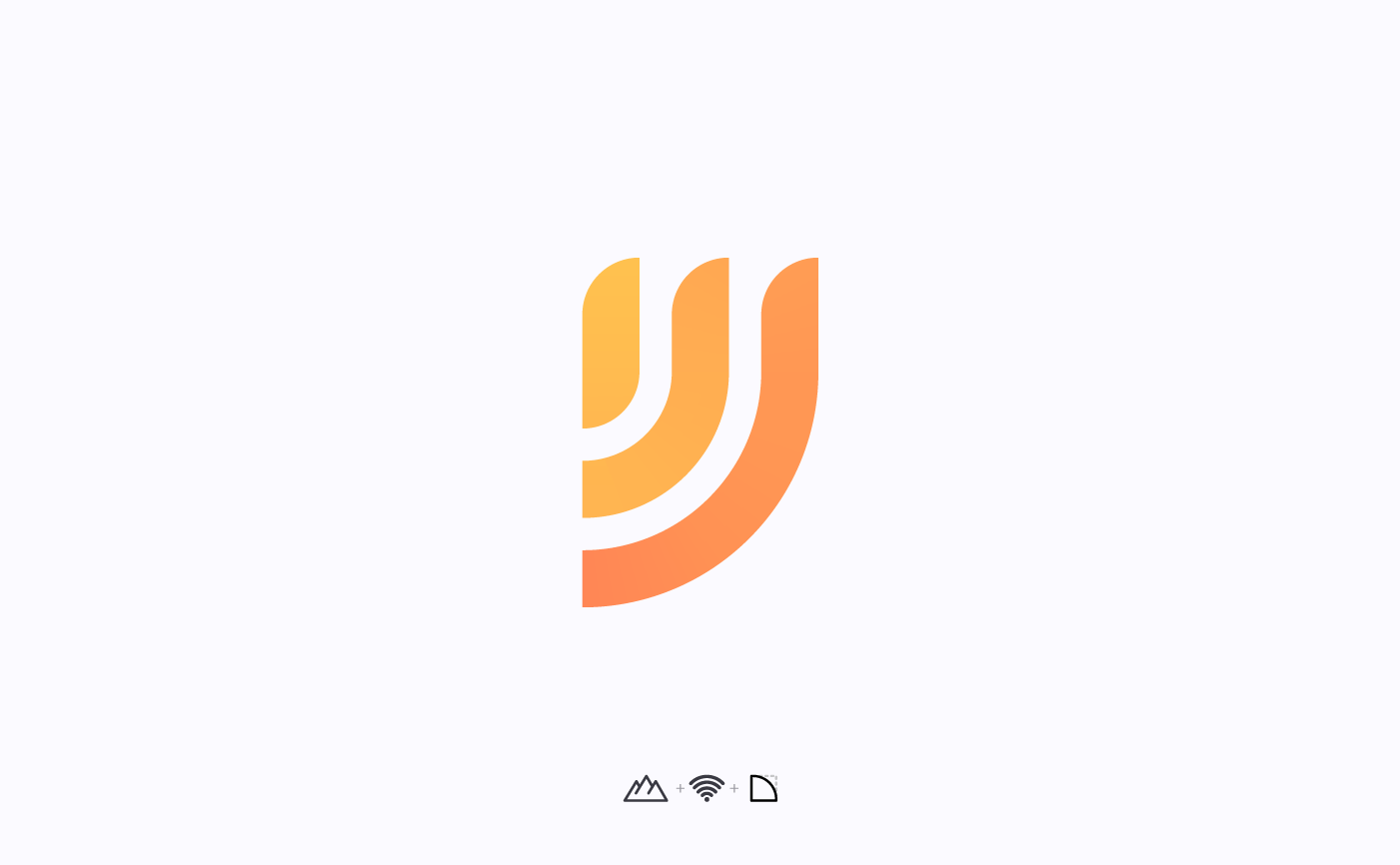
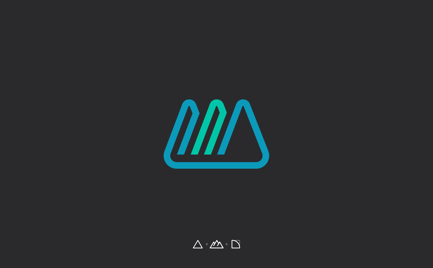
Modern proposal for Labcave's logo
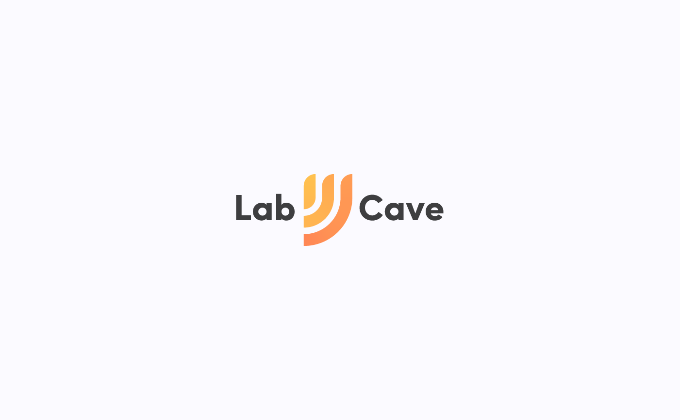
Modern proposal for Labcave's logo + typography
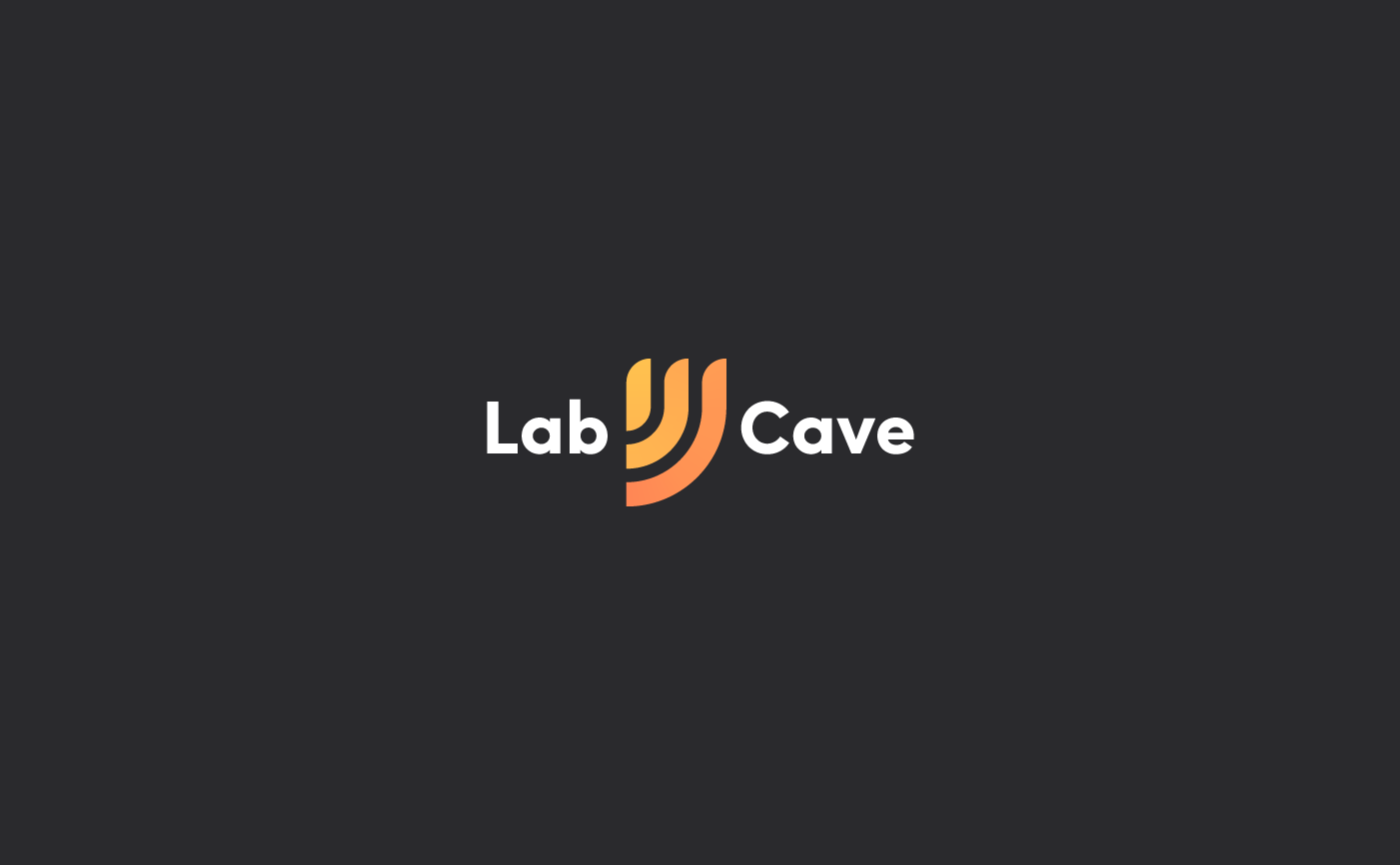
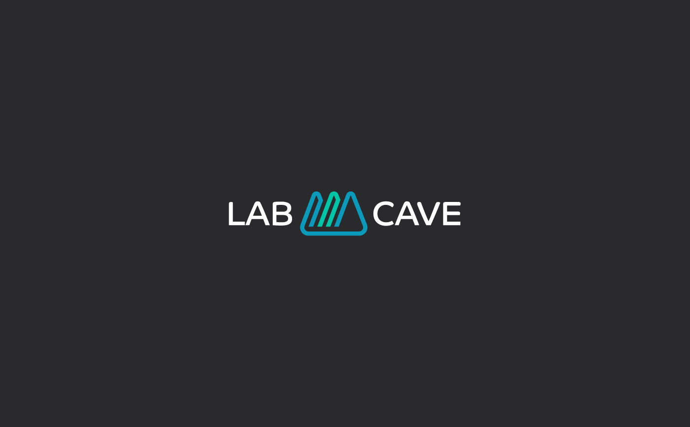
Modern proposal on dark background
As requested the above proposal's symbol depicts a three-peak mountain and some sound waves. It uses a modern, geometrical and bold visual style. Colours used within the symbol are also bold, playful and bright, to help convey Labcave's caracter. Version with typography places the symbol in the center, between the words: "Lab" and "Cave".
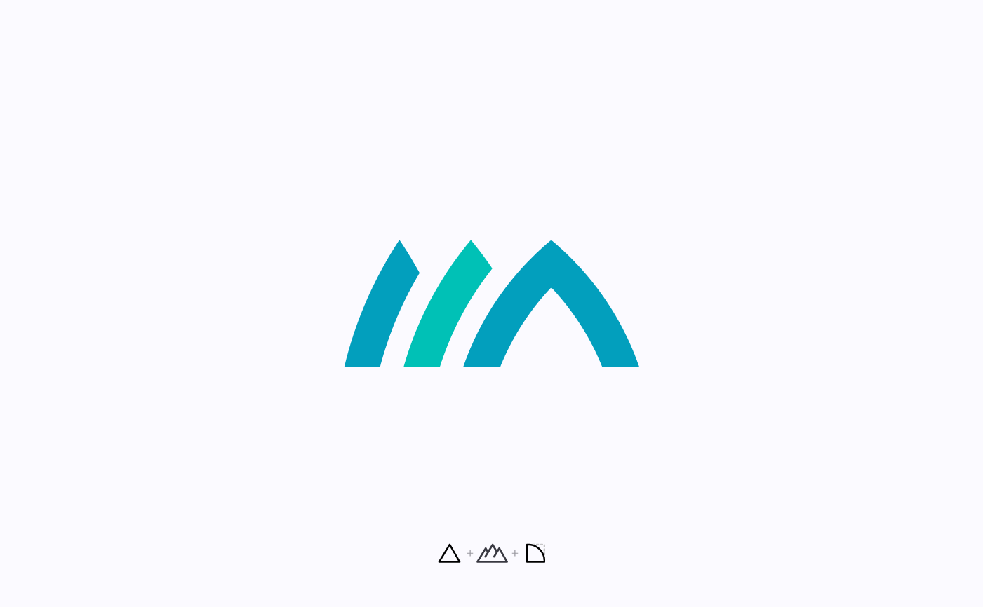
Modern and elegant proposal for Labcave's logo
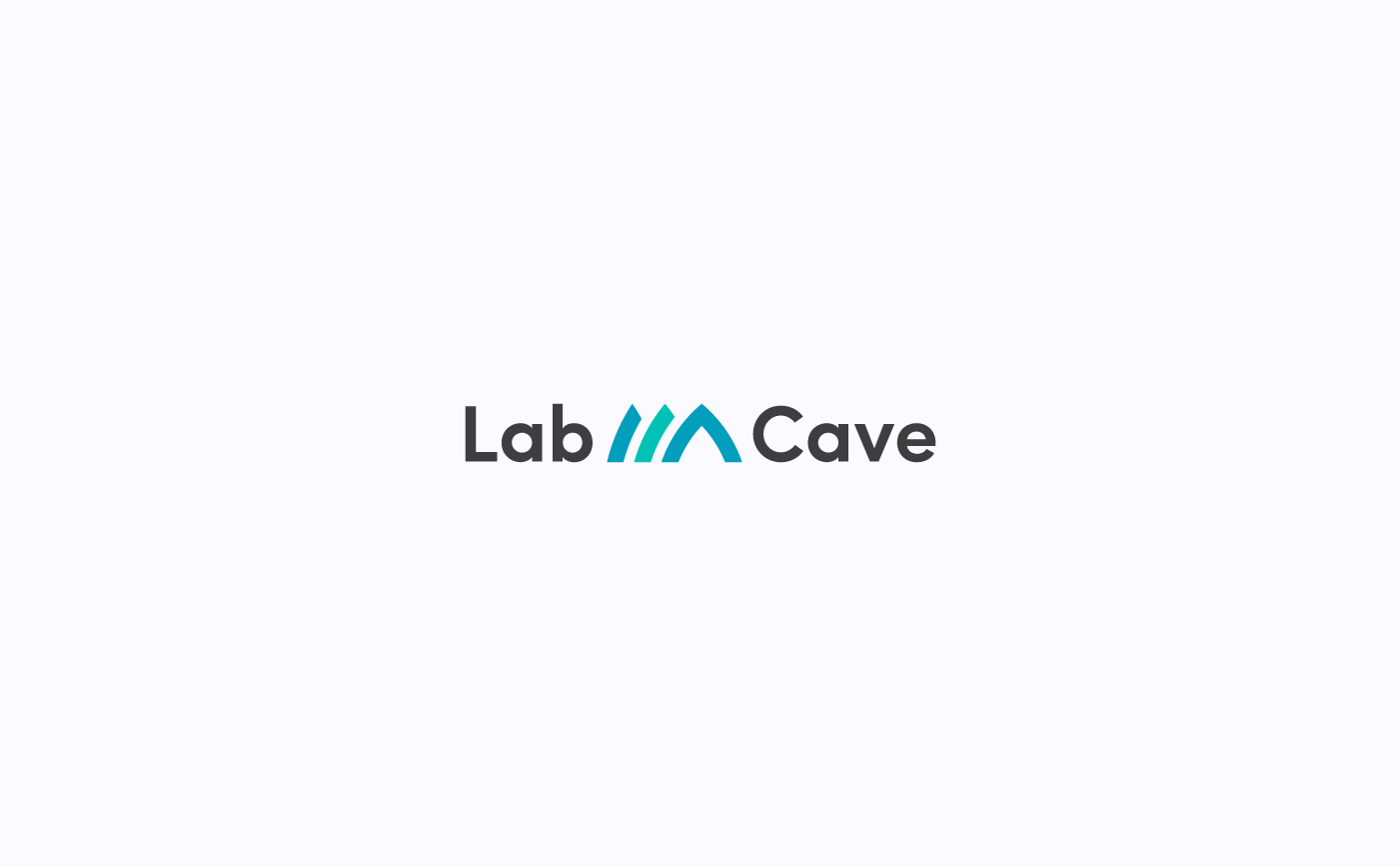
Modern and elegant proposal for Labcave's logo + typography
This logo also contains a symbol depicting a three-peak mountain. In this example final shapes are milder and more elegant. Colours used are colder and less bright and saturated to give the logo a more formal appearance. Here the symbol is also placed between the main words of the logo.
Modern and elegant proposal for Labcave's logo
Modern and elegant proposal for Labcave's logo + typography
Modern and elegant proposal for Labcave's logo + typography
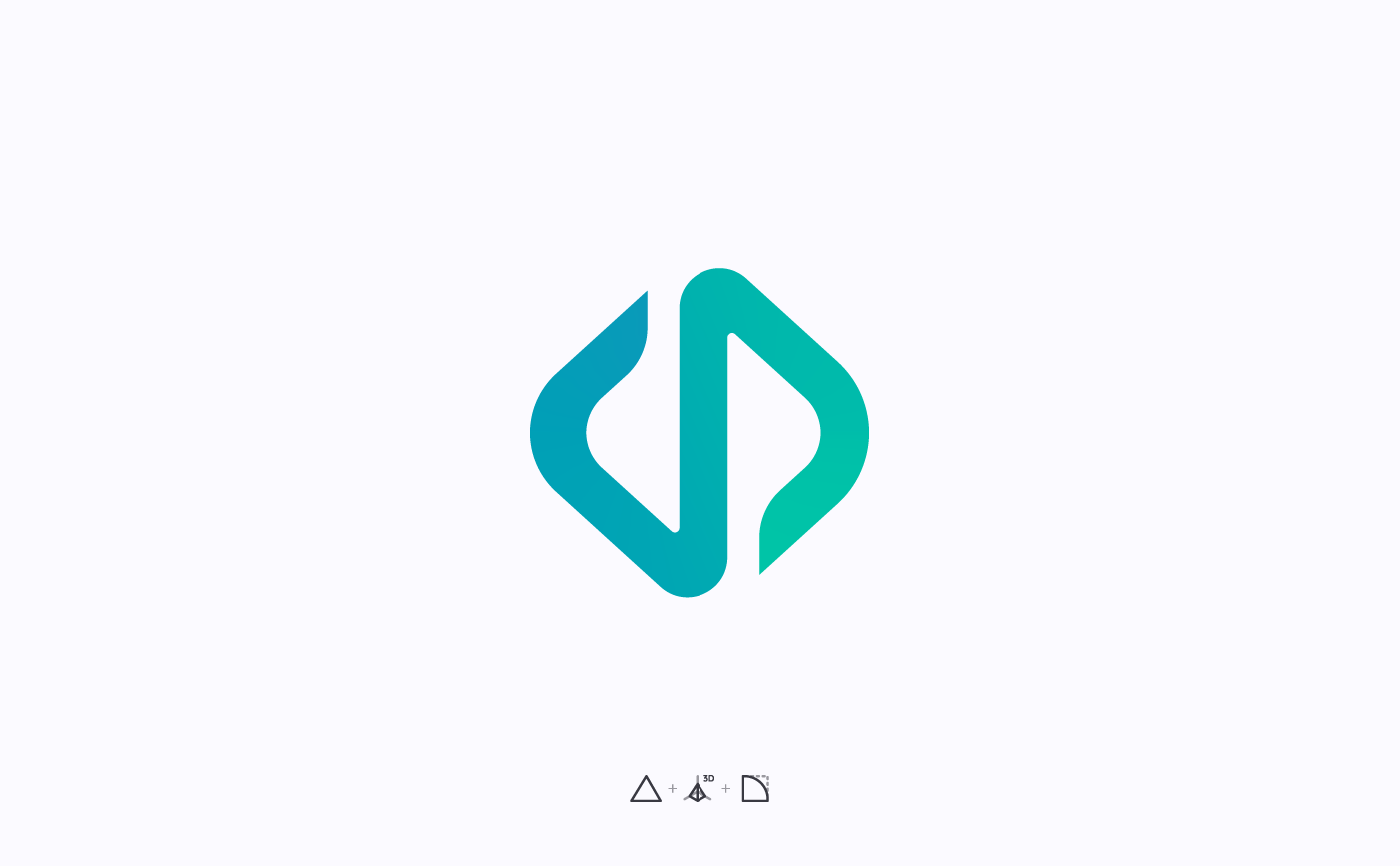
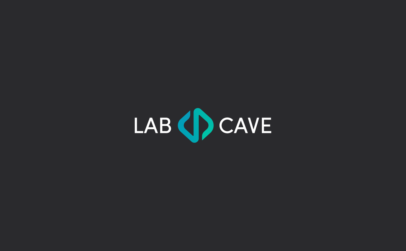
I kept working with blue hues in this proporsal for Labcave's logo. The three-peak mountain here is simplified to a single-peak one and its shape reminds of a 3D pyramid. Here typography is used in capital letters unlike the previous ones but the symbol is still between the main words of the logo.
Proposal for Labcave's logo
Proposal for Labcave's logo + typography
Above you can still see a modern and geometric looking proposal. Blue hues are also used and again capital letters substitute small letters. Here the final shape of the symbol is less bold and thick than prior proposals to give the logo a lighter and more sophisticated aspect.
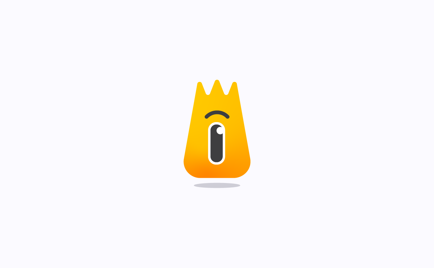
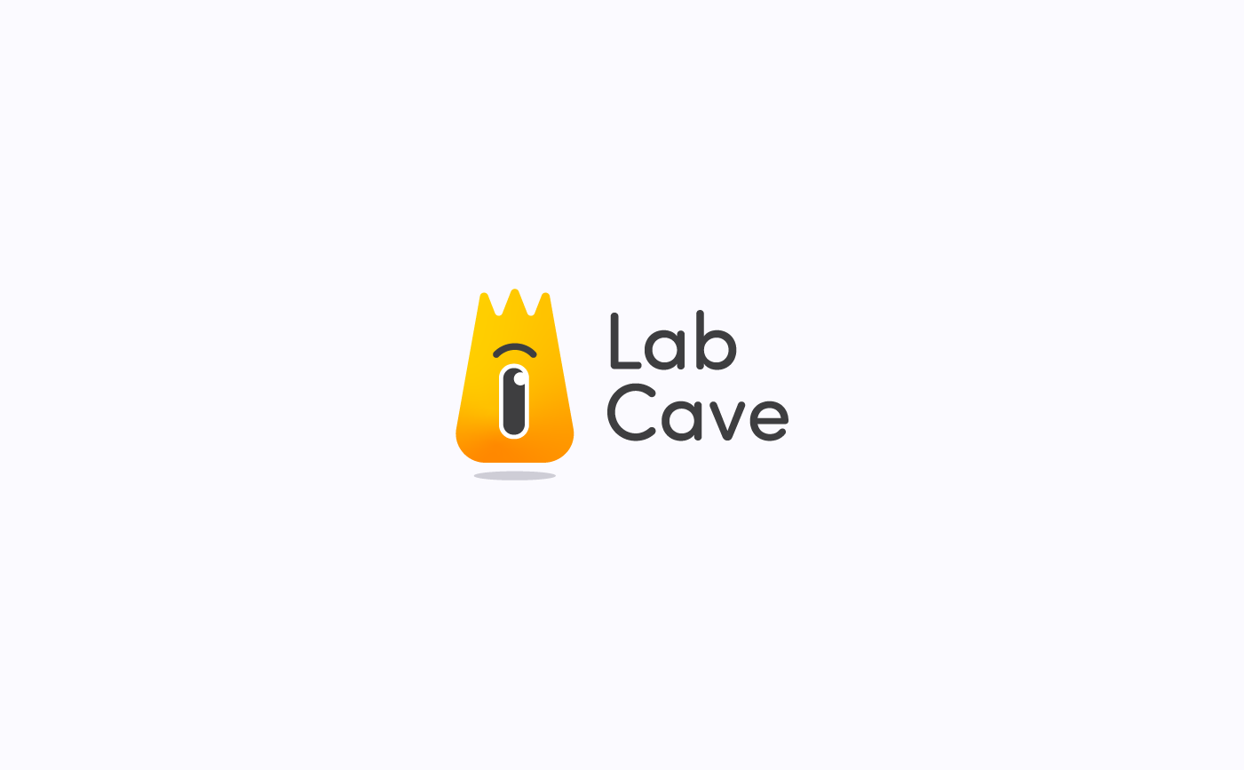
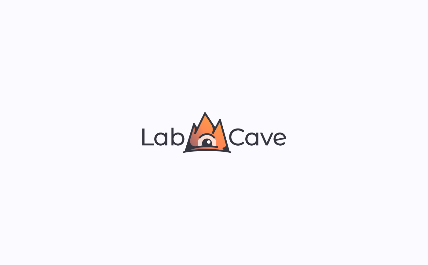
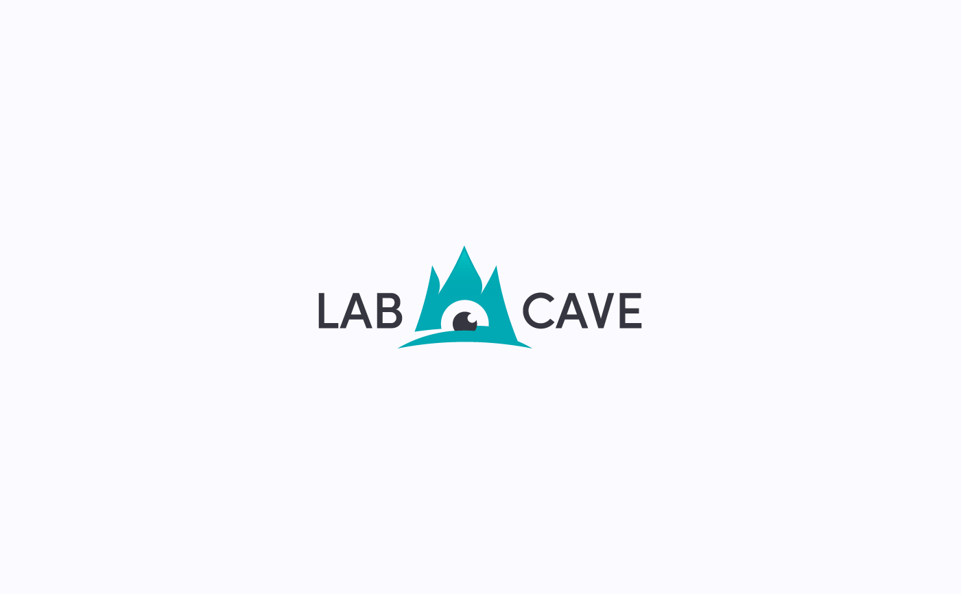
Playful proposal for Labcave's logo + typography
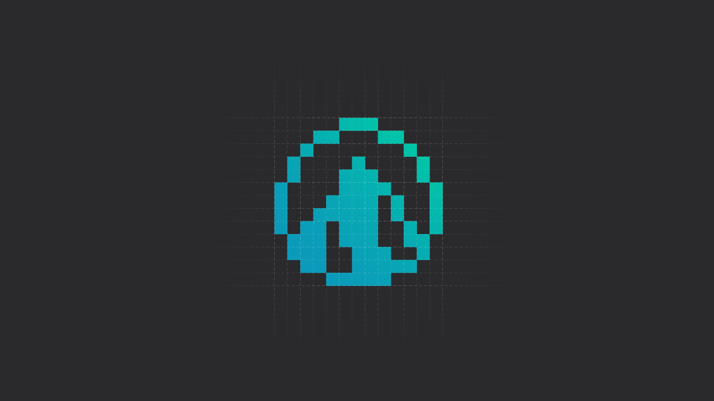
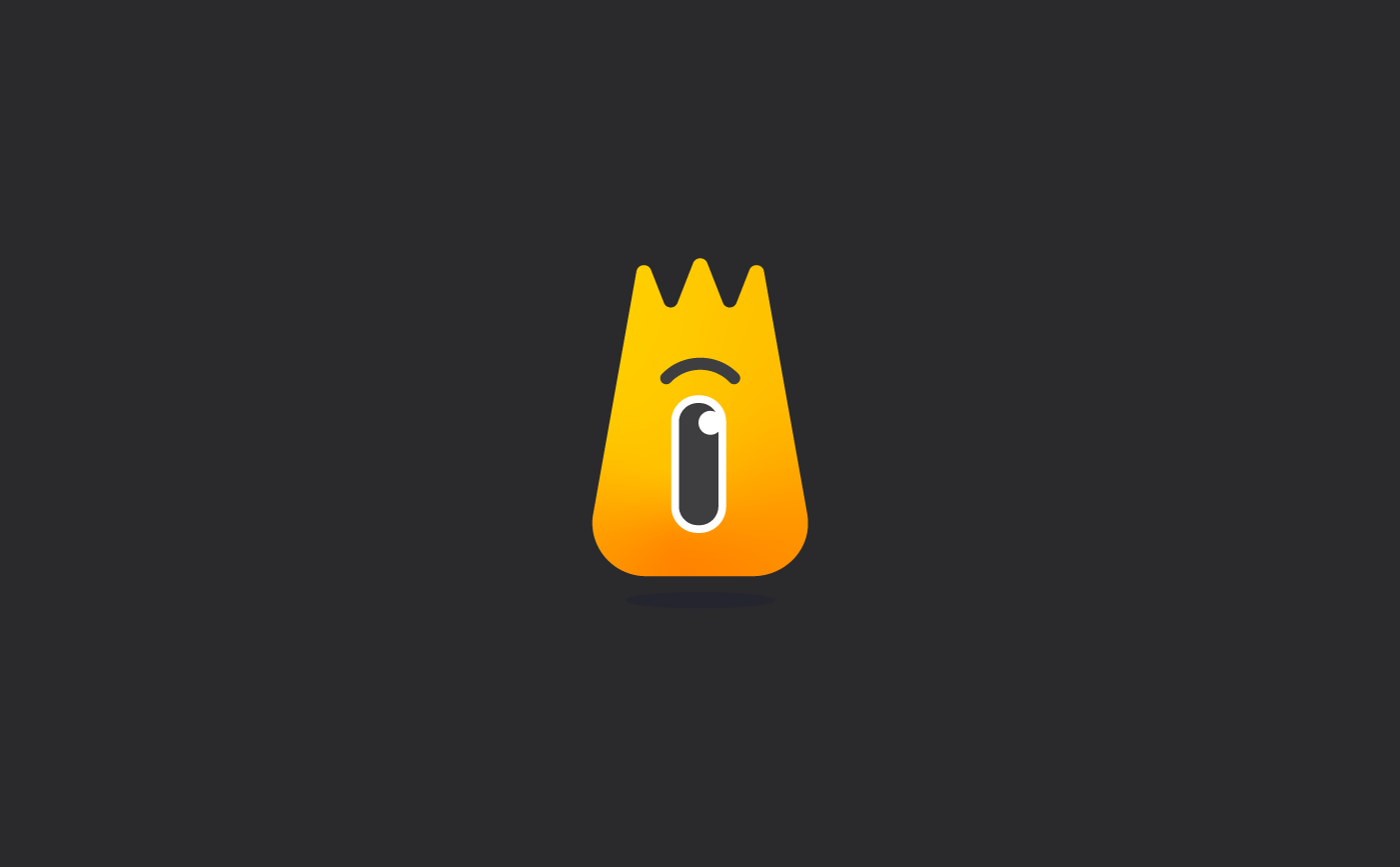
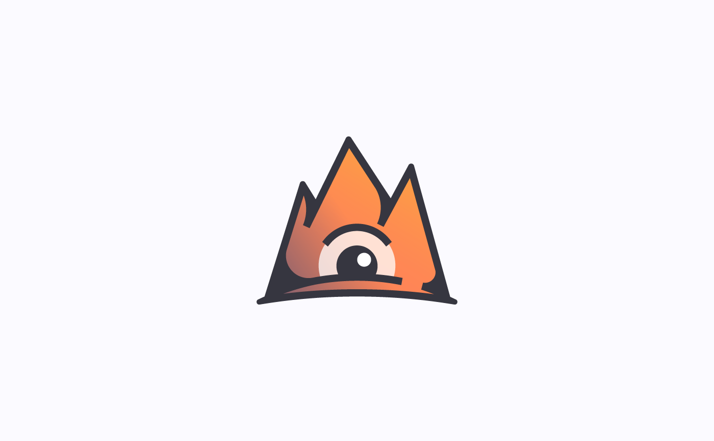
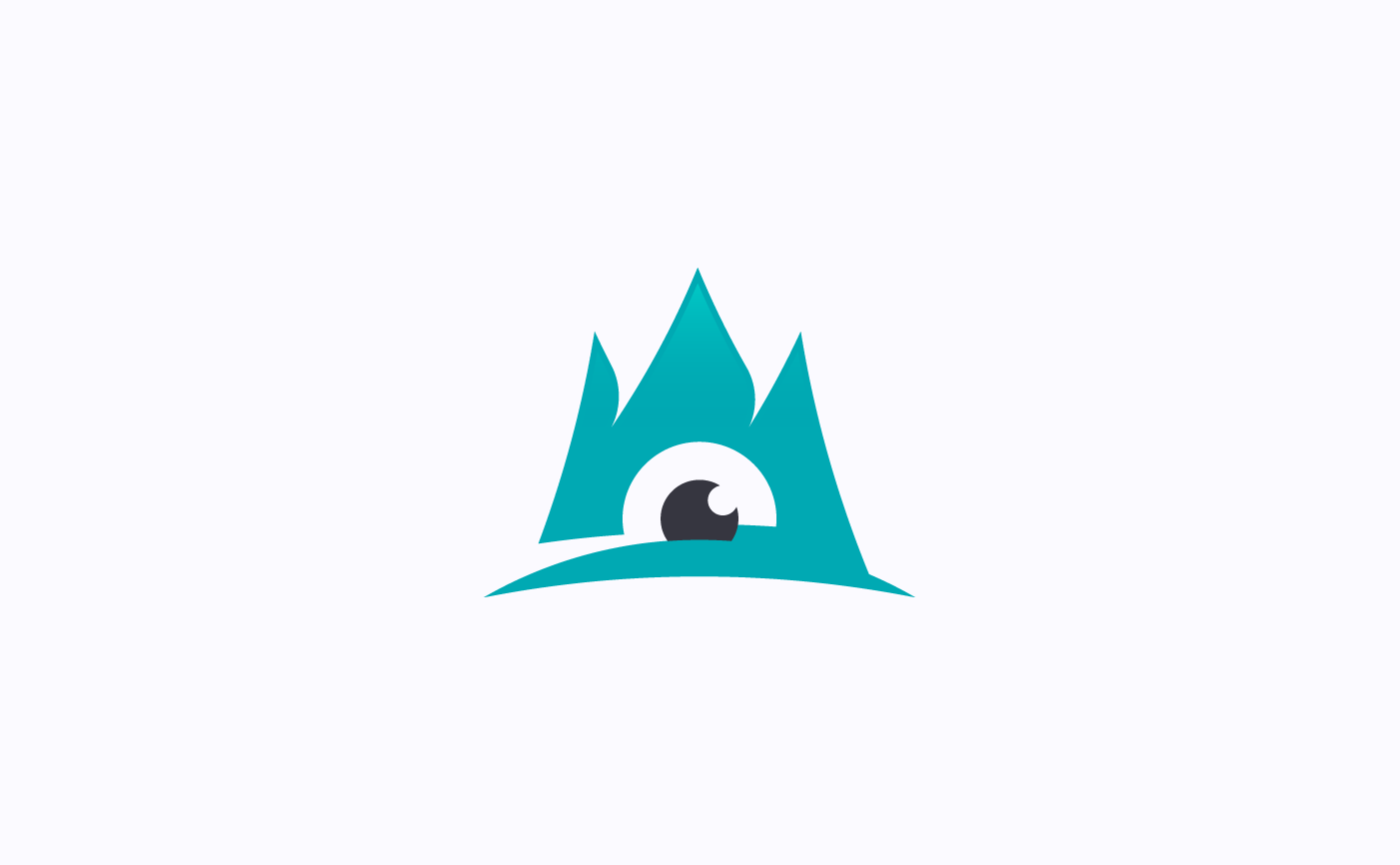
Geometric and minimal lines used in prior proposals give way, this time, to a more playful and cartoonish visual approach. Based on its current symbol, at that time (and still today), here the mountain became an alive being. Main words within the logo are placed together here but in a different typographical line and Font used is softer and milder so as to match visually with new logo design.
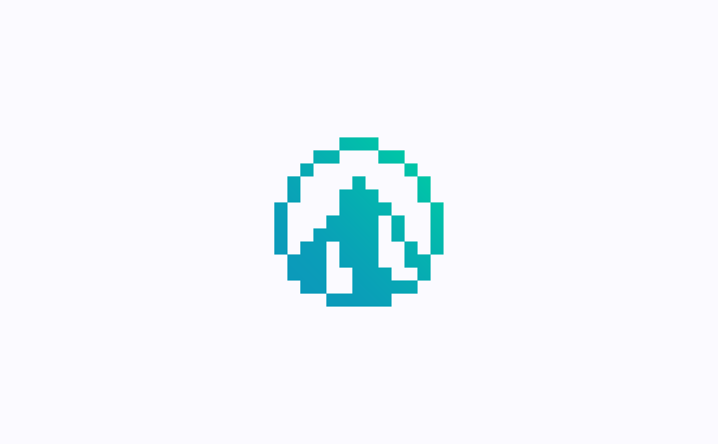
Proposal for Labcave's Symbol
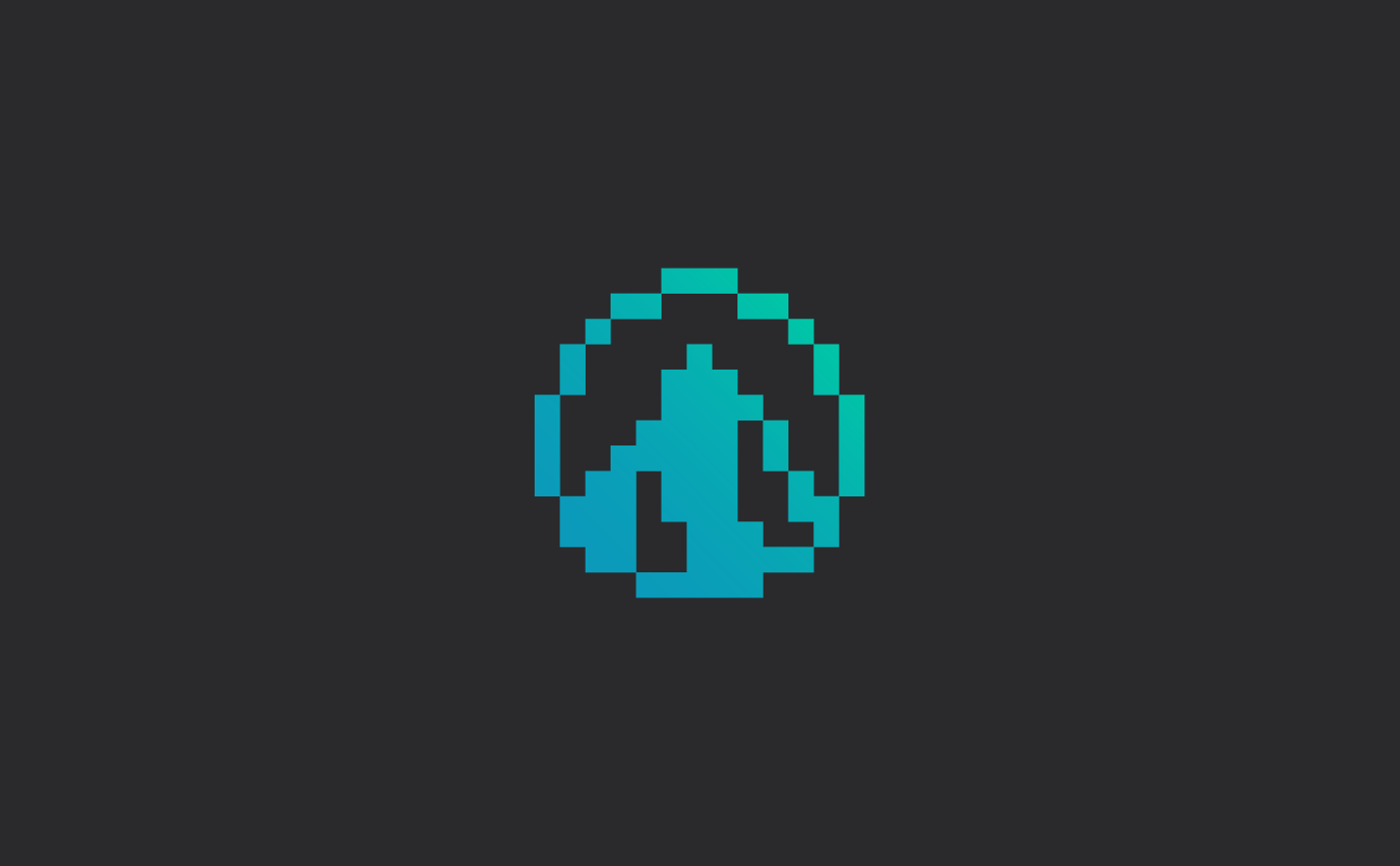
Proposal for Labcave's Symbol
Proposal for Labcave's Symbol
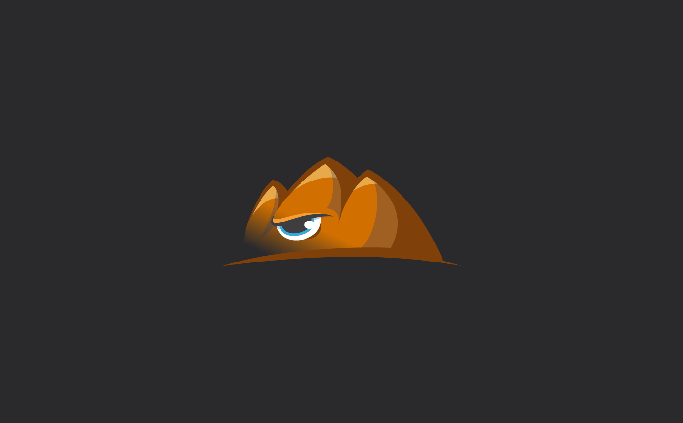
Proposal for Labcave's logo
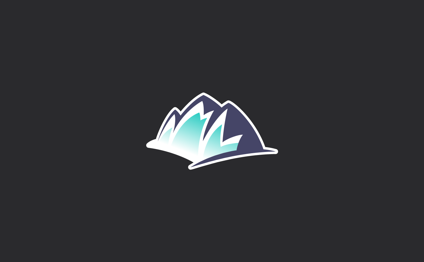
Proposal for Labcave's Symbol
Proposal for Labcave's Symbol
Proposal for Labcave's Symbol
Proposal for Labcave's logo
As you can see above, in the end, a fairly large number of proposals were created. Some of them were closely based on Labcave's logo and visual style back then but some just took the idea of the three-peak mountain developing a new visual approach and style.