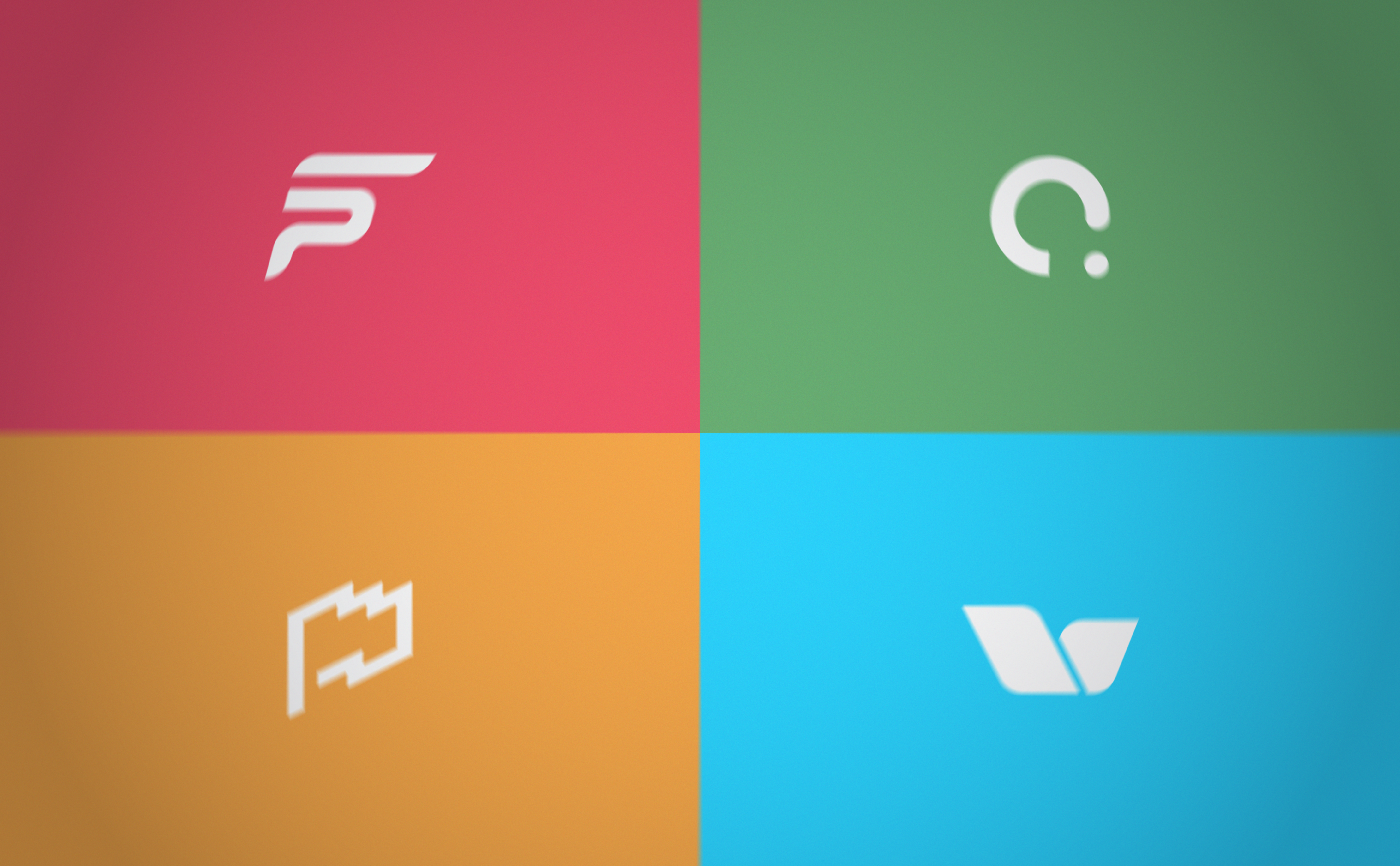
A selection of logos created for real brands under Mobusi's business umbrella.
For a period of time of roughfly 2 years, as one of Fibonad's Design Team members, I had the chance to be in charge of creating several logos for different products under Mobusi's patronage such as: "Advertiser Defender", "Delivery Leads", "Fast-Push", "Efike.co", etc... Here you can see some of those concepts and the ideas behind of nearly every of them.
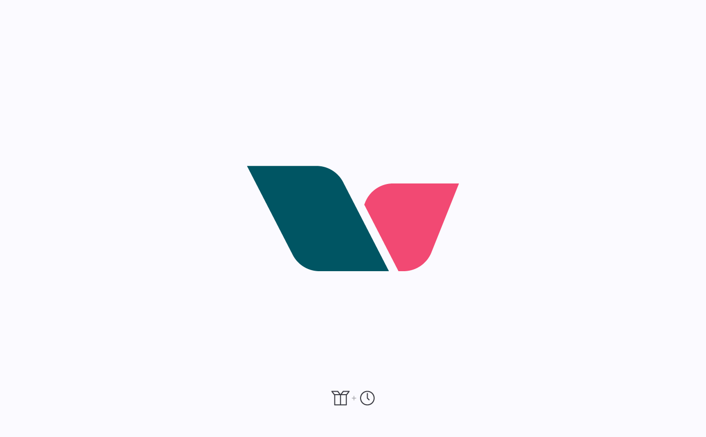
Deliveryleads symbol & their concepts behind the shape
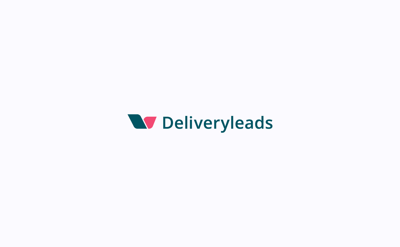
Deliveryleads symbol + typography
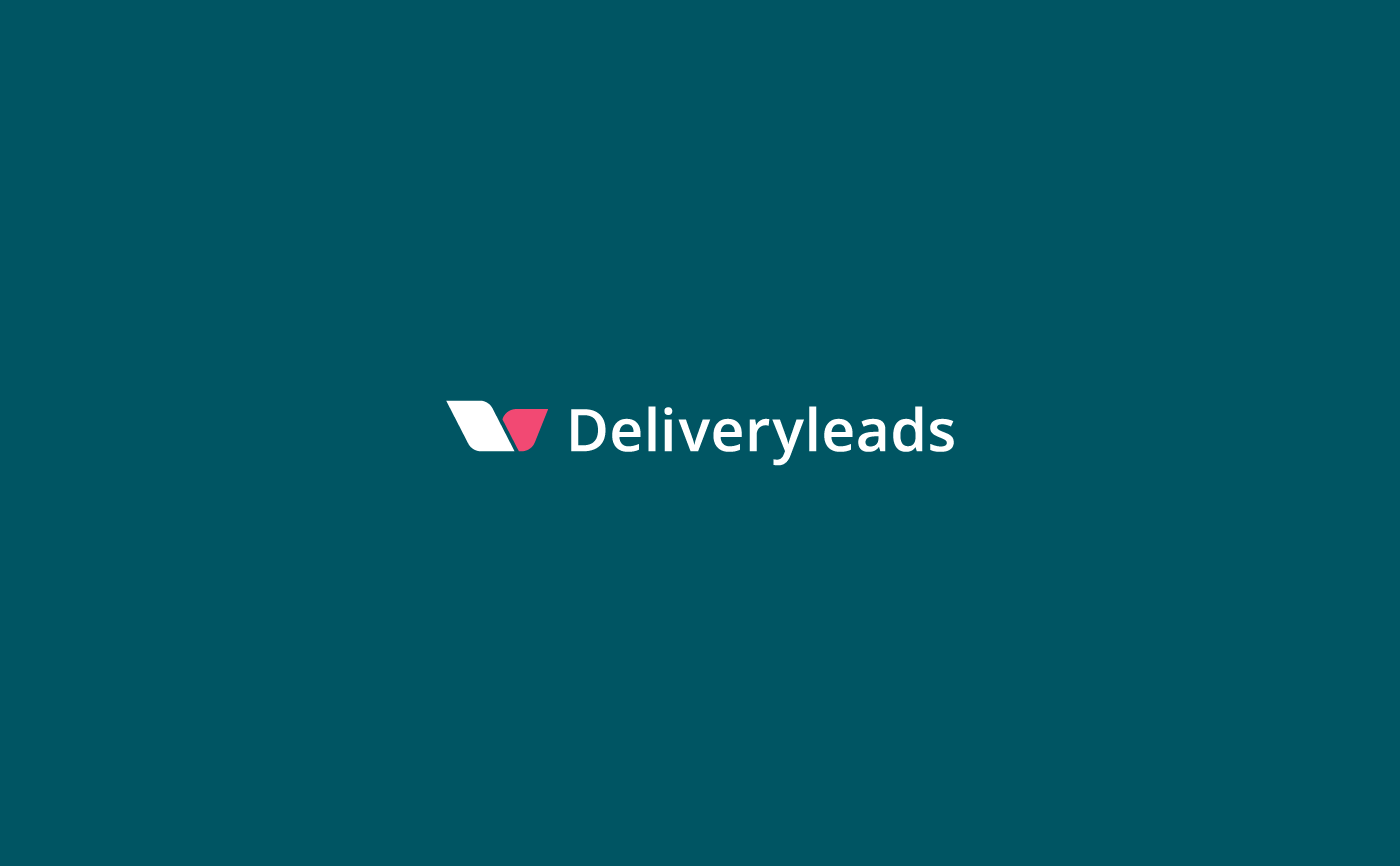
Deliveryleads symbol + typography
Above you can see the proposal for the logo created for "Deliveryleads", a new product of Mobusi. Shapes and lines of the symbol are based on a cardboard box and the concept of hurry, depicted here by a clock and applied to the shape by skewing the symbol main lines.
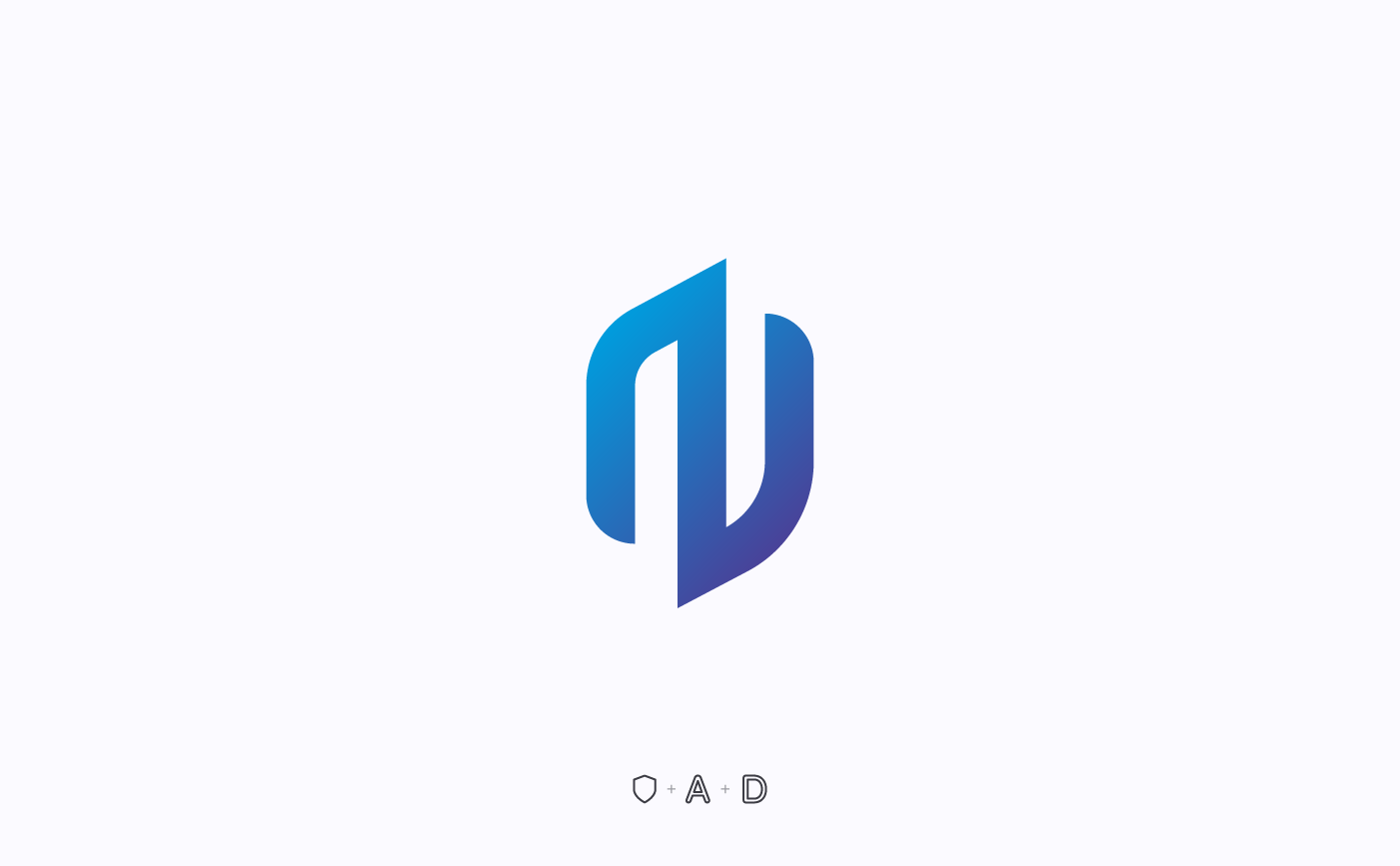
Advertiser Defender symbol & their concepts behind the shape
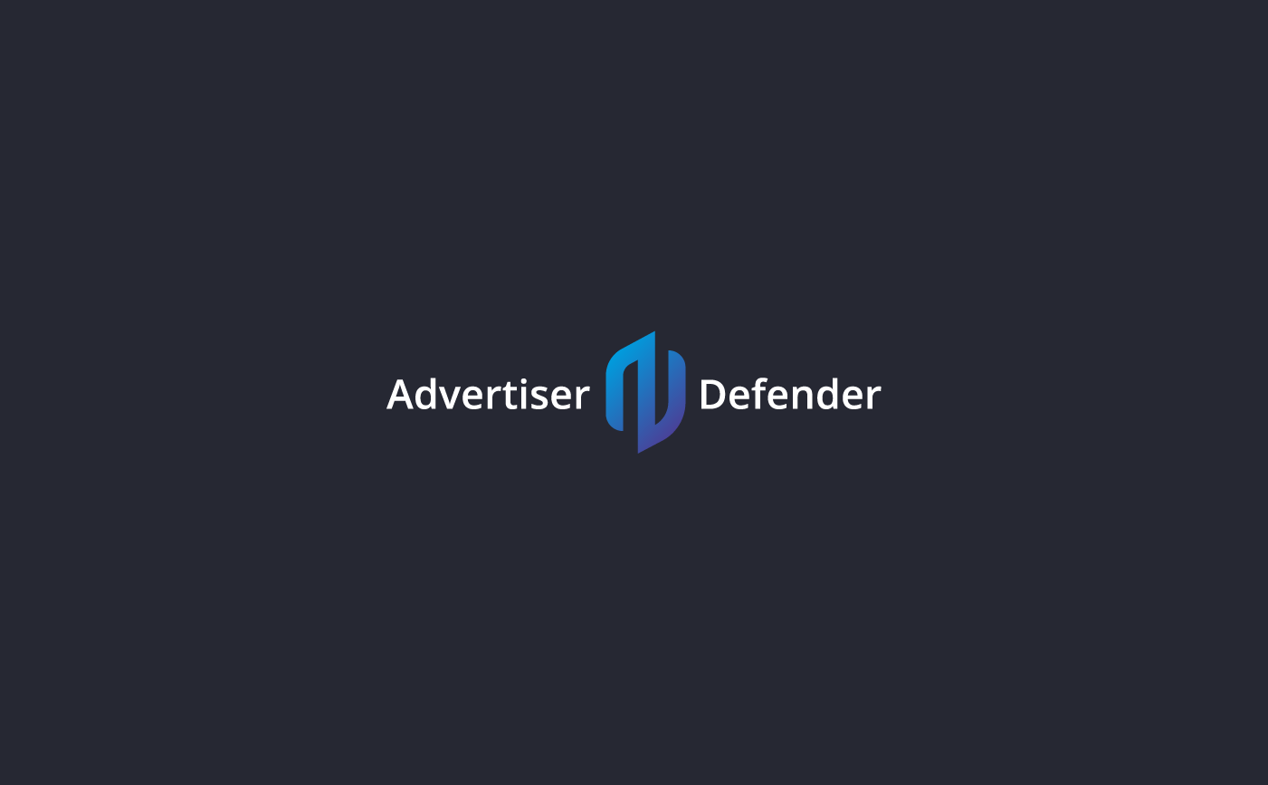
Advertiser Defender symbol + typography
Advertiser Defender symbol + typography
A logo was also created for "Advertiser Defender" a new tool to "take back control of your Ads". Lines of the symbol represent a shield, a letter A (advertiser) and the letter D (defender). Lines are also bold and straight to accurately convey the character of the brand.
Visit the website in order to know the product: www.advertiserdefender.com
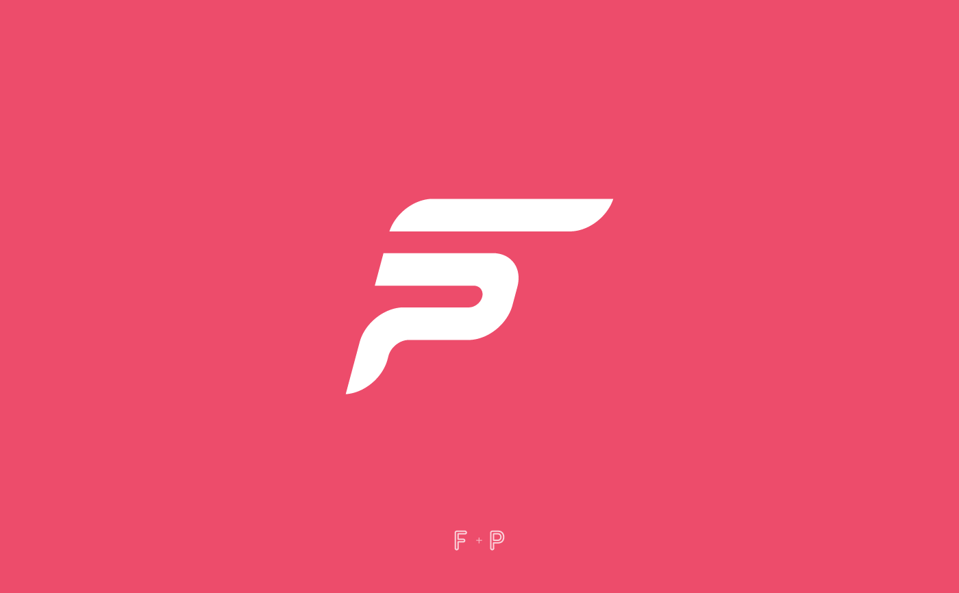
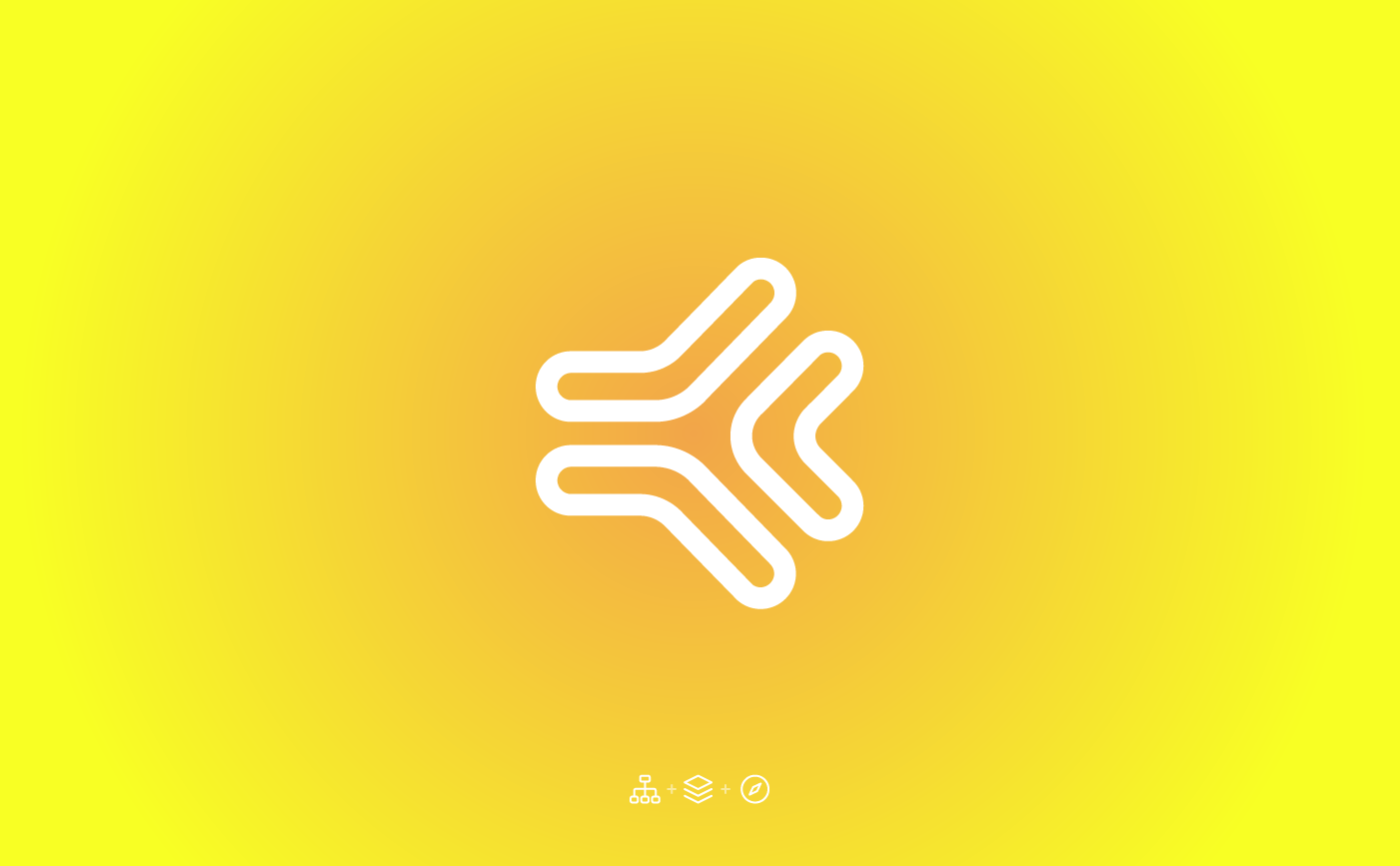
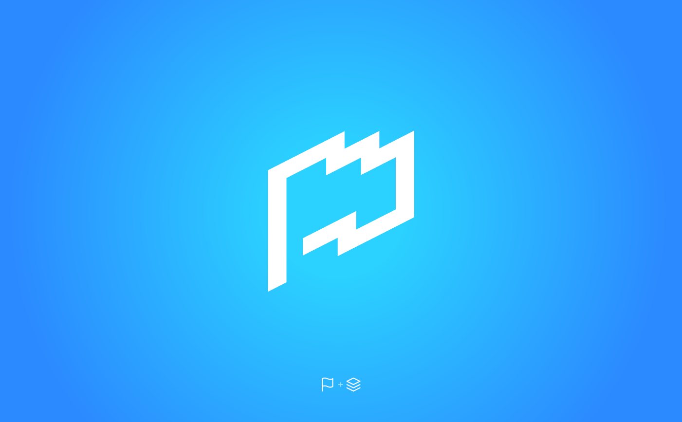
Fast-push symbol and concepts
Fast-push symbol + typography
Fast-push symbol + typography
Fast-push logo shown above was another winning proposal. The letters F and P are represented in its symbol.
Mobusi symbol update
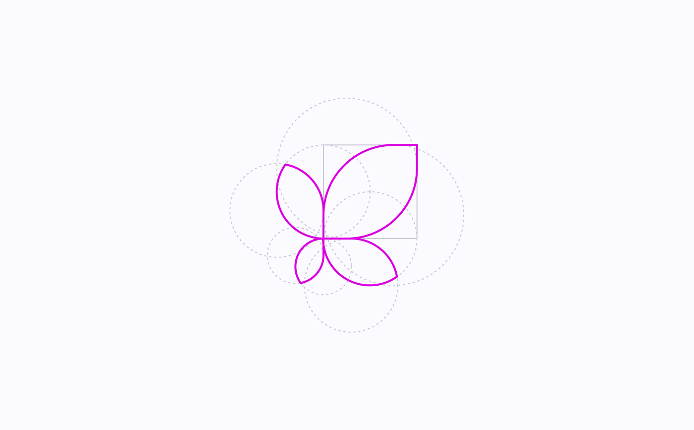
Mobusi symbol and its basic lines
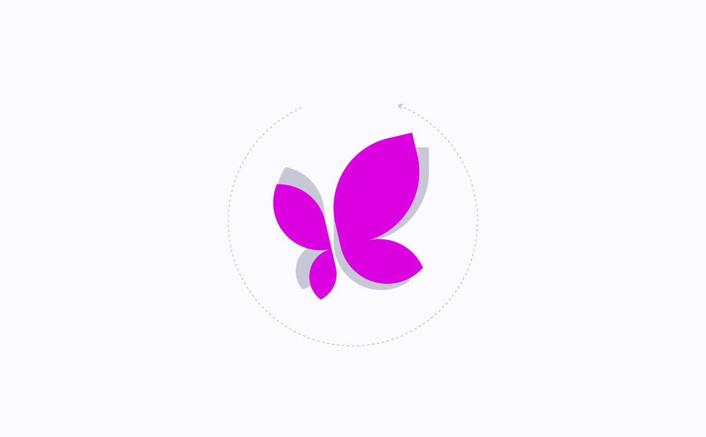
Mobusi symbol and its basic lines
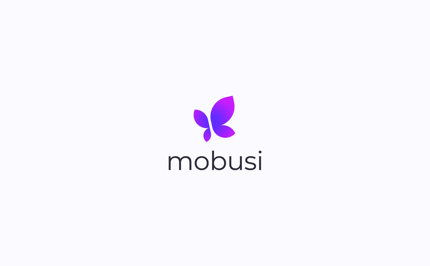
Mobusi symbol update + typography
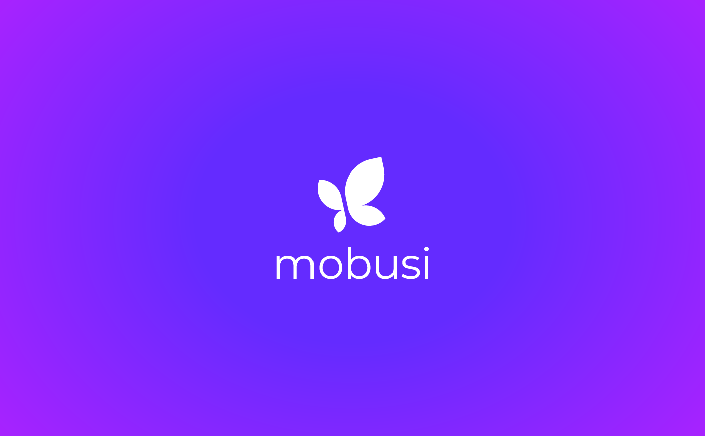
Mobusi symbol update + typography
I was also able to have a bit of fun on Mobusi's logo update. The proposal shown above was not chosen in the end but at least it allowed me to bring about a completely new and renovated idea for Mobusi's logo. As you can see on its website unfortunately, by the time being, Mobusi's logo still remain the same as 7 years ago (what a shame): www.mobusi.com
Efike.co symbol concept A
Efike.co symbol concept B
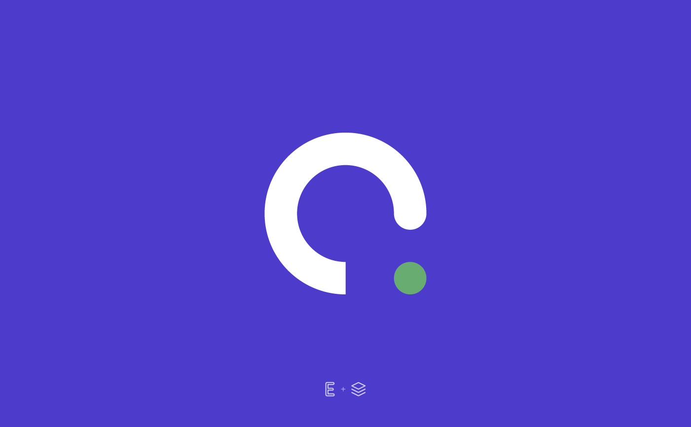
Efike.co symbol concept C
Efike.co was in need of a logo as well. As usually I created several versions for the same logo, using different visual styles and approaches as you can see on proposals shown above.